| Image |
Comment |
| 04/29/2005 12:12:29 PM |
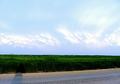
Photographers Shadowby Prime_TimeComment: There isn’t really anything in this picture to keep me looking for more than a couple of seconds. Unfortunately the subject isn't very strong and I would have not noticed it without the title. For me there is no real center of interest in this photo and that is the main thing that is keeping it from being a great photo. |
 Photographer found comment helpful. Photographer found comment helpful. |
| 04/29/2005 12:10:38 PM |
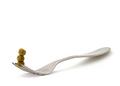
Three Peasby dsa157Comment: This is a very neat picture. The composition is very clean but I think it might be stronger with a tad more contrast and more saturation on the peas. Great work. |
| Photographer found comment helpful. |
| 04/29/2005 12:08:55 PM |
Buddingby prbettsComment: The first thing that I notice when I look at this picture are the bright branches at the top of the branch and in the background. Unfortunately they distract me strongly from the buds which I think are the subject of the photo. The brightly lit bud in the back of the branch is also a bit distracting. This picture might have been better with a tighter composition and more balanced lighting. |
| Photographer found comment helpful. |
| 04/29/2005 12:06:19 PM |
Full Moon and a New Pope.by docpjvComment: Interesting photo. I really wish that the cross had the bottom part on it also. This is the sort of picture that I expect to have some message to it though I am not clever enough to figure out what it is. I think it fits the challenge very well and I wouldn’t change anything about it. |
| Photographer found comment helpful. |
| 04/29/2005 12:03:29 PM |
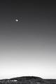
Almost Fullby cloudsmeComment: I like the tones in the sky a lot and find the picture to be pleasing overall. The composition works very well for me but I don’t think the scene is strong enough to really hold my attention for very long. |
| Photographer found comment helpful. |
| 04/29/2005 12:00:11 PM |
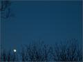
Rising Moonby LadeeMComment: I think the use of color and brightness was effective in making your subject really stand out despite its being very small in the frame. For me the picture would be better if it wasn’t quite such a common scene. I like the shapes of the branches coming up from the bottom of the picture but don’t think the branches at the top add much to the picture (to me they take away from the picture). This picture might have more impact if you really boost the saturation to make the blue really intense and the yellow/orange of the moon really stand out more. |
| Photographer found comment helpful. |
| 04/29/2005 11:54:20 AM |
Countdownby SycoPhantComment: For me the main thing about this picture that keeps it from being really great is the choice of subject. Maybe it would have been better had you taken it from so close that it was no longer recognizable. I think a couple of things could have been done to make this particular shot better though. First off, I have found that for photos of items like this, it is best to really clean everything off so that there is no dust or anything visible. Also, I think that the paper that the remote is sitting on doesn’t add anything to the picture. Maybe a white sheet would have been more effective. |
| Photographer found comment helpful. |
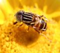
| 03/23/2005 01:29:19 PM |
Drone flyby gaurawaComment: The eye detail in this picture is very nice as well as the color. I think a tad more DOF would help this shot out as it would be nice to see the whole fly at least somewhat in focus.
Tom
|
| Photographer found comment helpful. |
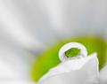
| 03/23/2005 01:27:20 PM |
Daisy in a dropletby gaurawaComment: I think this image is very interesting. I had to look at the title before I figured out what exactly it was I was looking at. Maybe a bit more DOF would make it more recognizable but I think it is pretty cool the way it is.
Tom
|
| Photographer found comment helpful. |
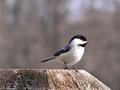
| 03/22/2005 03:07:02 PM |
Conservation Area Brochures / Bird Seed Packagingby BeingCleverComment: I think I would like this image more if the chickadee filled the frame more and if the exposure was just a tad darker. I think you could crop quite a bit off the top and to the rear of the bird and the picture wouldn’t suffer. This way the viewer could see a lot more detail in the feathers and the picture would be more interesting (for me anyway). However, the large empty space in the photo could be used to enter text which could make it more valuable as a stock photo. I do like that you have the bird slightly off center. |
| Photographer found comment helpful. |
Home -
Challenges -
Community -
League -
Photos -
Cameras -
Lenses -
Learn -
Help -
Terms of Use -
Privacy -
Top ^
DPChallenge, and website content and design, Copyright © 2001-2026 Challenging Technologies, LLC.
All digital photo copyrights belong to the photographers and may not be used without permission.
Current Server Time: 07/16/2026 09:06:17 AM EDT.