| Image |
Comment |
| 09/16/2005 08:25:03 PM |
Oliviaby CoolsComment: seems a tad underexposed. also try to achieve the most distance between the background on the model as possible to get a better background blur. the background leaves still seem to be a bit too defined. |
 Photographer found comment helpful. Photographer found comment helpful. |
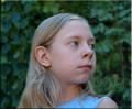
| 09/16/2005 08:23:55 PM |
Girl in loveby birgirComment: although the light source is coming off from the right and slightly above the model's head, it still appears a bit flat. also a tighter cropped might have been better |
| Photographer found comment helpful. |
| 09/16/2005 08:22:34 PM |
Little braidsby pacpintoComment: overall picture seems a bit out of focus. remember to make sure that the eyes are in focus |
| Photographer found comment helpful. |
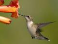
| 09/16/2005 08:21:55 PM |
Hummingbird Portraitby TomH1000Comment: would have liked a bit more saturation in the orange and yellow channels to bring out more vibrance to the photo |
| Photographer found comment helpful. |
| 09/16/2005 08:21:00 PM |
Eye-Lined Beautyby briantammyComment: i think the heads should be placed to the left more to make it perfectly symmetrical. also, the head on the right seems a bit overexposed. exposure might have been off because the black shirts might have messed with the exposure calculation |
| Photographer found comment helpful. |
| 09/13/2005 10:13:57 PM |
Alluraby Napalm NymphComment: hmm i dunno if i'm liking the crop on her arm. it's kind of in between being in the picture and not. the vertical length seems good though. i think the inclusion of the arm would have been better though. it would also have acted more of a frame around her head as well. i like this shot though, great colors and you'll probably get a lot of comments about bad white balance or warm tones, but i think it goes well with the casualness of this shot |
| Photographer found comment helpful. |
| 09/07/2005 12:13:48 AM |
|
| Photographer found comment helpful. |
| 09/07/2005 12:03:06 AM |
|
| Photographer found comment helpful. |
| 09/01/2005 12:04:12 AM |
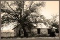
This Old Houseby phinbobComment: i always thought high contrast and sepia didn't go together. because sepia is usually done to add antique-ness to a photo. and usually older photos aren't very contrasty. but i like this shot. it conveys that old country feel very well. |
| 08/22/2005 01:31:11 AM |
|
| Photographer found comment helpful. |
Home -
Challenges -
Community -
League -
Photos -
Cameras -
Lenses -
Learn -
Help -
Terms of Use -
Privacy -
Top ^
DPChallenge, and website content and design, Copyright © 2001-2026 Challenging Technologies, LLC.
All digital photo copyrights belong to the photographers and may not be used without permission.
Current Server Time: 07/15/2026 07:08:35 PM EDT.