| Image |
Comment |
| 10/04/2006 12:35:20 PM |
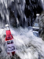
Jones Sodaby stare_at_the_sunComment: Great idea that needs a tighter crop. You really bring out the idea that the product is refreshing. Its just that I'd like to see the product more prominantly displayed. |
 Photographer found comment helpful. Photographer found comment helpful. |
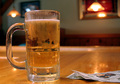
| 10/04/2006 12:33:08 PM |
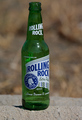
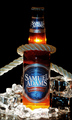
Roll With Itby bobgaitherComment: This has great lighting and it presents the product really well. Nice DOF helps presentation too. However, patience would improved this 100% I.E. wait until after the shoot to drink the beer. It would make the product more appealing. A little less centered crop too, would help with text placement. |
| Photographer found comment helpful. |
| 10/04/2006 12:29:19 PM |
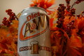
Creamy and delicious, A&W Root Beer!by TwigComment: Nice perspaective thats really presents the product nicely. However its needs to be sharper and against a different background to make what you're selling really stand out. (I.E. it needs more contrast.) |
| Photographer found comment helpful. |
| 10/04/2006 12:26:54 PM |
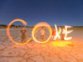
Send Coke !by John WhiteComment: I like this concept very much. I can picture this in flames or written in the sand with a coke logo off to one side. I might've requested a tighter crop to adjust the comp to be less centered besides what I've already mentioned. You get an "A" for effort as I can imagine how many takes this took. |
| Photographer found comment helpful. |
| 10/04/2006 12:21:38 PM |
|
| Photographer found comment helpful. |
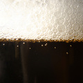
| 10/04/2006 12:19:57 PM |
Bud Light on Tapby David1411Comment: I like the set up and the idea (especially the defining DOF). A different color bar that would lend to more contrast would serve better IMO. (no pun intended)Also albiet small detail is that Beer companies like to have a nice head of foam on their beers as it infers freshness. Still very nice overall. |
| 10/04/2006 10:58:10 AM |
|
| Photographer found comment helpful. |
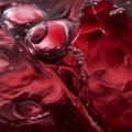
| 10/04/2006 10:56:43 AM |
Beer Bubblesby fl-AshComment: A slight white balance adjustment would go a long way with this. there's a ton of potential here. With the proper tag line, well placed in the great comp/negative space of this photo, this could appear in almost any magazine. |
| 10/04/2006 10:54:11 AM |
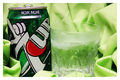
7 Up!by CheerzComment: I like the green background and the negative space would work well for text placement. acouple of blown highlighs detracts a bit from excellent product presentation. |
| Photographer found comment helpful. |
| 10/04/2006 10:35:57 AM |
Cruel and Unusualby hokieComment: Great idea...Lighting's a bit harsh and I might've asked for a less centered comp to allow space for text placement. I could still make this work. |
Home -
Challenges -
Community -
League -
Photos -
Cameras -
Lenses -
Learn -
Help -
Terms of Use -
Privacy -
Top ^
DPChallenge, and website content and design, Copyright © 2001-2026 Challenging Technologies, LLC.
All digital photo copyrights belong to the photographers and may not be used without permission.
Current Server Time: 07/19/2026 11:33:30 AM EDT.