| Image |
Comment |
| 10/05/2006 06:30:26 PM |
|
 Photographer found comment helpful. Photographer found comment helpful. |
| 10/05/2006 06:28:53 PM |
king of good times!by yadevComment: Nice capture. I can imagine how many takes this took. Lighting is a bit harsh but probably could be corrected with a white balance adjustment.?.?
Off centered comp is interesting and would work well with text. |
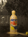
| 10/05/2006 03:35:40 PM |
It blows your thirst away!by graphicfunkComment: Nice capture. This "action" Photo is perfect for this product. Catchy tag line too. Needs a little more contrast to really pop out at the viewer. |
| Photographer found comment helpful. |
| 10/05/2006 03:33:00 PM |
|
| Photographer found comment helpful. |
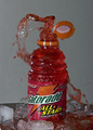
| 10/05/2006 03:30:37 PM |
Mithosby Z_iddComment: Nice pour thats a bit too cluttered. A cleared table by either removing the objects or a shallow DOF would've improved this immensely. |
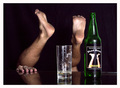
| 10/05/2006 03:28:55 PM |
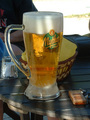
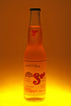
Hot Sun, Cold Beerby talikfComment: Nice job. Comp is a little too centered but a taller crop would allow space for text underneath the bottle. A little condensation would help add a "refreshing" touch in contrast to the warm colors you use for the background. Also a bit more contrast betwen the product and the background would help. |
| Photographer found comment helpful. |
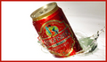
| 10/05/2006 12:04:33 PM |
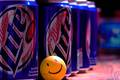
Dynasties are built one can at a timeby MegaweaponComment: Comp and dof work well . Text could easily and creativly placed. Lighting seems a bit too subtle that would maybe improved with a little less saturation and a levels adjustment. |
| Photographer found comment helpful. |
| 10/05/2006 10:17:34 AM |
Jax Beach...by surfwakeskateComment: I like the concept here. Comp is nice and would work well with possible text. Lighing is nice and DOF gives just enough detail while displaying product nicely. However, A tighter crop would bring the product into a more Prominent role. The bottle shouldn't be titlted either. |
| 10/05/2006 10:14:45 AM |
Smoothby behindthescenesComment: Nice. I always believe that less is more when it comes to ads. Lighting and comp are great but the product needs to be sharper. Off centered comp work well with possible text. |
| Photographer found comment helpful. |
| 10/05/2006 10:12:03 AM |
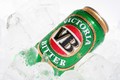
For a hard earned thirstby Kimberly75Comment: Nice attention to detail. I always like condensation on cold beverage ads. White balance adjustment could've helped bring out a little more detail on the ice. Comp works well for text placement. |
Home -
Challenges -
Community -
League -
Photos -
Cameras -
Lenses -
Learn -
Help -
Terms of Use -
Privacy -
Top ^
DPChallenge, and website content and design, Copyright © 2001-2026 Challenging Technologies, LLC.
All digital photo copyrights belong to the photographers and may not be used without permission.
Current Server Time: 07/21/2026 06:28:19 PM EDT.