| Image |
Comment |
| 02/11/2008 01:23:30 PM |
Tea - Best Drink of the Dayby TacTZillaComment: This is one of those ads that I can't really tell what the product is. The background is a bit distracting too. I'd use a tighter crop and maybe include the tag from the tea bag to present the product better. |
 Photographer found comment helpful. Photographer found comment helpful. |
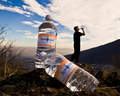
| 02/11/2008 01:20:58 PM |
A refreshing reward...by gpalosComment: This is really good. Product is well displayed and the background adds perfect ambience. The only thing I'd have issues with is the comp. Moving the bottles more to the left would give the ad more balance. |
| Photographer found comment helpful. |
| 02/11/2008 01:03:37 PM |
scent of appleby CamabsComment: I like the divided background. Nice comp allows for text and product is well displated. I think this needs a levels adjustment to really make the product pop out at me. |
| Photographer found comment helpful. |
| 02/11/2008 01:01:48 PM |
|
| Photographer found comment helpful. |
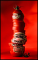
| 02/11/2008 12:59:58 PM |
Freshly Squeezed by TechoComment: The creativity in this is great and effective I get the idea that this ketchup is made fresh from your ad. I guess th only thing I'd say is that a different color or tone in the background would really make this pop. |
| Photographer found comment helpful. |
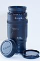
| 02/11/2008 12:57:51 PM |
Pre-Lovedby cpanaiotiComment: Very prominant product presentation. I'm sure what's for sale. This would make a great photo for ebay or a used lens section of the camera shop. My only pick is that it could use a bit more contrast or a levels adjustment. |
| Photographer found comment helpful. |
| 02/11/2008 12:55:18 PM |
Simple but to the pointby SteveBassComment: I like this type of "less is more" ad. But be careful when you go this way because everythting has to be "tack sharp". |
| Photographer found comment helpful. |
| 02/11/2008 12:52:20 PM |
Actual sizeby lambie83Comment: I like this. You're advertising and aspect of the product, I.E. the convienent size of the phone.Lighrting is good but photo could be a bit sharper. Also, a less centered crop would allow for text to be added without seeming unbalanced. |
| Photographer found comment helpful. |
| 02/11/2008 12:50:07 PM |
|
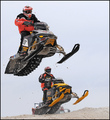
| 02/11/2008 12:49:00 PM |
Choose Ski-Doo....If You Dare!by basssman7Comment: Great photo for the product. Comp is great and I'm sure what the product is. In the real world you could change the sky to make it more blue and more appealing. |
| Photographer found comment helpful. |
Home -
Challenges -
Community -
League -
Photos -
Cameras -
Lenses -
Learn -
Help -
Terms of Use -
Privacy -
Top ^
DPChallenge, and website content and design, Copyright © 2001-2026 Challenging Technologies, LLC.
All digital photo copyrights belong to the photographers and may not be used without permission.
Current Server Time: 07/18/2026 05:48:36 AM EDT.