| Image |
Comment |
| 02/13/2008 11:16:10 AM |
|
 Photographer found comment helpful. Photographer found comment helpful. |
| 02/11/2008 10:44:06 PM |
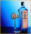
Sapphire Inspiredby timwest167Comment: Tones and comp are extraordianry. I'm sure what's being sold and I could add text to this very easily. The only thing I'd ask is to see the bottle more face on or at less of an angle. |
| Photographer found comment helpful. |
| 02/11/2008 10:32:11 PM |
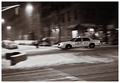
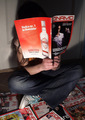
My Wetsuit Takes Me Through the Winterby PelleComment: Not a bad ad. I see potential. A tighter crop would lend itself better to crop placement and put more focus on the product. (providing the crop removed some of the negative space to the left) |
| 02/11/2008 10:30:29 PM |
|
| Photographer found comment helpful. |
| 02/11/2008 10:29:08 PM |
Miles Away From Ordinaryby bdennyComment: I like the way you followed their ad campaign for this. I like the comp and the fact that the product is prominant in the photo. The background adds to the ambiance. I do think that you could've cropped this tighter and achieved the same effect while putting more attention on the product. |
| 02/11/2008 10:24:18 PM |
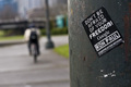
Freedomby get04ritComment: Nice political ad. Message is clearly stated and the negative space leaves room for text placemnent. |
| Photographer found comment helpful. |
| 02/11/2008 10:22:54 PM |
Home Brewby SyberguyComment: Many would say that it too bitter;) Nice ad. Product placement and presentation are great. Overall look and tones are very appealing. |
| Photographer found comment helpful. |
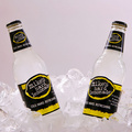
| 02/11/2008 10:21:36 PM |
COLD, HARD, REFRESHINGby ace flymanComment: Great work. Ice gives the ad a "cold" feel to it. Product is well presented and the photo is perfectly sharp. Tones add to the visual fell and the comp is excellent for text placement in the future. I really like the symmetrical aspect of this too. 10 |
| Photographer found comment helpful. |
| 02/11/2008 10:19:15 PM |
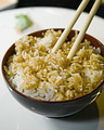
O'Hana Riceby korileyComment: Nice work. Food is well displayed and presented in an appetizing manner. DOF really controls the viewers attention.Off centered comp makes text placement easy. Very effective ad photo. |
| Photographer found comment helpful. |
| 02/11/2008 10:17:49 PM |
|
Home -
Challenges -
Community -
League -
Photos -
Cameras -
Lenses -
Learn -
Help -
Terms of Use -
Privacy -
Top ^
DPChallenge, and website content and design, Copyright © 2001-2026 Challenging Technologies, LLC.
All digital photo copyrights belong to the photographers and may not be used without permission.
Current Server Time: 07/18/2026 04:39:08 AM EDT.