|
|
|
Showing 571 - 580 of ~1811 |
| Image |
Comment |
| 02/10/2003 10:30:04 PM | |
| 02/10/2003 12:07:55 AM | |  Photographer found comment helpful. Photographer found comment helpful. |
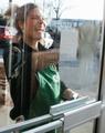
| 02/09/2003 11:16:33 PM | katie-mac smile-wipeby johnny_justjohnnyComment: Greetings from the Critique Club };-)
Initial thoughts
Fast and friendly, meets the challenge, pretty cool shot
Composition/ Content
I'm a little surprised this didn't do a better than it did. Windows was a tough challenge with lots of high scores but I like this. It has a fresh and happy feel to it. Katie-Mac is very inviting. The blow-out behind her head is a little distracting as are the red car and the apartments. The bricks that show as a reflection in the window actually add to the shot in my estimation. They seem to point right toward Katie and her infectious smile.
Background
As I mentioned there are a lot of distracting elements here and probably the weakest area of the shot. Did you try different angles or was Katie too quick for that?
Camera Work - Technical
Focus seems good but it's hard to know what to even focus on. It seems pretty even though. Lighting is good on Katie-Mac, the focal point. I like the blur of the towel.
Digital Processing - Technical
Because of the relaxed rules of this challenge you may have been able to clone out some of the distractions but it would have been a nightmare IMHO.
Fits The Challenge
Definitely fits the challenge well.
My Opinion On The Photo
I originally scored this shot a six that bordered on a seven. I think that it meets the challenge well but was a little busy. It may have done better in another challenge i.e. reflections or journalism because Katie-Mac is more the focus than the window or door. I like the shot. Good job, and keep up the good work.
I would be happy to talk further about this shot if you would like to contact me.
DougPaz
| | Photographer found comment helpful. |
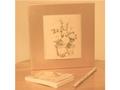
| 02/09/2003 10:52:05 PM | Subtle Squareby BJComment: Greetings from the Critique Club };-)
Initial thoughts
gutty submittal, meets the challenge, seems a bit soft on focus and lighting
Composition/ Content
I am assuming that you meant for the shot itself to be a square, thus the white borders on the side. I kind of like the softness of the shot in relation to the tones and focus. I know that it didn't do well in the challenge but that is kind of to be expected. With a bit more color I think this would have had a greater impact. The triangle formed by the picture and the pencil and pad leads you nicely to the subject.
Background
Pretty much the same color as everything else in the shot so it is not a distraction by any means.
Camera Work - Technical
It's hard to tell about the focus because of the low light. I feel as if it was meant to be soft anyway.
Digital Processing - Technical
I don't like the white "on the sides only" border. I feel it makes the shot appear unfinished.
Fits The Challenge
Definitely fits the challenge well.
My Opinion On The Photo
I originally scored this shot a four as did the vast majority of the voters. I would actually like to hear a little about your thinking on the shot and the idea behind it. It may be a shot that you like but didn't do well with the voters. There is certainly nothing wrong with that. As one of your commenters said, "Keep Shooting!"
I would be happy to talk further about this shot if you would like to contact me.
DougPaz
| | Photographer found comment helpful. |
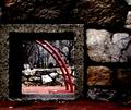
| 02/09/2003 05:39:31 AM | Clark Parkby JPRComment: Greetings from the Critique Club };-) I noticed that this was your first entry, congrats on a fantastic first shot.
Initial thoughts
Wonderful composition, more than meets the challenge.
Composition/ Content
I was excited when I recieved this to Critique as it was by far one of my favorites this week. The composition is excellent. I really like the offset of the windos in the wall. I like the texture against the opening and the flash of red through the window. The only nitpick I have is that it might be very slightly leaning to the left.
Background
I like the muted tones of the background and the way they make the playground apparatus stand out. Because of the relaxed rules for this challenge, I might have cloned out the yellow traffic light to leave the red really stay the focus of the shot.
Camera Work - Technical
Focus seems good but could have been just a wee bit sharper. That and some additional contrast would have been nice but may have been unatainable under the light conditions.
Digital Processing - Technical
Seems good. A thin white followed by a black border may have been nice.
Fits The Challenge
Definitely fits the challenge well.
My Opinion On The Photo
I originally scored this shot a nine. It was one of my favorite shots and has a haunting quality that I feel is hard to capture. I think that it meets the challenge well and for a first entry is probably pretty scary to the rest of us! Great job, welcome, and keep up the good work.
I would be happy to talk further about this shot if you would like to contact me.
DougPaz
| | Photographer found comment helpful. |
| 02/09/2003 05:24:25 AM | Perspectiveby PaulMdxComment: Greetings from the Critique Club };-)
Initial thoughts
Interesting composition, meets the challenge, could use a bit more interest
Composition/ Content
I realized after reading about how you did this shot how much of a pain it was for the results you recived. When voting on it, I kind of passed over the fact that this disc was sitting up in the air. I like the angle you used and lighting is pretty good for this shot.
Background
The background is clear of any distractions. I wish it was a bit whiter for this shot but that may be tough for the camera limitations you have.
Camera Work - Technical
Focus seems pretty good, make sure you use as much light as possible so that your focus seems even sharper.
Digital Processing - Technical
Nice border and good cropping. It appears you must have used Neat Image as your grain is excellent.
Fits The Challenge
Definitely fits the challenge.
My Opinion On The Photo
I think you probably could have scored higher than you did if there weren't so many floppys and CD type shots this week. I noticed your relatively new to the site and improved from the previous shot. Keep doing that and you will go far. It is amazing how much you can learn here. I go back to my early shots and can't believe how much I've been able to gain in knowledge here. Good job, and keep up the good work.
I would be happy to talk further about this shot if you would like to contact me.
DougPaz
| | Photographer found comment helpful. |
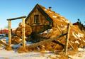
| 02/09/2003 05:10:31 AM | Farmhouses in Icelandby IceRockComment: Greetings from the Critique Club };-) First, let me congratulate you on your first submission, very nice!
Initial thoughts
Interesting composition, meets the challenge, Nice colors.
Composition/ Content
Very nice shot, I like the warm colors which appear to come from a setting sun. An interesting shot especially after reading your explanation. The house almost appears huddled against the cold. The setup seems good, i like the placement of both the gate and window in your shot.
Background
It is a bit cluttered, although you could normally not do a lot about it, there was a possiblity of cloning out both the red fence on the left and red barn-like structure on the right during this challenge which I feel would make a better shot.
Camera Work - Technical
Focus seems good as is the contrast for this light level. I wish that I had a better idea of how large the house is. This may have been a good shot to have someone standing out front, especially in traditional garb to use as a reference in that respect.
Digital Processing - Technical
I wonder why you entered a relatively small photo with relatively low file size. You have a great camera that would really show up well by using all of the alloted file size and photo size. I think a dark border may have really brought out your blues and golds in this shot as well.
Fits The Challenge
Fits the challenge well, although a tighter shot of a door or window would have scored better in my opinion.
My Opinion On The Photo
I think a little more size as mentioned may have helped this shot score better. I think that it meets the challenge well but could have been improved a little to finish even higher than it did. Good job, welcome, and keep up the good work.
I would be happy to talk further about this shot if you would like to contact me.
DougPaz
|
| 02/09/2003 04:56:59 AM | Borders Gone Mad :-)by marboComment: Greetings from the Critique Club };-)
Initial thoughts
Wow is that bright, meets the challenge, way too much border
Composition/ Content
I believe that you achieved your primary goal of showing how ridiculous borders can be. The four felt pieces work well here as squares although I think it may have felt more balanced if the red and yellow squares were reversed. Lighting seems even and well balanced, perfect for this shot.
Background
The background is non-descript and just about right. The only thing that may have worked even better would be if you matched it to the same gray color as the DPC background, that would have been really freaky!
Camera Work - Technical
Focus seems just a bit soft and with so little of your shot actually being a photo, I think this is a major downfall.
Digital Processing - Technical
You certainly strained the limits of the border rule. I see that you recieved three 10's so some folks liked it but I found it overpowering. Good job of matching though.
Fits The Challenge
Oh yeah, it fit the challenge alright.
My Opinion On The Photo
Not my style for sure, but then I lived through the 60's when these colors were more common place. Good take on the challenge though and using everything available to you this week.
I would be happy to talk further about this shot if you would like to contact me.
DougPaz
| | Photographer found comment helpful. |
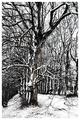
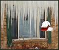
| 02/09/2003 12:00:13 AM | Michigan Stalactitesby dodobirdComment: Greetings from the Critique Club };-)
Initial thoughts
It looks stinking cold!! Meets the challenge, a bit off balance
Composition/ Content
The biggest thing that jumps out at you (after the icicles of course!) is that it seems to be leaning a bit to the left. The window and the stand for the birdhouse are leaning left and it makes the whole shot seem off balance. Other than that, I like the addition of the birdhouse as it adds some needed color. I wonder if you tried this from different angles, perhaps a more straight on shot of the window.
Background
The bricks and shutters seem a bit drab but that is part of winter as I remembrrrrrr it from my time up north.
Camera Work - Technical
Focus seems like it could be just a little sharper. Of course you were probably shivering and I doubt you were using a tripod.
Digital Processing - Technical
It seems that a little more color from the shutters and perhaps a little less from the birdhouse is in order. You may have been able to do that by playing with the saturation and hue in post production if you have Photo Shop available.
Fits The Challenge
Definitely fits the challenge well.
My Opinion On The Photo
I originally scored this shot a five as did almost half of the voters. It is a good solid shot but wasn't a real grabber. Good job, and keep up the good work.
I would be happy to talk further about this shot if you would like to contact me.
DougPaz
|
| 02/08/2003 11:34:15 PM | SQUARE from Squaresby av8orboyComment: Greetings from the Critique Club };-)
Initial thoughts
Interesting take and certainly meets the challenge, surprised this didn't score a bit higher.
Composition/ Content
I am a big fan of Black and White but wonder if this wouldn't have scored better with a sepia or even light color. Quite ingenious in my mind to form the word "square". Good use of the panorama shot and the word isn't dead center which I think adds to the shot.
Background
None really to speak of.
Camera Work - Technical
Focus seems good but maybe not really sharp.
Digital Processing - Technical
Good cropping on the word. Once again, I think I would really like to see what this looks like in Sepia.
Fits The Challenge
Definitely fits the challenge well.
My Opinion On The Photo
I originally scored this shot a six. It amazes me how evenly spread your votes were. From top to bottom it is almost perfectly even. I think you had a really good idea but it did't have quite enough "wow" factor to really score high. Good job and keep up the good work!
I would be happy to talk further about this shot if you would like to contact me.
DougPaz
| | Photographer found comment helpful. |
|
Showing 571 - 580 of ~1811 |
Home -
Challenges -
Community -
League -
Photos -
Cameras -
Lenses -
Learn -
Help -
Terms of Use -
Privacy -
Top ^
DPChallenge, and website content and design, Copyright © 2001-2026 Challenging Technologies, LLC.
All digital photo copyrights belong to the photographers and may not be used without permission.
Current Server Time: 06/11/2026 08:06:23 PM EDT.
|