| Image |
Comment |
| 03/25/2008 10:28:21 AM |
Winding by charmayneComment: Great details and colours. I love this photo. Definite ribbon... as I'm unable to fault this image. Well done. |
 Photographer found comment helpful. Photographer found comment helpful. |
| 03/25/2008 10:26:25 AM |
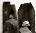
Fence Foreverby cstein96Comment: Beautiful photo. Contrast is spot on... balance is perfect. My money is on this one getting in the top ten (at least)... perhaps a ribbon. |
| Photographer found comment helpful. |
| 03/25/2008 10:24:14 AM |
Drummerby OmanOtterComment: DNMC... clearly posted to the wrong Open Challenge. Unfortunate really, because I quite like the photo as an Environmental Portrait. |
| 03/21/2008 12:06:44 AM |
|
| Photographer found comment helpful. |
| 03/20/2008 11:57:52 PM |
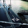
Parisby Aurel78Comment: Had to look for the fence(s). Nice shot though. |
| Photographer found comment helpful. |
| 03/20/2008 11:56:53 PM |
Rural Framingby JaimeVinasComment: Lovely image. EXCELLENT composition with the houses and plane perfectly placed. Colours are good. |
| Photographer found comment helpful. |
| 03/20/2008 11:53:52 PM |
|
| Photographer found comment helpful. |
| 03/20/2008 11:50:04 PM |
Shadowsby kiskatComment: Ho Ho Ho...
Capture a very interesting pattern created by the fence shadows... shame about the white section across the centre. |
| Photographer found comment helpful. |
| 03/20/2008 11:37:41 PM |
Stare downby kebbieComment: Powerful. Very powerful. Great use of leading lines and DOF. |
| 03/20/2008 11:35:00 PM |
Inside Trackby SherwinJamesComment: Nice colour and detail... I find it a bit heavy to the left though... my eyes follow the fence to the left and stay there... even if they were to swing around and continue following, they only get as far as the centre, then don't now whether to follow the trees left or right. I've has similar dilemma's with fences around sporting ovals, and now just avoid them. |
| Photographer found comment helpful. |
Home -
Challenges -
Community -
League -
Photos -
Cameras -
Lenses -
Learn -
Help -
Terms of Use -
Privacy -
Top ^
DPChallenge, and website content and design, Copyright © 2001-2026 Challenging Technologies, LLC.
All digital photo copyrights belong to the photographers and may not be used without permission.
Current Server Time: 09/16/2026 10:16:23 PM EDT.