| Image |
Comment |
| 09/24/2008 12:04:13 AM |
|
 Photographer found comment helpful. Photographer found comment helpful. |
| 09/19/2008 11:32:54 PM |
Plan Aheadby maclenComment: Good lighting and I like the idea of including the the candle and wine. The wood grain at the bottom of the image is a negative.. the overall crop actually, doesn't work for me. Also, the colours is a bit too yellow. |
| Photographer found comment helpful. |
| 09/19/2008 10:14:37 PM |
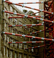
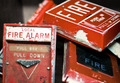
Lengths of Historical Preservationby gideonpComment: This is a very interesting image. Abstract meets heritage architecture... works for me... even under the theme of "safety". I think the image could have benefited from a little more saturation, as the reds look a little flat. Also, you might have cropped a little off the bottom as it adds little to the image. |
| Photographer found comment helpful. |
| 09/19/2008 10:10:44 PM |
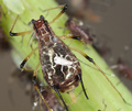
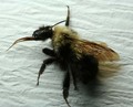
Baby is safe! yikes...by michelaudetteComment: Nice and sharp on the baby, but I think the DOF is a little too shallow. Also, the light is a tad too harsh and the glare on the insect takes away from the "baby" a little. |
| Photographer found comment helpful. |
| 09/19/2008 10:07:51 PM |
cautionby troy77Comment: This is quite abstract, which does not really add to the challenge. Shallow DOF works to keep it abstract, though doesn't really help the image sell the "safety" theme. The crop isn't great either... the area on the left doesn't do anything for this... then there's the glare and reflection which is really just too distracting for my liking. |
| 09/19/2008 09:01:31 PM |
Not Too Loudby houstonianComment: Nice idea, however there's not enough of a connection with the subject. Back of heads works sometimes, but I for this challenge, I think an emotional connection to the mother and child would have helped. Hard to get the gridiron game in if you took it from the other side, thereby eliminating the "story" in the photo, same too if you had them pose for the shot... hard, I know. Let's leave that aspect. The composition isn't bad, the use of a shallow DOF works here, as the background adds context to the story without being too much of a distraction. Not sure why you chose to go with B&W with this. |
| 09/19/2008 08:55:24 PM |
Retired from Dutyby bauerfan71Comment: Good idea for this challenge, though I feel it's a little too cluttered and slightly out-of-focus. |
| Photographer found comment helpful. |
| 09/19/2008 08:53:57 PM |
Melissophobia by AnnaXTComment: Lighting isn't the best, as the bulk of the insect is much too dark. The texture in the background is very distraction. Perhaps if you tweaked the exposure a little (or the brightness and contrast if you're not shooting in RAW) to lose the background and bring out some of the detail s lost in the shadows. Focus is also a little off. Good effort though. |
| Photographer found comment helpful. |
| 09/19/2008 09:41:16 AM |
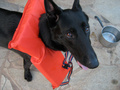
Water Bowl Safetyby hokulani_13Comment: This is OOF. The crop has removed the dogs ears. I do like the idea behind the photo, and think it would have been better if you'd gotten down to the dogs level to take the shot. |
| 09/19/2008 09:38:34 AM |
My light!by oldEyeComment: Nice idea, though, the "safety" of this might be a little too subtle. I'd like to have seen more detail in the hair, and perhaps a little more light (perhaps a second source) to give some substance to the body attached to the face. |
| Photographer found comment helpful. |
Home -
Challenges -
Community -
League -
Photos -
Cameras -
Lenses -
Learn -
Help -
Terms of Use -
Privacy -
Top ^
DPChallenge, and website content and design, Copyright © 2001-2026 Challenging Technologies, LLC.
All digital photo copyrights belong to the photographers and may not be used without permission.
Current Server Time: 09/17/2026 09:47:10 PM EDT.