| Image |
Comment |
| 12/06/2009 09:32:38 PM |
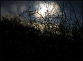
au-dessous, les étoilesby skewsmeComment: I'm sorry, but I'm not seeing this as polka dots. The white dots look more like sensor noise with a Threshold filter applied to the area. |
| 12/06/2009 09:31:11 PM |
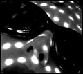
Dotzillaby tangueraComment: The dots seem too manufactured here - I think of printed or sewn dots (or dots on an animal) when I think of polka dots, not so much lighting through holes. That's personal preference, I know, but that's how voting goes. The DOF is a bit shallow, with the blurry nose becoming a bit of a distraction. Good composition. Perhaps color would've worked better to make it a bit more interesting? |
 Photographer found comment helpful. Photographer found comment helpful. |
| 12/06/2009 09:28:18 PM |
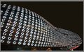
Escape!by dtremainComment: Well, there's polka dots and plenty of color and it's pretty sharp... but I'm not sure I understand what's going on in the image. Also, the light seems uneven, like on-camera flash. |
| Photographer found comment helpful. |
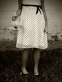
| 12/06/2009 09:26:54 PM |
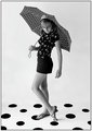
Mind the Dog Pleaseby BlackboxComment: Good use of polka dots, but it's not a very well-taken image. Seems like either noise, noise reduction, or motion blur (or all three?) is making it a bit soft, and it seems oversharpened. Also, it looks like you sharpened after adding the border, creating a white halo. |
| Photographer found comment helpful. |
| 12/06/2009 02:17:02 PM |
Kunsthaus Grazby sarsonukComment: This is like something out of "I, Robot." Nice, but nothing too special. Good angle. |
| Photographer found comment helpful. |
| 12/06/2009 02:16:23 PM |
|
| Photographer found comment helpful. |
| 12/06/2009 02:15:37 PM |
The Carnival Prizeby njsabsComment: Cute, but I'm not liking the centered composition. Very nice tones, very nostalgic.
ETA: I gave this a 7. Congrats on your placement. Message edited by author 2009-12-07 06:05:22. |
| Photographer found comment helpful. |
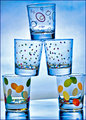
| 12/06/2009 02:15:05 PM |
refractby jimboneComment: This is completely unoriginal, but it's well shot. A bit soft inside the glasses, but I'm assuming you couldn't really do anything about that. |
| Photographer found comment helpful. |
| 12/06/2009 02:14:21 PM |
Going Dottyby jomernerComment: The DOF is a bit too shallow here, with the bow a bit soft. Also, not fond of the centered composition. Great pattern and good random-looking arrangement of buttons. The green adds a nice contrast. |
| Photographer found comment helpful. |
| 12/06/2009 02:13:13 PM |
Delicate Balanceby HeiSchComment: I like the sharpness and colors, but the tilt is unpleasant to me, and it's not really too original. 7 |
| Photographer found comment helpful. |
Home -
Challenges -
Community -
League -
Photos -
Cameras -
Lenses -
Learn -
Help -
Terms of Use -
Privacy -
Top ^
DPChallenge, and website content and design, Copyright © 2001-2026 Challenging Technologies, LLC.
All digital photo copyrights belong to the photographers and may not be used without permission.
Current Server Time: 07/16/2026 10:09:31 PM EDT.