| Image |
Comment |
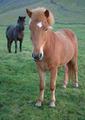
| 06/11/2003 11:08:04 AM |
The Horseby birgirComment: Must be a *tiny* magazine... :) Please try to provide a bigger shot -- it's awfully hard to make a good judgement on such a small image... |
 Photographer found comment helpful. Photographer found comment helpful. |
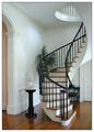
| 06/11/2003 11:07:10 AM |
Home and Design by sherComment: Beautifully done! Not much more I can offer than that! Looks like there's a teeny bit of excessive grain here, but it's a wonderful scene. - 9 |
| Photographer found comment helpful. |
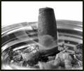
| 06/11/2003 11:06:07 AM |
Cigar Aficionadoby bgmorrisComment: I could be wrong, considering I'm not a smoker... but doesn't this basically depict cigar smoking as a bad thing? I would think that a magazine that is promoting cigars wouldn't want to show ugly ashes, along with a cigar being snuffed out. |
| 06/11/2003 11:03:14 AM |
National Geographicby InnaNComment: It really does look like an issue of National Geographic! Seems like there's just a teeny bit too much headroom here, but it's a great shot. |
| Photographer found comment helpful. |
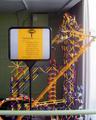
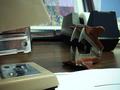
| 06/10/2003 09:19:05 AM |
But you can stay and play a while...by qachykComment: Well, the colors of the "contraption" are interesting and provide for some interesting contrasts... but the overall image needs a little help, I'm afraid. The overall image is blurry with no particular area being in full focus. The bar at the bottom and the window on the right seem to act as distractions. And I'm honestly not sure how the sign fits in with the rest of the shot. |
| Photographer found comment helpful. |
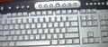
| 06/10/2003 09:13:01 AM |
My keyboardby Crafty SueComment: In all honesty, it just doesn't look like much thought was put into this. Sorry to sound harsh... but it's "just a picture of a keyboard." The counterclockwise tilt feels uncomfortable, and the apparent use of flash created over-lit spots in the center of the shot. Again, I hate being harsh in comments, but if I score something low, I generally try to provide an explanation as to why... - 2 |
| Photographer found comment helpful. |
| 06/09/2003 01:02:22 PM |
Turf Warby GeneralEComment: May have been stronger if the stapler and staple remover were isolated against a plain backdrop. There seem to be too many other elements to conflict with the subjects here. |
| Photographer found comment helpful. |
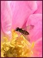
| 06/09/2003 11:21:55 AM |
Bug's Officeby pitsamanComment: Somehow I knew someone would manage to squeeze a flower shot in here somewhere... |
| Photographer found comment helpful. |
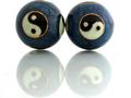
| 06/09/2003 11:19:30 AM |
Stress managementby tommy_tComment: Neat items and technique with the reflection. The crop seems just a tad bit too tight, though. |
| Photographer found comment helpful. |
| 06/09/2003 11:18:11 AM |
Complaint Departmentby draney4Comment: I'm afraid this just doesn't work for me in general... sorry... The shot is just too cluttered (granted, intentionally), and the reverse effect just isn't flattering. Sorry to be rather harsh on this one... |
| Photographer found comment helpful. |
Home -
Challenges -
Community -
League -
Photos -
Cameras -
Lenses -
Learn -
Help -
Terms of Use -
Privacy -
Top ^
DPChallenge, and website content and design, Copyright © 2001-2026 Challenging Technologies, LLC.
All digital photo copyrights belong to the photographers and may not be used without permission.
Current Server Time: 07/27/2026 01:49:47 AM EDT.