| Image |
Comment |
| 07/30/2003 06:50:14 PM |
|
 Photographer found comment helpful. Photographer found comment helpful. |
| 07/30/2003 06:48:24 PM |
|
| 07/30/2003 06:46:46 PM |
Hanging Leafby K-RobComment: I like the DOF here, but I'm not comfortable with the toning. It seems like the brown tint makes it look like everything's dead. Not sure whether that was your intent. |
| Photographer found comment helpful. |
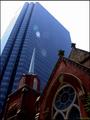
| 07/21/2003 01:41:36 PM |
Churchby pitsamanComment: I'm not entirely sure where the "contrast" is in this image... would have been a winner with a guy in a devil outfit walking past... :) |
| Photographer found comment helpful. |
| 07/21/2003 01:39:08 PM |
Odd Man Out.by macoxComment: You might have juiced the saturation of the reds a little better to make the Jack stand out a little more, but it's a great crisp image, and a nice concept. |
| Photographer found comment helpful. |
| 07/21/2003 12:37:43 PM |
|
| Photographer found comment helpful. |
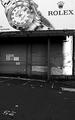
| 07/21/2003 12:35:54 PM |
Contrast of Economiesby mzanoniComment: Good eye! A well thought out way of meeting the challenge! And B&W seems like a good choice for the mood, too. |
| Photographer found comment helpful. |
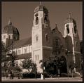
| 07/21/2003 10:18:53 AM |
The Old Contrasts The Newby cmrk74Comment: Very, very similar to my shot, actually! The church could be a little brighter, and of course people are going to whine a bit about the lens flare, but it's still a nice image. |
| Photographer found comment helpful. |
| 07/16/2003 11:40:37 AM |
Canada's Horseby MorganComment: Not sure how this really meets the challenge, other than sticking a round border on it...? It's an otherwise nice shot, though. |
| Photographer found comment helpful. |
| 07/16/2003 11:35:11 AM |
|
Home -
Challenges -
Community -
League -
Photos -
Cameras -
Lenses -
Learn -
Help -
Terms of Use -
Privacy -
Top ^
DPChallenge, and website content and design, Copyright © 2001-2026 Challenging Technologies, LLC.
All digital photo copyrights belong to the photographers and may not be used without permission.
Current Server Time: 07/28/2026 09:24:50 AM EDT.