| Image |
Comment |
| 02/11/2006 01:37:12 PM |
Hollowby SJCarterComment: Congrats on the gallery thing. I gave this a 9 in "Best of" and it was one of my top five. Really a very emotionally gripping shot, and the technical aspect is superb as well. |
 Photographer found comment helpful. Photographer found comment helpful. |
| 02/11/2006 11:58:38 AM |
Self portraitby egillbjarkiComment: From a photography perspective - very well done. From a "wow" perspective - look at this, then look at the picture of your father. |
| Photographer found comment helpful. |
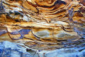
| 02/11/2006 09:37:01 AM |
Natures Paletteby sherpetComment: Beautiful capture! The colors are simply marvelous and the detail is nice and sharp. It's very well balanced, too, with the blue forming a natural "base" to the picture. Very good eye to see and compose this! |
| Photographer found comment helpful. |
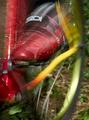
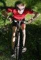
| 02/11/2006 09:29:09 AM |
Mountain Bikingby magnusComment: Very cool shot! I love the shoe. The motion is excellent, as is the tight crop. Really surprised it didn't do better in the challenge, but I'm learning that the ones I like aren't necessarily the ones everyone else likes. Not necessarily a bad thing, either. |
| Photographer found comment helpful. |
| 02/11/2006 09:26:37 AM |
Keep the rubber side downby magnusComment: Love this one for the message it offers! And yes, rubber side down, always good! (Helmet always required, too.) Happy riding! |
| Photographer found comment helpful. |
| 02/11/2006 12:07:15 AM |
Port "A" Morningby dleachComment: Gorgeous sunrise - I especially like the crop, and the fact you have people in it to show perspective and size. Nice! |
| Photographer found comment helpful. |
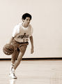
| 02/10/2006 10:16:25 PM |
Setting Up The Playby debitiptonComment: Great shot. You've got determination on the player's face, motion (the shorts are cool), and the ball in perfect position. Very well done! |
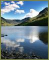
| 02/10/2006 06:12:13 PM |
Buttermereby MudHutComment: The reflections here are gorgeous - like how you cropped the shot so the reflected clouds match the actual clouds, rather than cropping the sky more. |
| Photographer found comment helpful. |
| 02/10/2006 04:45:28 PM |
Test of Timeby magnusComment: I'm a little surprised at the score on this one, even given it's a Free Study - this is a very simple and lovely picture. The chosen stone stands far enough away from the rest that it creates an excellent balance without being busy, and the tones you ended up with are perfect. |
| Photographer found comment helpful. |
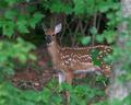
| 02/10/2006 04:23:28 PM |
Curious Deerby wkoffelComment: Great capture - crisp focus on the deer and very nice natural framing. Color is excellent as well - hard to do when these guys tend to blend with their surroundings by design! |
Home -
Challenges -
Community -
League -
Photos -
Cameras -
Lenses -
Learn -
Help -
Terms of Use -
Privacy -
Top ^
DPChallenge, and website content and design, Copyright © 2001-2026 Challenging Technologies, LLC.
All digital photo copyrights belong to the photographers and may not be used without permission.
Current Server Time: 06/24/2026 11:24:13 PM EDT.