| Image |
Comment |
| 04/29/2006 12:47:59 PM |
|
 Photographer found comment helpful. Photographer found comment helpful. |
| 04/29/2006 12:43:02 PM |
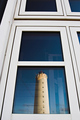
Ghost of the lighthouseby HauxonComment: Nice idea! Wonder if there was a way you could have captured it such that the lighthouse reflection covered both panes. |
| Photographer found comment helpful. |
| 04/29/2006 12:39:47 PM |
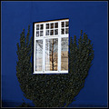
Framed by the Window Dresserby GuGiComment: Nice choice for this challenge and the saturation of the colors, especially the blue, is very pleasing in this shot. |
| Photographer found comment helpful. |
| 04/29/2006 12:30:08 PM |
A New Castle Awaits the Coming Tideby chaliceComment: Ah, I remember this one from voting - what strikes me first is the strong composition - well done, in my opinion. I like the diagonal of the water, and that you put the subject and shadows in the middle/lower left to keep the beach to the right pristine. Lovely tones in the sand, and the colors of her hat really add a nice touch of contrast. |
| Photographer found comment helpful. |
| 04/29/2006 12:25:07 PM |
are you done ?by DanSigComment: The lighting and expression are very good here! What I'd change if I could are the colors of her shirt and/or the background to get a bit more overall color into the picture, and to provide a bit more contrast. She needs just a bit more room on the right of the picture, to get all of that lovely curly hair in the shot. Gorgeous model, by the way! Tell her she did a good job! |
| Photographer found comment helpful. |
| 04/29/2006 12:05:58 PM |
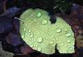
Fallenby LouisComment: I like this quite a bit but almost wish you'd included more of the background. It looks like there are dark, richly colored leaves behind this new green one, and more of that would have made a wonderful contrast. |
| Photographer found comment helpful. |
| 04/29/2006 10:50:47 AM |
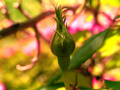
New life buddingby KelliComment: Fits the challenge well and the subject is in sharp focus, but the subject is also overwhelmed by the brightness of the background. I love the overall color of the picture. |
| Photographer found comment helpful. |
| 04/28/2006 11:35:07 PM |
Available, first month freeby ericwooComment: Maybe not "old" as most would perceive it, but works well when taken with the title. Color is excellent - very rich and vibrant - I like the golden tones to it. The tree branch on the right does compete for a bit of attention, but not sure how else you could have composed the shot. DOF is used well here. |
| Photographer found comment helpful. |
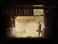
| 04/28/2006 10:18:56 PM |
The Old Barn and Iby nards656Comment: Now this I rather like! I suspect the biggest problem as far as score would be it didn't say "Old" to some. Compositionally, I like the way you've framed the opening, and it's overall balanced to me. You've done a pretty good job of a hard exposure - getting detail in both the dark and the light sections. Should you try it again and want to get down and dirty with post processing, I've heard taking the shot twice with two different exposures then combining the results can be done. But I couldn't tell you how, exactly. Overall, I find this a solid, appealing picture. |
| Photographer found comment helpful. |
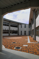
| 04/28/2006 10:13:24 PM |
New School (the fourth day)by Pug-HComment: Underrated - maybe it just didn't say "New" to some, but it certainly looks very pristine to me. I liked the perspective you chose and the resulting lines and angles. |
| Photographer found comment helpful. |
Home -
Challenges -
Community -
League -
Photos -
Cameras -
Lenses -
Learn -
Help -
Terms of Use -
Privacy -
Top ^
DPChallenge, and website content and design, Copyright © 2001-2026 Challenging Technologies, LLC.
All digital photo copyrights belong to the photographers and may not be used without permission.
Current Server Time: 07/19/2026 02:26:23 AM EDT.