| Image |
Comment |
| 07/01/2006 03:47:18 PM |
|
 Photographer found comment helpful. Photographer found comment helpful. |
| 07/01/2006 03:35:06 PM |
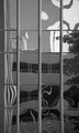
Can't Read Without It...by cardmaverickComment: Nice approach. You could crop a bit off the right - the whole column with the black blob in it, as this tends to pull the eye away. I like that you chose to have the lettering appear upside down. |
| Photographer found comment helpful. |
| 07/01/2006 03:34:03 PM |
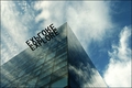
Exploreby ohanapicsComment: A bit on the smallish side - use the max of 640 pixels on the longest side of you submission if you can. Very clever sign! Well seen. |
| Photographer found comment helpful. |
| 07/01/2006 03:32:47 PM |
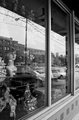
The Bike Shopby texaskevComment: Probably really isn't, but the perspective makes it seem to be leaning to the right. |
| Photographer found comment helpful. |
| 07/01/2006 03:31:53 PM |
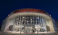
twenty.fiveby annasenseComment: Composition is good. A bit of color noise, but a well balanced shot in my opinion. |
| Photographer found comment helpful. |
| 07/01/2006 03:31:09 PM |
|
| Photographer found comment helpful. |
| 07/01/2006 03:30:19 PM |
|
| Photographer found comment helpful. |
| 07/01/2006 03:29:54 PM |
|
| Photographer found comment helpful. |
| 07/01/2006 03:29:22 PM |
Lostby pacpintoComment: Might make a good ad for an optometrist. A bit more of the water might be nice - right now it just kinda teases you into wanting to see more of it. |
| Photographer found comment helpful. |
| 07/01/2006 03:28:19 PM |
|
| Photographer found comment helpful. |
Home -
Challenges -
Community -
League -
Photos -
Cameras -
Lenses -
Learn -
Help -
Terms of Use -
Privacy -
Top ^
DPChallenge, and website content and design, Copyright © 2001-2026 Challenging Technologies, LLC.
All digital photo copyrights belong to the photographers and may not be used without permission.
Current Server Time: 07/26/2026 12:07:09 PM EDT.