| Image |
Comment |
| 11/29/2006 03:54:54 PM |
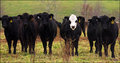
"Yo Spottie...you want we should charge?by aimeethetooComment: This is just too cool. I'm with Jutilda - for some reason I love cow pictures - for being such big slow animals, they sure seem to be very expressive, don't they? These guys definitely look like a gang of bad-a$$ dudes.... :-) |
 Photographer found comment helpful. Photographer found comment helpful. |
| 11/29/2006 03:51:52 PM |
|
| Photographer found comment helpful. |
| 11/29/2006 03:44:37 PM |
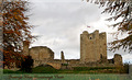
Greetings from Conisbrough Castleby mistComment: I, too, like the trees as a method of framing the shot. Gives a sense of depth and size. Does look like the castle needs a wee bit o' maintenance. And having spent a whopping two weeks in Europe now, I can understand the whole gray sky phenomenon. :-) |
| Photographer found comment helpful. |
| 11/29/2006 03:41:39 PM |
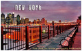
Along the Waterfrontby skewsmeComment: Really a very nice postcard, in my opinion. I like the painterly kinda feel it has and oddly enough like the suboptimal vantage point. Excellent perspective study as well. What you consider suboptimal conditions resulted in a very nice sky, by the way. |
| Photographer found comment helpful. |
| 11/29/2006 03:37:39 PM |
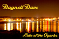
Night at the Damby bryantbusComment: A little grainy in the sky, but not too terribly bad. The design of the card is really quite nice - well balanced and the text fits well without interrupting the picture. I notice a lot of folks thought the lettering was too big, but seems to me a lot of postcards look just like this as far as text, size and where it's placed. I love the two streaks of red - really adds a nice touch. This could be a bit "crisper" if exposed just a little less, maybe. I find with night photography that underexposing is better than overexposing. With this shot, you can make it darker in post but you will emphasize the grain when you do. Try levels and bringing the top of the sky to black then add a bit of sharpening - gives a different look to it. |
| Photographer found comment helpful. |
| 11/29/2006 03:28:47 PM |
Reach for the Skyby quiet_observationComment: Almost looks personified - like a giant robot guy covered in braille, which is kinda cool. I like the perspective and the way the color of the bridge coordinates so nicely with that lovely soft sky. |
| Photographer found comment helpful. |
| 11/29/2006 03:26:24 PM |
They typed crooked in 1964by KelliComment: A couple of interesting things this picture tells me - the most significant of which is that I didn't know it took nearly a year for the commission to submit their final report. In my dealings with the government, that's actually not bad! I with the "I like the pencil" gang on this one - adds a dimension that would be lacking without it. |
| Photographer found comment helpful. |
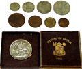
| 11/29/2006 03:18:20 PM |
Some Circulation and Environmental Damage 1951by raishComment: First off I think it's incredibly cool that you have such a nice collection of coins from the year of your birth. Wish I'd done the same! Some of your commenters have made good points - it looks like a documentary shot which is fine for that purpose but may be lacking for the purposes of "DPC wow!" and score. Detail is pretty good for having such varying surfaces/colors to work with; lighting is even. Definitely a very cool collection! |
| Photographer found comment helpful. |
| 11/29/2006 09:55:07 AM |
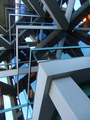
cornersby sickdogComment: Dude! A 6! Woo hoo! I do so like shots like these. Kinda sterile sometimes but this one seems to have life in it. In addition to the cool blues/grays of the glass/steel, you've got the warmth of the orange from the lights. OK, you do architecture well - now branch out and try, umm, different architecture? :-) |
| Photographer found comment helpful. |
| 11/29/2006 09:52:44 AM |
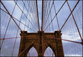
Caught in the Brooklyn Bridgeby skewsmeComment: Dang, woman. This doesn't exactly suck, now does it? Nice score, nice placement! I've never seen this bridge in person, but it certainly does make for a lovely subject for photography. The thing I found different with this shot is the pink. Pink is not something I would associate with the Brooklyn Bridge. Dull brown and gray, possibly some dusty shade of green, but not pink. Well seen, well shot, and nicely processed. |
| Photographer found comment helpful. |
Home -
Challenges -
Community -
League -
Photos -
Cameras -
Lenses -
Learn -
Help -
Terms of Use -
Privacy -
Top ^
DPChallenge, and website content and design, Copyright © 2001-2026 Challenging Technologies, LLC.
All digital photo copyrights belong to the photographers and may not be used without permission.
Current Server Time: 06/17/2026 07:41:13 AM EDT.