| Image |
Comment |
| 03/04/2007 02:28:00 PM |
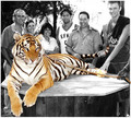
The Lion Manby dx_powerComment: Gorgeous kitty! I think the use of selective desat (you did a good, neat job of it) in this case makes it look like the cat is "pasted" in after the picture was taken. |
 Photographer found comment helpful. Photographer found comment helpful. |
| 03/04/2007 02:14:00 PM |
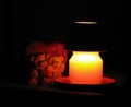
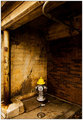
You and Me - Made for each other !by jayitaComment: Greetings from the Critique Club
This is a very good idea for the challenge, but you picked a tough one to execute well. It's hard to get a good shot by candlelight! From the comments you received, I think viewers liked your subject choice for the challenge, but the lighting and the composition may have hurt you.
What you may want to try is using some additional light to highlight your subjects - don't rely on candlelight alone. You'll still get the effect you're after if you keep the additional light diffuse and soft, and you'll get a clearer image of your subject. By adding some additional light, you can reduce the size of your candle so it doesn't overwhelm your subject in size, too.
Hope you find this helpful! Feel free to PM me if you have any questions, and keep shooting! |
| 03/04/2007 02:08:27 PM |
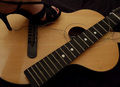
Revenge is sweetby purpleflutterby13Comment: Greetings from the Critique Club
First of all, welcome to the madhouse that is DPC!!
In reading through the comments given below, I think the major issue with this picture has already been identified - lighting. The idea is very good, the composition is pretty good, too, with the neck of the guitar forming a nice diagonal. To get your point across, I think the shoe and foot need to be a bit more prominent in the picture. And overall, you need more, less flat light. For those of us who don't have studios, you can try shooting outdoors, preferably on a cloudy day, which provides nice even light, or use some indoor lights available in your house. I've used desk lamps and large pieces of white posterboard as "reflectors", opposite the desk lamps to provide reflected light and help reduce shadows.
In this picture, some stronger light coming from the lower right would add some texture and depth, I think. You'd still need some from the above left to highlight the shoe and face of the guitar.
If you have any questions about my critique, please don't hesitate to send me a PM. You've got a good eye and a creative approach - best of luck and keep shooting! |
| Photographer found comment helpful. |
| 03/04/2007 01:56:46 PM |
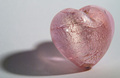
Shadow of Loveby joekentComment: Greetings from the Critique Club
Meets the challenge? Yep. I think you did a good job of using an icon with universal familiarity to meet the challenge.
Techicals? You did a very good job with the lighting and using the macro to get good detail in the heart itself. Nice DOF chosen. There's on itty bitty hot spot on the heart that I'd have never noticed if I weren't critiquing the picture - in other words, it doesn't stand out. Color is nice and not overly saturated. The background is a WEE bit on the grayish side - a bit "whiter" might have given this a bit more spark.
Composition? I'll agree with two of your commenters - the shadow needs just a bit more room. I'd give a bit more room at the top, too.
Overall? I think it's a good solid picture, with good technicals. A slight change in composition to provide a bit of breathing room might improve the presentation. I suspect the "average" score is due to lack of the DPC "WOW!" factor, which I don't think is a bad thing - this is a nice, quiet, well-presented image. |
| Photographer found comment helpful. |
| 03/04/2007 12:44:17 PM |
|
| Photographer found comment helpful. |
| 03/04/2007 10:16:08 AM |
Ducksby raishComment: There's something incredibly magic about this. Worlds collide and then some. |
| Photographer found comment helpful. |
| 03/04/2007 01:43:51 AM |
Coming Soonby jenesisComment: I quite like this - a nice quiet, unassuming portrait. Lovely processing. |
| Photographer found comment helpful. |
| 03/04/2007 01:41:02 AM |
Jaxed's Girlby elemessComment: What a gorgeous young lady - love the portrait, and the way here hair matches the lettering on the monument/building. Nice! |
| Photographer found comment helpful. |
| 03/04/2007 01:40:05 AM |
Wby ericwooComment: Neat find! Great shot, perfectly processed. |
| Photographer found comment helpful. |
| 03/04/2007 01:39:27 AM |
Pushby jenesisComment: I like the choice of focus and the processing. |
| Photographer found comment helpful. |
Home -
Challenges -
Community -
League -
Photos -
Cameras -
Lenses -
Learn -
Help -
Terms of Use -
Privacy -
Top ^
DPChallenge, and website content and design, Copyright © 2001-2026 Challenging Technologies, LLC.
All digital photo copyrights belong to the photographers and may not be used without permission.
Current Server Time: 06/24/2026 01:30:54 AM EDT.