| Image |
Comment |
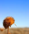
| 02/09/2004 11:24:18 AM |
Dried Sunflowerby fredrojComment: I like the use of the expanse of sky to express the emptiness of the landscape. |
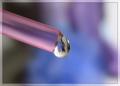
| 02/09/2004 11:23:05 AM |
A delicate dropby ScantyNebulaComment: Lovely colours and the droplet detail is great. I think I'd prefer the straw to push further into the frame in terms of composition. Even though the droplet is centred it feels kind of oddly balanced because the straw adds more weight to one side. For that reason I'd not opt for the centred composition and go for a two thirds/ one third instead. Just my preference. |
 Photographer found comment helpful. Photographer found comment helpful. |
| 02/09/2004 11:06:26 AM |
One sticks outby giseleComment: Great use of colour. I like the strong lighting - it makes it more abstract somehow. |
| 02/09/2004 10:59:33 AM |
Bodyscapeby tariqueComment: This is a beautiful image - the lighting is flattering to the skin tones and the composition is really unusual.
I'm not sure I like the inclusion of the hair - I think either more or none would work better in terms of composition, for me. And, although I like the texture and stripes of the cloth on her body, it feels a little too neatly folded and placed - I wonder if it would be more interesting with a few folds in it?
Altogether a wonderful image. |
| Photographer found comment helpful. |
| 02/09/2004 10:56:19 AM |
Networkingby tomlewis1980Comment: Vibrant background colour really lifts this image. I like the jagged white lines in the background too. |
| Photographer found comment helpful. |
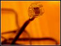
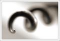
| 02/09/2004 10:52:54 AM |
Matrix-Revisitedby tfarrell23Comment: I quite like the strong orange tone but I am not so keen on composition. Although I like the diagonal of the cable, I think the head is too close to the top edge of the frame and not well positioned horizontally. I find the position of the other cables somewhat messy and not adding to composition in any way. |
| Photographer found comment helpful. |
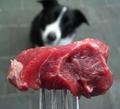
| 02/09/2004 10:43:16 AM |
Temptation by stickylizardComment: I like the unusual viewpoint here - shows such a different perspective. Although the meat gives a wonderful rich colour against the black, white and grey of dog and paving, I don't know that it's the most appealing foreground subject - and I quite like the look and feel of raw meat. Wonder whether a doggie biscuit would have made a good alternative or whether the lack of vibrant colour would have made it too dull? Anyway, this one has certainly made me think about the image. |
| Photographer found comment helpful. |
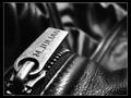
| 02/09/2004 10:40:03 AM |
Overlooking The Parted Tracksby tyt2000Comment: Beautifull composed - I love the angle of the zipper pull and the "topography" of the leather. Black and white really allows the excellent use of lighting to stand out. A great image. |
| Photographer found comment helpful. |
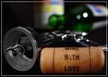
| 02/09/2004 10:36:53 AM |
Cork Screwby JackoComment: Oooooh! Love this! Just wonderfully wonderfully representative of shallow DOF and also a fantastically composed and balanced image. The tip of that screw seems rather oversharpened but I think that actually it might just be that there is a lot of detailed pattern reflected in the surface there rather than smooth colour. I really like this one a lot, and were I someone who felt it worthwhile paying for postage from DPC Prints I'd buy this one.
:oP |
| Photographer found comment helpful. |
| 02/09/2004 05:54:18 AM |
A "Key" To Good Timesby Russell2566Comment: Responding to your request for comments in the forums:
Actually I'm not going to be so helpful as I would have scored this a 6 or 7.
I like the feel of perspective that you have achieved by going close in to the subjects in the foreground and also by using a low viewpoint. I also really like the low DOF that has resulted.
Another thing I like is the inclusion of the cork text - adds an interesting detail.
I would say that the overall image is quite dark - not badly lit, just in terms of choices of backdrop and subject matter - which may not appeal to a lot of voters.
I'd also add that composition isn't particularly strong or balanced - there is an interesting diagonal from the corkscrew and top right bottle but otherwise the composition feels very random, and doesn't click for me.
|
| Photographer found comment helpful. |
Home -
Challenges -
Community -
League -
Photos -
Cameras -
Lenses -
Learn -
Help -
Terms of Use -
Privacy -
Top ^
DPChallenge, and website content and design, Copyright © 2001-2026 Challenging Technologies, LLC.
All digital photo copyrights belong to the photographers and may not be used without permission.
Current Server Time: 04/13/2026 07:36:43 AM EDT.