| Image |
Comment |
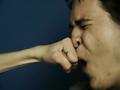
| 02/26/2004 11:11:10 AM |
Escalated Conflictby relgraphicsComment: Nicely done - the shapes are quite cool - the angle of that arm and the deep blue background are both good. |
 Photographer found comment helpful. Photographer found comment helpful. |
| 02/26/2004 11:09:50 AM |
|
| Photographer found comment helpful. |
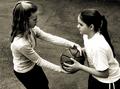
| 02/26/2004 11:09:15 AM |
Paper Scissors Stoneby RichT8496Comment: What a clever idea - that little "conflict resolution game" is a clever way to represent the theme. Composition doesn't do anything for me - seems a bit haphazard - what shape are you looking to make with your choice of layout - the shapes of both the objects and the space around them isn't particularly dynamic to me. I also find lighting a little uneven and DOF too shallow - that the nearer extremes of the scissors are out of focus doesn't add to this for me. |
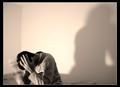
| 02/26/2004 11:06:26 AM |
I'm Taking My Ball and Going Homeby WildflowerJoyComment: One of the few entries in this challenge that conveys the challenge theme accurately by content alone. Feels a little dark and could do with some fill-in lighting on the face of the girl at the left, maybe also get down to their height to take it? |
| Photographer found comment helpful. |
| 02/25/2004 03:56:44 PM |
Grizzledby casualguyComment: I like the composition, though I'm not sure the collar/ zip adds anything to it. I think your choice of going in close is good. Lighting is a little harsh to my mind - I don't like that white chin area - I think softer lighting could have reduced that glare. This definitely speaks of texture though. Apologies if I'm repeating previous comments, I haven't read them. |
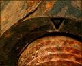
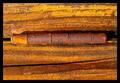
| 02/25/2004 03:54:17 PM |
Oxidationby QuadrajetComment: The colours are beautiful - isn't it incredible how wide a colour palette can be created by oxidation? |
| Photographer found comment helpful. |
| 02/25/2004 03:50:46 PM |
Textureby TiberiusComment: Very rich warm lighting, which really brings out the subject matter. I don't know why but I think I like this better when rotated into a portrait orientation though it works very well as it is. |
| Photographer found comment helpful. |
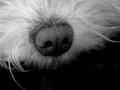
| 02/25/2004 03:49:11 PM |
Dog Noseby qwerty_314Comment: What a very unusual pet photo - I really like it. Not only the limited amount of the dog that's showing but also the way the background creates compositional balance and balances with the black of his nose. Very cool! |
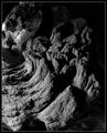
| 02/25/2004 03:47:09 PM |
Driftwoodby mbardeenComment: Beautiful subject matter - I feel I can't quite see the detail clearly enough. Lighting is intriguing but I think it's a touch dark towards the top which, to me, makes the overall image a little unbalanced. I like it best when I make it a square by cropping off the top - that seems to pull the focus more towards that wonderful sweeping curve. |
| Photographer found comment helpful. |
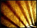
| 02/25/2004 03:44:19 PM |
The Golden Wallby tyt2000Comment: This is beautiful and intriguing because it's not obvious what it is. This image is all about light and shadow and shapes and I like that very much. |
| Photographer found comment helpful. |
Home -
Challenges -
Community -
League -
Photos -
Cameras -
Lenses -
Learn -
Help -
Terms of Use -
Privacy -
Top ^
DPChallenge, and website content and design, Copyright © 2001-2026 Challenging Technologies, LLC.
All digital photo copyrights belong to the photographers and may not be used without permission.
Current Server Time: 04/15/2026 08:39:49 AM EDT.