| Image |
Comment |
| 03/08/2004 09:17:41 AM |
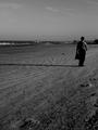
it's too crowded here.by artinfectionComment: I like aspects of this image - the texture within the sand leading us in, the long shadows, the empty beach - but feel that overall it's too dark and that the man is too close to the edge of the frame for a strong composition. |
| 03/08/2004 09:05:42 AM |
Playground in Winterby lilnukeeComment: The subject itself is great - but I think the image lacks punch. Being so far away (and thus including trees, foreground etd) doesn't really add anything, I think going closer might be better.
I'm also most intrigued by the snow-covered tyres and think a photo of those would be striking. |
 Photographer found comment helpful. Photographer found comment helpful. |
| 03/08/2004 09:03:45 AM |
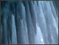
Frozen Soundby clkingComment: This one made me think to understand how it conveyed silence - and then I "auralised" the sound of running water and realised this represented the absence of that sound. I like the abstract you've created.
(Someone made up the word auralise for me when I said I wanted a "sound" version of visualise but then we later found the word has been coined before) |
| 03/08/2004 09:01:11 AM |
Sand Creek - thawby undieyatchComment: I like the way that the frame is split into three horizontal "stripes" - the largest white one, the vertically lined top one and the centre plain one. The dark spot on the right within the white band adds a focal point - I think I'd crop out the one at the far left to focus more on the one on the right. |
| 03/08/2004 08:59:09 AM |
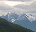
Cathedral Mountainby ellamayComment: I like your choice to opt for a square image shape and also the way that the foreground creates that wonderful triangle into the lower right corner. I also like the way the clouds echo the shapes of the mountain peaks. |
| Photographer found comment helpful. |
| 03/08/2004 07:20:02 AM |
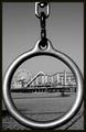
Round & Roundby qmdiComment: I really like this very much indeed. The repetition of shapes - the foreground circle and ferris wheel - works very well. The texture is good. The viewpoint is very unusual. I like that the foreground isn't just framing but actually as interesting as the scene it frames. Really great image, and black and white is perfect. |
| Photographer found comment helpful. |
| 03/08/2004 07:16:23 AM |
Cutting Edge Designby BAMartinComment: Wow, that's striking! And my first impression is of how well the black background really brings out the rich gold and red. Interesting diagonal composition too. The detail work on the object is beautiful and one can really peer closely at it and see the fine workmanship. In terms of how much I like the image itself, I think it's one of the stronger entries in the challenge, but am less enthusiastic about it outside the context of the challenge. The image quality is good, lighting works well to bring out the detail, but for me, it lacks interest. I feel like I'm looking at a catalogue photo of a beautiful item rather than an image I might choose to hang on the wall. Nice choice of a less obvious subject matter for the challenge. |
| Photographer found comment helpful. |
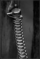
| 03/08/2004 07:05:57 AM |
Simplicity of Designby PaulMdxComment: I have no idea what the subject actually is but I love the image. The wood frames the image very well and echoes the vertical line of the metal spring. The light/ reflections on the metal look great in black and white. I like the slightly shallow DOF choice. Very nice indeed. |
| Photographer found comment helpful. |
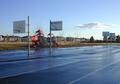
| 03/07/2004 05:41:49 PM |
Calm Before the Stormby lindsayComment: I have voted this image a 4 because it doesn't have a hook to pull me in - either visually or emotionally. I understand the idea - an empty playing court which is silent now but will soon be heaving with noise and movement. So the idea itself works well.
However the image lacks visual appeal. There isn't really a focal point. Composition seems random (why did you choose to take it from that exact spot? what would it have looked like taken from other spots? what about getting lower to the ground? why did you position the pole/basket things where you did within the frame?) The background of kiddy play structure and mundane housing estate doesn't add anything positive. I'd say that you have definitely got the right idea in terms of meeting the challenge theme but that this entry doesn't manage to convey that theme whilst still offering an image that holds appeal in its own right. A question that may or may not be useful to you is this: Would this image be worth taking/ keeping/ sharing outside of this challenge? Would it mean anything/ hold any appeal?
Please feel free to completely ignore all/ any of my comments, I'm just stating my ideas, nothing more. |
| Photographer found comment helpful. |
| 03/07/2004 05:36:11 PM |
After the Musicby leafComment: Interesting image, lighting doesn't work for me - I just don't like that red-orange colour of skin. It may not have been possible to throw more light on the subject, perhaps a higher ISO rating might have helped? |
| Photographer found comment helpful. |
Home -
Challenges -
Community -
League -
Photos -
Cameras -
Lenses -
Learn -
Help -
Terms of Use -
Privacy -
Top ^
DPChallenge, and website content and design, Copyright © 2001-2026 Challenging Technologies, LLC.
All digital photo copyrights belong to the photographers and may not be used without permission.
Current Server Time: 04/16/2026 06:43:11 AM EDT.