|
|
|
Showing 9701 - 9710 of ~12485 |
| Image |
Comment |
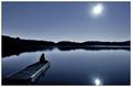
| 04/30/2006 03:30:31 AM | Calmby jaxedComment: I just stumbled on this, which somehow I missed before. It's very beautiful. The tonalities you have generated here, the purity of the steely blue, are very evocative. I'd wish the sun reflection weren't touching the bottom of the frame, and I might try to mute the slightly more greenish cast in the glare upper right, but that's about it. First-rate shot, and belated congrats from me to you! |  Photographer found comment helpful. Photographer found comment helpful. |
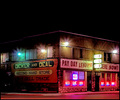
| 04/30/2006 03:26:43 AM | ...bought it in a second hand store...by taterbugComment: AW, you got robbed a little bit here IMO. I think this should've been in the mid-5's anyway. I actually quite liked it myself.
I don't agree with the suggestion to crop out some the black; I think that oppressive weight of black is integral to this. Hell, I might even ask for more... What I WOULD like to see you do is rotate this so the corner of the building is vertical. That would help a lot. I'd like to see a little more ont he right too. I might like to see it with a faint misty/glow overlay also.
Anyway, good shot and a nice try!
| | Photographer found comment helpful. |
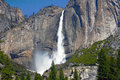
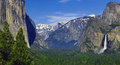
| 04/30/2006 02:58:25 AM | Yosemite Fallsby robpomComment: In many ways the strongest of the photos. I still have this sense of cramped composition. I'm pretty much noticing it in all 4 images. Processing is pretty realistic here, composition cries out for another 10-20% at the top to open her up and let her breathe. Anyhow, the light is less flat here, and this has paid benefits on the wall to the right.
But imagine the light coming from the left and perfectly parallel to the left wall: that wall will be "raked" by light, fairly dark, textured, the waterfall will glow, the texture of the right wall will also be expressed, the lower, foreground wall will be in shadow. If it's the right time of year for the light to be low in the sky when it rakes that wall, then the vegetation in the foreground/middleground will become luminous, or more so anyway.
I'm rambling. You had whatever you had, you wanted to shoot these shots, they ARE nice :-) I'd only gently urge that next time, you turn around as you go and look at the light all around you. If the light's right behind you, turn around and find something else where the light is working well. Yosemite LOVES backlighting, for instance.
I'll try to process a variation of one of these and post it.
Thanks for sharing! |
| 04/30/2006 02:50:55 AM | _DSC0060.jpgby robpomComment: Again, the flat light. Overall, tones too bright. Pretty arbitrary composition, oddly static for such a dynamic place. Composition feels "cramped", it's all squeezed tight ya know? It's a tough viewpoint to shoot from though. |
| 04/30/2006 02:48:37 AM | Valley View - Yosemite National Parkby robpomComment: Here, the flat light is really hurting you, and the whole scene is processed too light, it looks washed out. The branches upper right are unfortunate; as a rule, either none at all or a whole lot more is desirable.
One wishes for some foreground interest, also; how nice it would be to have stones in the water closer to you, just more water in the picture even, to make it a more active compositional element. |
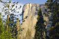
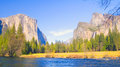
| 04/30/2006 02:45:56 AM | Tunnel View - Yosemite National Parkby robpomComment: Rob,
I may's well mention I'm an old Yosemite hand. Many years ago I actually taught workshops there. It's one of my favorite places on earth. And I know how stunningly difficult it can be to take great images there. The lighting issues are very complex because the valley is so deep and narrow, and it twists.
Speaking of your shots collectively, the first thing I notice is that you nearly always are shooting with the light from behind you; over one shoulder, if not directly behind. This, in general, is exactly what you don't want to do in landscape photography, and especially in places like Yosemite, where the texture of the rock is one of its most overpowering features. If you look at Ansel's best shots there, they are so much about texture and luminosity, essentially about the light itself.
I realize that if one is just passing through Yosemite, and especially if one has companions in tow who are not photographically inclined, then one's opportunities are very limited and one must of course make do with what one is provided...
Anyway, this shot, the classic view, the Gateway to Yosemite, aside from suffering from the aforementioned flat light, is oddly tuncated in its framing. One would, especially, epect to see all of El Capitan on the left. And more of the dome to the right would be a plus, as it makes a very nice shape indeed as it curves down there. I don't know if this is as wide as you could go (you didn't list the lens), but wider would be better. Another thing: this classic viewpoint works especially well if one includes more sky; the interplay between the immense sky and the narrow valley, when it's properly lit, is astounding.
A nice, crisp shot, good color rendition here. |
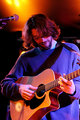
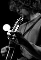
| 04/30/2006 02:33:07 AM | Old Silver Band 3by NVPhotoComment: This one kind of fails to make the mark also; it seems awfully static. That might be OK if it was Joan Baez being sensitive or something (am I dating myself), but I don't get that sense here. The mic is distracting, too. The cropping feels arbitrary; awkward on the bottom, too much nothing on the top, unfortunate truncation of the left arm off the right side. Crop on the left is just right though :-)
And again, the focus is on the neck of the guitar just in front of the near hand, that whole edge of the guitar, and it's not enough. I really want the face to be in focus. You can do that if you want, you know? Download a trial copy of "Focus Magic", mask off the face and hair, and use the tool just on that area. It's remarkable. But you may not want to do that.
Anyway, I love the green shot. I love it when you do crazy things I guess...
R. |
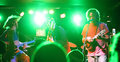
| 04/30/2006 02:27:23 AM | Old Silver Band 4by NVPhotoComment: Now, THIS one I like! I like the immediacy of it, it jazzes me up (so to speak). The color's just great for me, the complementaries working like that, the transparency of the green, the luminance of it.One might wish the raised arm on the left weren't aobscuring the guitarist's hand work, but what the heck. It is what it is. Nice! |
| 04/30/2006 02:24:43 AM | Old Silver Band 2by NVPhotoComment: For me this image is solid but not spectacular. It doesn't really involve me, draw me in. There's nothing happening in the face, I think; it's not even contemplative-looking. The focus would seem to be the near hand, which is OK except it isn't; in focus, I mean. I know this is real tough of course, shot wide open handheld at slow shutter speeds...
It would be great, BTW, if you would post your settings with the picture, especially on shots like this, band shots where low-light contril is essential.
Anyway, I also find the BG spot unncomfortably close to the hand action, a sort of souble whammy. So, a nice shot but nothing to get real excited about in my book. |
| 04/29/2006 03:43:28 PM | To-Bear_music.jpgby MambeComment: Yee haw! Are we getting there or what? mambe, this shot's "just like you"; sweet and serene and soft and comfortable. Nice work! | | Photographer found comment helpful. |
|
Showing 9701 - 9710 of ~12485 |
Home -
Challenges -
Community -
League -
Photos -
Cameras -
Lenses -
Learn -
Help -
Terms of Use -
Privacy -
Top ^
DPChallenge, and website content and design, Copyright © 2001-2026 Challenging Technologies, LLC.
All digital photo copyrights belong to the photographers and may not be used without permission.
Current Server Time: 07/28/2026 09:45:46 AM EDT.
|