|
|
|
Showing 9691 - 9700 of ~12485 |
| Image |
Comment |
| 05/01/2006 01:33:58 AM | Old Pierby IceRockComment: This is very, very nicely done. Not sure I've seen a shot with no 1,2, or 3 votes not ribbon before :-)
Congrats on 4th! |  Photographer found comment helpful. Photographer found comment helpful. |
| 05/01/2006 01:31:51 AM | Silencio by kiwinessComment: Good grief, Kiwiness snapshot wins ribbon! We mortals cringe. Congrats, Gary! | | Photographer found comment helpful. |
| 05/01/2006 01:30:47 AM | | | Photographer found comment helpful. |
| 05/01/2006 01:29:16 AM | | | Photographer found comment helpful. |
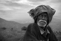
| 04/30/2006 04:27:39 AM | Old Manby arindam_thokderComment: Somehow I never got around to this image (the challenge was one of the few I have not voted on) but I want to register how much I like this, and make one small suggestion.
I like it because it's intense and rich and real and doesn't try to blow me away with any sort of artificality or attention getting devices, compositionally or in post-processing. The image has DIGNITY and I appreciate that. The tonalities of the figure itself, and the face , are beautifully expressed. I'd personally wish for more expanded tonal range in the surround, but that's really an artistic choice and I can't fault you this one.
The one think I don't like, and it's a nit, is the faint haloing that shows where you have dodged the head. The feathered brush has affected the sky slightly, I think. When next you do something like this, make a selection of the head itself, and your dodging/burning will not affect anything outside that selection. You can use the magnetic lasso and then in the select menu shrink the selection a few pixels to be sure its feathering doesn't overlap to the sky, and that will work just fine.
Again, conmgrats on a first-rate piece of work! | | Photographer found comment helpful. |
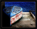
| 04/30/2006 04:06:38 AM | Out of Orderby carlomuscatComment: This is really very nicely seen, and it well deserves its high finish. I do have a couple of issues with the processing of it, but they don't take away from the quality of the essential work.
First and foremost, the frame seems way too heavy and restrictive for this image. Secondly, the burning-in of the water upper right is not very smoothly done, and it looks very artifical. If you did this by hand, you might want to know about how to do this kind of thing with gradient overlays. Feel free to PM me for an explanation of how, if you wish.
Finally, I wish there were a trace of separation between the boat and the wall/pier in the lower left. Not much, just a hint, to have that area come alive.
VERY nice work! |
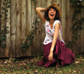
| 04/30/2006 03:51:25 AM | Yee Haw!by JutildaComment: One last pass. This one just cracks me up, no kidding! Such joie-de-vivre! I find very little to fault, really, except that the square cropping is vaguely constricting and centers the subject (centers YOU) a tad too much. I'd try adding back maybe 10-15% on the left, assuming you cropped from there. If you cropped from the right, then this is about as good as you can do. I wouldn't go along with Tikki, because I don't think cropping into the middle of the ivy on the right is a good idea.
One more bear hug, and I'm off... | | Photographer found comment helpful. |
| 04/30/2006 03:47:43 AM | Cheap Imitationby JutildaComment: I can't believe I never got back to comment on this, because I meant to. And that was before Iknew it was yours, it was during voting, where I ranked this quite high.
I think this is just wohnderful work! I love the lighting, the muted harmonius colors, the purity of the silver, the glow of the pearls. This is very skilled work, and I'm impressed. I only wish there wasn't a hot spot on the upper arm middle left...
I'm glad I found this one again! | | Photographer found comment helpful. |
| 04/30/2006 03:44:05 AM | Sidewaysby JutildaComment: Ah, good GRIEF Judy! This is equal parts absolutely hysterical and profoundly disturbing. Fortunately, I'm a funny guy who loves psychological horror movies and books, so I'll be able to sleep at night.
Somehow I rarely seem to make it to commenting on your pictures (because I do most of my commenting in forum activity) but that's really a shame.
So kudos on a truly amusing and oddly compelling image! Bear hug from me to you! I'm on my way over to "Cheap Imitation" now... | | Photographer found comment helpful. |
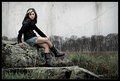
| 04/30/2006 03:39:17 AM | Lady on the Rockby Joey LawrenceComment: HaHa! I have to laugh at the "wall crack wars". It is and it isn't! It's actually semi-amazing. For quite a long moment I thought "girl against wall urban joey", then I realized she's in a FIELD, there's a TREELINE facripesake, and I actually thought "DAMN, some killer murals in Toronto!", then reality (or rurreality?) set in and I realized you layered a wall shot into an outdoor portrait. It's bizarre.
Jutilda's comment about the Vee is spot on: foreground rock to knee back up crack is a pronounced Vee. Actually I'd call it a triangle: and there's even more of them:
1. The most foreground rock is a triangle
2. The two legs make a triangle
3. The upper body makes a triangle from the 2 hands up to the head
4. The two long foreground grass stalks make a vee that never completes a triangle visually.
So this whole compsition is messing with triangles, EXCEPT that the main composition is composed of three distinctly horizontal zones overlaid with a strong vertical zone (the figure). Altogether, very satisfying if a touch bizarre.
| | Photographer found comment helpful. |
|
Showing 9691 - 9700 of ~12485 |
Home -
Challenges -
Community -
League -
Photos -
Cameras -
Lenses -
Learn -
Help -
Terms of Use -
Privacy -
Top ^
DPChallenge, and website content and design, Copyright © 2001-2026 Challenging Technologies, LLC.
All digital photo copyrights belong to the photographers and may not be used without permission.
Current Server Time: 07/28/2026 08:30:12 AM EDT.
|