|
|
|
Showing 2551 - 2560 of ~12485 |
| Image |
Comment |
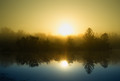
| 10/21/2013 11:37:40 PM | The Sun Also Risesby MarfunComment: It's an absolutely gorgeous, misty sunrise. I'm having a hard time figuring out if it's possible to have that color water under that color sky, though, and that bothers me some.
I'm more bothered by the fact that it has absolutely nothing to do, emotionally, with the Hemingway novel. But you're far from alone in having taken this approach, working from a title only.
6 from me. |  Photographer found comment helpful. Photographer found comment helpful. |
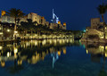
| 10/21/2013 11:35:02 PM | Arabian Nightsby ecmguyComment: Not to pick nits, but "The Thousand Nights and a Night" isn't a novel, it's a collection of stories woven together.
That said, clearly the image IS from the Middle East and it IS night, and it's nicely put together technically. Looks like a magical place. 6 from me. | | Photographer found comment helpful. |
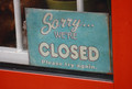
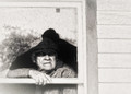
| 10/21/2013 11:31:52 PM | The Old Curiosity Shop-Charles Dickensby MonaComment: Technically I don't much care for this; the framing is awkward, the light is kind of blah, it's just so matter-of-fact. But the Old Curiosity Shop was a magical place, layer upon layers of remarkable things. So this is just a disconnect for me.
I'll give it a 4. | | Photographer found comment helpful. |
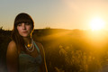
| 10/21/2013 11:29:47 PM | Catch Her in the Ryeby IrvineJamesComment: Well, it's a nice pun :-) Technically the image is pretty accomplished, though I'm seeing an odd disconnect between face color/tones and the rest of her skin that really bothers me.
In the end, it doesn't connect for me. I need more, at some level. 5. | | Photographer found comment helpful. |
| 10/21/2013 11:27:55 PM | Damn Dust - The Grapes of Wrath by RmacComment: This works for me as having been inspired by the novel. I've spent a lot of time in "Steinbeck Country", Salinas and environs, and this scene feels faithful to the rundown farm buildings (and run-down people) we used to see a lot of, and maybe still do for all I know. There's a nice sense of hopeless foreboding ("What's the world gonna throw at me NEXT?") in this shot, and that works.
I'm not sure all your processing choices really work for me, but I can see why you made them. I do like the granularity of it. 7 from me. | | Photographer found comment helpful. |
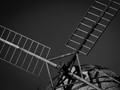
| 10/21/2013 11:05:54 AM | Don Quixote (de la mancha) by HarlequinComment: Windmills? Check! Tilting? Check! Of course, when they talk about Don Q "tilting at windmills" they are describing him attacking with a lance, as in "jousting", but what the heck. I'm amused.
Photographically, sort of "meh" but still intriguing in a matter-of-fact way.
You get a 6 from me... |
| 10/21/2013 11:04:07 AM | Snow Whiteby PennyStreetComment: Such an intriguing image in its own right, but only the most tenuous connection to the fairy tale "Snow White", which isn't a novel in any case. I'm gonna take a leap of faith and assume you are referencing Donald Barthelme's modernist classic version of Snow White, which indeed makes numerous "absurdist" leaps in the narrative. Fits THAT one to a tee, it does, because this image is absurd :-)
Give ya a 7. | | Photographer found comment helpful. |
| 10/21/2013 10:27:44 AM | Fanny Hillby disassociationComment: This isn't working for me at all. Chalk it up to latent prudery if you want, but I find the image profoundly unappealing. The expression, especially, is quite disturbing. I suppose the image meets the challenge, in the sense that the book's about a prostitute and it's quite bawdy, but for me "bawdy" inspires a sense of rough-and-tumble fun (the book displays a tremendous amount of risque humor), and this doesn't incorporate that element.
Regardless, the image is not technically especially well done, either in lighting or in pose, IMO. I'll give it a 5, which is what I give any image in this challenge that seems to me to MEET the challenge. | | Photographer found comment helpful. |
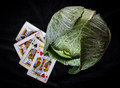
| 10/21/2013 10:14:40 AM | Tribute to O.Henryby lei_73Comment: Kings, check. Cabbage, check. Composition, workmanlike. Technicals, adequate: the lighting is decent if uninspired, the choice of shallow DOF is interesting.
Does it fit the book (which is a collection of short stories, not a novel)? Not really, except for the obvious one-on-one match with the title. But see, the thing of it is that the TITLE has nothing to do with the book either; it's a quote from Lewis Carroll ("The time has come, the walrus said, to talk of many things: / Of shoes and ships and sealing-wax, of cabbages and kings...") that highlights the miscellaneous nature of the book itself.
Heck, what am I saying? It's clean, if unimaginative, but it doesn't especially float my boat. I'll give it a 5. | | Photographer found comment helpful. |
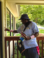
| 10/21/2013 10:14:38 AM | The Postman Always Rings Twiceby LinMalAngComment: As far as meeting the challenge, well... you have a postman and he's ringing a doorbell, and this illustrates the title, so you have that nailed pretty tight I guess, although the title of the book, in the real world, is a complete non-sequitur. That is to say, nowhere in the book is there a postman, and nowhere does he ring twice, or ring at all for that matter :-)
The book's not ABOUT that, see? It's an early, and notorious, modern crime novel, having to do with a wife and a drifter conspiring to kill her husband. So there's a dilemma, huh? One that's troubling me in all this voting, truth be known. If you made an image faithful to the BOOK, the voters would say "WTF does this murder-in-the-bathtub have to do with a Postman?" and you'd get hammered. But you make an image that matches the title, people can understand that, but people like me who've read the book get a little peeved and...
You get the picture :-) I'm trying to rise above that...
As to the merits of the image, I'd be a lot happier if you'd coaxed some detail and structure out of the face. I like the light on his glasses though...
5 from me. |
|
Showing 2551 - 2560 of ~12485 |
Home -
Challenges -
Community -
League -
Photos -
Cameras -
Lenses -
Learn -
Help -
Terms of Use -
Privacy -
Top ^
DPChallenge, and website content and design, Copyright © 2001-2026 Challenging Technologies, LLC.
All digital photo copyrights belong to the photographers and may not be used without permission.
Current Server Time: 07/18/2026 10:21:30 PM EDT.
|