| Image |
Comment |
| 01/04/2005 02:08:53 AM |
A Quiet Momentby mariomelComment: This is one of those very fine images that just doesn't "feel" candid to me. I'm sure it was, but it doesn't feel that way to me, and in this challenge I am voting in favor of immediacy over calculation. |
 Photographer found comment helpful. Photographer found comment helpful. |
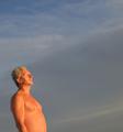
| 01/04/2005 02:07:31 AM |
War Paintby grigrigirlComment: sweet and eerie at the same time. Lower right seems too bright to me, and possibly the brush hand as well. |
| Photographer found comment helpful. |
| 01/04/2005 02:06:32 AM |
"No Where"by ace flymanComment: strong and evocative, doesn't call attention to itself in any way, lets the scene be what it is. |
| Photographer found comment helpful. |
| 01/04/2005 02:05:44 AM |
Native Indian Dancerby jonpinkComment: This would be MUCH stronger if the right edge were cropped in to bring the image back to a more conventional width/height ratio. As it is, the image is almost precisely bisected into all subject / all BG. |
| 01/04/2005 02:01:45 AM |
Puppet Showby TelehubbieComment: REALLY nice pic. It's a slight flaw that the face, the center of this composition physically and emotionally, seems less sharp than the pig and the backfrop cloths. Note that his hand is sharper than his face The eyes are priceless. |
| Photographer found comment helpful. |
| 01/04/2005 01:59:43 AM |
Winter Wonderlandby agwrightComment: Deceptively appealing. I wish you'd applied a little local adjustment to the man, to make him render more up-tone. |
| Photographer found comment helpful. |
| 01/04/2005 01:58:39 AM |
Natural Beautyby librodoComment: It's a beautiful picture, but it's overworked to the degree that it no longer feels candid, even though I'm sure it was. As long as you're working it so hard, why not whiten the teeth a tad? Lovely image, but for me it doesn't work directly to the challenge. |
| Photographer found comment helpful. |
| 01/04/2005 01:57:15 AM |
|
| Photographer found comment helpful. |
| 01/04/2005 01:56:06 AM |
|
| Photographer found comment helpful. |
| 01/04/2005 01:55:11 AM |
After the rainby dr rickComment: Striking composition and colors, not all that "candid" feeling though. Looks like sharpness filters were overapplied. |
| Photographer found comment helpful. |
Home -
Challenges -
Community -
League -
Photos -
Cameras -
Lenses -
Learn -
Help -
Terms of Use -
Privacy -
Top ^
DPChallenge, and website content and design, Copyright © 2001-2026 Challenging Technologies, LLC.
All digital photo copyrights belong to the photographers and may not be used without permission.
Current Server Time: 06/20/2026 01:36:31 PM EDT.