| Image |
Comment |
| 03/02/2005 01:08:29 PM |
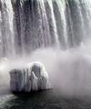
White Rock White Waterby netdudeComment: I understand what you are after here and it's a beautiful image, but the challenge calls for a white BG and this wasn't isn't. Still, it's an honest attempt and just a differing interpretation, I am giving it a 7. |
| 03/02/2005 01:06:57 PM |
white wineby ursulaComment: This is a nicely composed image that suffers from being more "light on grey" than "light on white"... 7 |
 Photographer found comment helpful. Photographer found comment helpful. |
| 03/02/2005 01:05:53 PM |
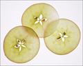
A Little Sugar On Topby sibelingComment: Technically more or less flawless. The border is not working for me, it's makign the piece "heavy". And I'm not anti-border, I use them and appreciate them. For me the border makes the difference between a 9 and a 10 in this case. |
| Photographer found comment helpful. |
| 03/02/2005 01:03:46 PM |
|
| Photographer found comment helpful. |
| 03/02/2005 01:02:52 PM |
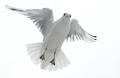
Snowy Dayby RefocusedComment: And the oscar for best bird-in-flight in light-on-white goes to.... Sweet capture! 10 |
| Photographer found comment helpful. |
| 03/02/2005 01:01:47 PM |
Curvyby pgattComment: This is a beautiful, lovingly-rendered image that plays a little loose with the challenge description, as I'm sure you realize: "Take a photo in which the background is white and the subject is predominately a "light" color". You're far from alone int hat, of course, but I'm scoring higher the ones that succeed admirably withint he stric terms of the challenge itself. There are quite a few of those. 7 from me, and let me say I love the poicture and the tonalities in their own right. |
| Photographer found comment helpful. |
| 03/02/2005 12:59:17 PM |
Sleeping Beauty by JackoComment: Gotta be jacko, right? This is so pure it's breathtaking. 10 from me. |
| Photographer found comment helpful. |
| 03/02/2005 12:58:27 PM |
literallyby rhipsterComment: "Take a photo in which the background is white and the subject is predominately a "light" color"
You titled this "Literally". Well, it's literally light falling on white, I recognize that, but this is not a white BG with a light subject,a s you have rendered it. However, it's a striking image, and I like it very much. I'll sretch it to a 7. You're pl;aying the same kind of game I do, it seems :-) |
| Photographer found comment helpful. |
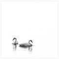
| 03/02/2005 12:55:33 PM |
swans by arngrimurComment: It's a sweet image but I feel like a hint of "horizon" or soemthign is needed, additional surface texture, I don't know... 8 |
| Photographer found comment helpful. |
| 03/02/2005 12:54:22 PM |
Supportersby alithenakeComment: Perhaps the most effective of the "natural" images, in challenge terms. Lovingly rendered. 9 |
| Photographer found comment helpful. |
Home -
Challenges -
Community -
League -
Photos -
Cameras -
Lenses -
Learn -
Help -
Terms of Use -
Privacy -
Top ^
DPChallenge, and website content and design, Copyright © 2001-2026 Challenging Technologies, LLC.
All digital photo copyrights belong to the photographers and may not be used without permission.
Current Server Time: 06/23/2026 02:59:06 AM EDT.