|
|
|
Showing 11161 - 11170 of ~12483 |
| Image |
Comment |
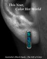
| 04/30/2005 03:17:15 AM | Surprise Herby BradComment: The picture itself is remarkable. Crisp, well-lit, wonderful and appropriate use of desat. Those are not easy stones to shoot. The type is doing you no favors herem however. One thing I notice that's really bugging me, though; this would appear to be a MAN, with a BEARD, and then there's the downy ear-hair... Seems at odds with the headline, "Color HER world"... What do you mean, if I wear an earring it color's my GAL's world? I don't quite get it. So basically you're confusing me with an otherwise wonderful image. Strong score regardless. |  Photographer found comment helpful. Photographer found comment helpful. |
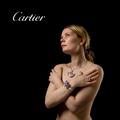
| 04/30/2005 03:13:05 AM | Defining Beautyby arnitComment: Beautifully lit. I'd have toned down the white of the type to something more in balance with the overall tone, and used a little less negative sapce, both type and subject seem a bit lost in all that black. Of course, if there were more copy being applied, the black sapce might integrate better... |
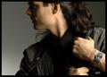
| 04/30/2005 03:11:15 AM | OUTBACKby DrJOnesComment: I love this one. It is beautifully lit, and makes a rational virtue of understating both the watch and the copy in a way that's entirely appropriate to the perceived marketing thrust; men who don't care about flash and value substance. I hope this does well. I'm afraid the voters may see "not enough jewelry" and score it down for that, but I think it's terrific. | | Photographer found comment helpful. |
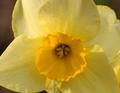
| 04/30/2005 03:08:53 AM | February by nico_blueComment: This is VERY nice. Crisp and detailed, luminous, nigh-key BG that still retains visual iinterest, Elegant type. | | Photographer found comment helpful. |
| 04/30/2005 03:07:33 AM | Dali's Earringsby labudsComment: This is a sweetly composed shot. In many ways it's very pleasing. I have a couple very specific nits, though.
1. The tonal range seems "off" somehow. I can't but my finger on it, but it's "dull". It may just be the mottled, flat gray BG, not sure. Certainly, there seems to be true black and true white, but overall the luminosity of the image isn't what I'd expect of the setup.
2. The way your lighting is set, the shadow lines exactly parallel the leftmost ear post, and this produces a strange effect in the lower left corner.
Still, a nice, subdued, detailed image and a strong score from me. |
| 04/29/2005 02:02:33 PM | tAcKs iN SpAcEby MickComment: ***** CRITIQUE CLUB COMMENT *****
Yowza, this is a fun one to draw! I had this picture pegged for a ribbon as soon as I saw it, and it was the second one that opened for me in the challenge random draw. My original comment was somethign like "I sure hope this isn't Calvert in a rut", I hope you took that as humorously as I meant it.
This wildly imaginative shot is one of my favorites among all the challenge entries I have voted upon. For me it excels on so many levels it's almost funny.
1. Technically it's exceptionally nice, and allt he more so given your relatively primitive lighting setup. Some might say the BG should be sharper, but I disagree with that. I think the tacks would be downvalued if the BG image were crystal-sharp (as, for example, it is in Scalvert's "Nightbulb" shot, where the sharpness is an asset since the BG becomes part of the foregrounds, as it were).
2. It has an extremely high, but not "in-your-face", humor quotient, only underlined by the bizarre spelling of the brilliant title, which calls to mind all sorts of low-budget sci-fi movies in my twisted brain.
3. It's metaphorically complex. It's amazing that such a mundane subject material and a few odds-and-ends can produce such an example of visual stortytelling. It has an air of "documentary", it has a heavy aura of "science fiction", It has hints of "global domination", it raises questions in my mind as to whether the tacks are a malevolent or a beneficient force, and it speaks (for me at least) to the loneliness of the human condition and our quest for meaning in the universe. Quite a load for a handful of tacks to tote, eh?
4. It's visually appealing; it's beautiful "eye candy" even though (as explained in 3) it's far MORE than eye candy.
In summary, this is a powerfully good image, and one of which you should be estremely proud. I wish I had some specific areas I could address by way of suggested "improvements", but honestly nothing stands out for me as being in NEED of improvement. Perhaps the large, central blue tack could be better-separated from the background? jejeje™
Thanks for the chance to comment upon this image in depth.
Robt. | | Photographer found comment helpful. |
| 04/29/2005 01:16:04 PM | blackhack pilots.jpgby No1_Dogman_2004Comment: This appears to be outstanding. It's hard to judge it fairly in such a small size though, the limited size/resolution can hide a lot of merging & layering flaws. I'm not sure how I feel about the blur you've added, but I'm not negative on it. I just wonder if it's too much, or not even needed at all. I'd have to see an original without blur to have an opinion. | | Photographer found comment helpful. |
| 04/29/2005 03:41:49 AM | art8.jpgby alonzo4bComment: Very nice shot, Henry. By far my favorite of yours I've seen. Metaphorical as hell. The white foot on the female model is very odd, though :-) |
| 04/29/2005 03:34:04 AM | | | Photographer found comment helpful. |
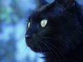
| 04/29/2005 03:30:54 AM | Poofieby allankentComment: Now that's EERIE! Consider using the desat brush (if you have photoshop) on the cyan highlights on the cat's fur upper right? And maybe clone out the speck under the nose? | | Photographer found comment helpful. |
|
Showing 11161 - 11170 of ~12483 |
Home -
Challenges -
Community -
League -
Photos -
Cameras -
Lenses -
Learn -
Help -
Terms of Use -
Privacy -
Top ^
DPChallenge, and website content and design, Copyright © 2001-2026 Challenging Technologies, LLC.
All digital photo copyrights belong to the photographers and may not be used without permission.
Current Server Time: 06/25/2026 11:25:04 AM EDT.
|