| Image |
Comment |
| 09/13/2005 02:02:37 AM |
Stratus Eclipseby NeilComment: This works very nicely, though I think you could use selective color to mute the blown cloud halo a tad. It may not be an issue at full size, but it sort of is as 640 pixels. |
 Photographer found comment helpful. Photographer found comment helpful. |
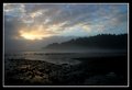
| 09/12/2005 03:57:34 PM |
Summer's End — Sunriseby Bear_MusicComment: Originally posted by legalbeagle:
Bad luck Robt - your image was very impressive. The colours are sublime (I must admit, I see the colour contrast rather more than any than luminosity contrast).
Keep that 20D charged in future (how did the date get reset? My backup battery seems to keep forever). |
It was never properly set to begin with; it was 12 hours off. Dumb error. |
| 09/12/2005 01:38:31 PM |
|
| Photographer found comment helpful. |
| 09/12/2005 05:32:30 AM |
Lotus Mood by librodoComment: Great finish manny. I find it interesting to compare this witht he color version, because this one seems softer (and not in a positive way) than the color one. Whatever, very strong image, as usual. I think this is the first time I've beaten out onw of your shots, so i'm happy :-) |
| Photographer found comment helpful. |
| 09/12/2005 05:31:05 AM |
Tributeby PanoComment: I really like this shot. I'd have bumbed it from 7 to 8 or 9 if it weren't for the PP haloing on the figure. I'll admit it had crossed my mind that this was the work of a certain icelander :-) |
| Photographer found comment helpful. |
| 09/12/2005 05:29:34 AM |
Cathedral of Colourby MatthewComment: Really nice finish here. I love this image. Definitely one of the very strongest color-contrast shots. I'd sort of expected it to ribbon, and it nearly did. |
| Photographer found comment helpful. |
| 09/12/2005 05:12:41 AM |
highcon04.jpgby librodoComment: IMO this is a much stronger image than the B/W version you entered, Manny. I like it very much. |
| Photographer found comment helpful. |
| 09/12/2005 05:06:50 AM |
DPC_portrait 9-11-15.jpgby pixielandComment: It has potential for sure. Plusses are a fine expression and some startling facial adornments. Negatives are a busy BG, blown-out wife-beater teeshirt, and an unfortunate cop on the top of the cap. The first two you can deal with in PP, the last depends on the framing of the original. There's also an overalls ense of slight fizziness to the face, possibly just an issue of no pp sharpening having been added.
Robt. |
| Photographer found comment helpful. |
| 09/12/2005 04:44:11 AM |
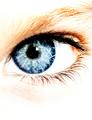
In this sky I feel lost.by srugoloComment: This image actually scored very well (commenting to your disappointment with the score) when you consider that it has major "high key" elements mixed in with the "high contrast" components. It's like it's two different pictures; a HC eye-and-eyelashes show superimposed on a HK eyebrows-and-face shot. It's a striking image, which is why it placed so well IMO, but it's visually shizophrenic, which might explain the relatively large number of 4 votes. |
| Photographer found comment helpful. |
| 09/12/2005 02:39:43 AM |
Summer's End — Sunriseby Bear_MusicComment: Thanks for all the lovely comments. I almost didn't enter this because I knew it would blow my anononymity out of the water, but then I thought "What the hell, it's the best shot you've taken all summer and it fits the challenge, so..."
I wasn't the least surprised at all the comments during voting that pegged this one as being mine :-) |
Home -
Challenges -
Community -
League -
Photos -
Cameras -
Lenses -
Learn -
Help -
Terms of Use -
Privacy -
Top ^
DPChallenge, and website content and design, Copyright © 2001-2026 Challenging Technologies, LLC.
All digital photo copyrights belong to the photographers and may not be used without permission.
Current Server Time: 07/22/2026 11:58:50 AM EDT.