| Image |
Comment |
| 06/18/2003 05:48:05 PM |
Martin G Munn: Cow Trainerby MartinComment: interesting. lol. Definately original. the lighting is good for the most part, except on your back. Assuming you're the guy on the right. :) Anyway, focus and clarity look good, and I like how you seperated the photo between you and the other guy. you cropped the horn a bit, but I think that's actually a good thing, otherwise you'd have too much cow. |
| 06/18/2003 05:44:32 PM |
Me and Giby ladpupmoeComment: focus and clarity are really good, but we can't really see either your face, or Gi's face. The main subject really seems to be your hair. specifically the top of your head. Wish we could see your faces more. I think that would make for a more exciting photo. |
 Photographer found comment helpful. Photographer found comment helpful. |
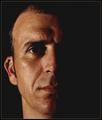
| 06/18/2003 05:40:04 PM |
Oh no ! A close up !! ahhhhby melissartsComment: I'm not really sure I like the lighting on this. looks like a flashlight shining on your mouth. which draws our attention to the light actually. I wish that your eyes were a bit more highlighted, you have very nice eyes. The pose is good, maybe a little better if you hadn't cropped your chin, but still a nice angle. |
| Photographer found comment helpful. |
| 06/18/2003 01:16:20 AM |
Feeling Blueby luckycharmsrockComment: Interesting take on the challenge, but I think it would work better without the background. I find it distracting with this effect. Try a close up, just face shot this way. Truely though, I'd like to see the original. You seem quite pretty, and shouldn't have to hide behind the effect. Good angle on your face. Maybe would have cropped it less body, more head. |
| Photographer found comment helpful. |
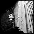
| 06/18/2003 01:13:25 AM |
My Weaknessby arnitComment: I'm not seeing a weekness here, but it must be a personal thing to you. I really like the use of black and white here. I also like the patterns created by the background. Lighting is a slight bit harsh on your left cheek, but nothing serious. I like the from below view. I think it works in this case because we aren't close enough to see up your nose. I also like how this is divided dark and light. I think that makes for a visually interesting shot. |
| 06/18/2003 01:03:54 AM |
The Devil in Bluejeansby PedroComment: The lighting looks strange here. Either that or this is desaturated? The skin tones just don't look right, but then again, you could just need some sun. :) you almost look like you're hovering above the road. I think it's cause of the lack of shadow. Different take on the challenge. Interesting angle. Focus and clarity look good. Overall interesting, but would have liked a closer up. ~Heather~ |
| Photographer found comment helpful. |
| 06/18/2003 12:56:02 AM |
Inside the Lensby dadas115Comment: I find the dust to be a bit of a distracting element here. I wish the portrait were a bit more clear. The focus on the camera is good, but not really on the portrait. I think that the bright light behind your head is also a bit distracting. interesting take on the challenge though. Different, and creative. ~Heather~ |
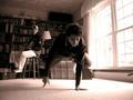
| 06/18/2003 12:44:56 AM |
Me Tooby ToddhComment: Great focus. I really love the lighting. Like how it divides your face. I like how you chose to go color for this. Great coloring and tones. Also really great detail. Wonderful textures. nothing to complain about here. :) ~Heather~ |
| Photographer found comment helpful. |
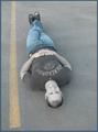
| 06/18/2003 12:41:04 AM |
Break Balanceby DesertShadowComment: Focus and clarity are better on the guy in back. If you are the guy in front, I would hve either blurred out the background, or told your buddy to move. Light coming through the right is quite a bit too bright, but the shot is definately different. Just think that the guy in back is taking away from the guy in front. If you are the guy in the back, than the guy shouldn't be in front. One or the other.
~Heather~ |
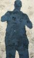
| 06/18/2003 12:37:50 AM |
My shadowby hilmarsigComment: Would like to have seen some actual person here, but hey, counts as a self portrait in my opinion. It doesn't really appeal much to me though. I'm a fan of detail, and detail is something this really doesn't have. I think you took it on a good background though, and focus and clarity look to be good. Just doesn't really appeal to me much. |
Home -
Challenges -
Community -
League -
Photos -
Cameras -
Lenses -
Learn -
Help -
Terms of Use -
Privacy -
Top ^
DPChallenge, and website content and design, Copyright © 2001-2026 Challenging Technologies, LLC.
All digital photo copyrights belong to the photographers and may not be used without permission.
Current Server Time: 07/23/2026 12:15:52 PM EDT.