|
|
|
Showing 911 - 920 of ~2785 |
| Image |
Comment |
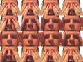
| 06/23/2003 10:09:01 PM | Peek-A-Boo!!! (All in-camera)by StevePaxComment: I've seen shots done like this before, and I think I stand by my decision that it doesn't appeal to me at all. You have a distracting element in the shot. In the background of each shot, to the left issomething that isn't only distracting, it's distracting 11X's worse than a single shot. it's in 11 of the shots, and your hands cover it in the others. Also, the lighting gives you raccoon eyes. Definately don't like the multi shot thing. ~Heather~ |  Photographer found comment helpful. Photographer found comment helpful. |
| 06/23/2003 05:01:39 PM | Happy White Blood Cell Hard at Workby TurbotechComment: This cracks me up. I think you did an excellent job getting this shot. I don't know what they look like directly, but the focus does seem a little soft, however, I realize that this is a tough shot to get. What a perfect smiley though. | | Photographer found comment helpful. |
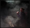
| 06/23/2003 04:41:14 PM | Vocalist by KonadorComment: I really like the lighting in this, and how we can see the smoke clearly. The way that the light falls on his face is great. I also like the highlights in his hair. I wonder how it would look with a bit more cropped of the left side? Also, we can just barely see a guy in the background, we can't see him enough to consider him an important part of the pic, but he's definately there. I wouldn't consider him a distraction, but definately an observation. Very nice with the lighting available. ~Heather~ | | Photographer found comment helpful. |
| 06/23/2003 04:13:57 PM | Moja Beba (eng. My Baby Magazine): Sweet Little Angel's Dreamby gaja_tzComment: *Critique Club*
This is a precious photo, however, I don't think it would work very well on the front cover of a magazine. They usually use bright or flashy covers to draw attention to make you buy it. This shot turns out just a bit too dark for this.
Also, after the title is added, 1/2 your baby would be covered up, and only her little head sticking out from under the title, making the main part of the magazine showing her animal and bedding.
I do like the shadows. I'm glad that the one on her face doesn't go over her eyes. That would have been a disaster in my opinion.
The angle is a bit odd, and I wanted to see it with her at the bottom of the photo, with her head going towards the top, rather than this way around.
Focus and clarity seem ok. A little softness here is alright by me, because of the overall feel of the photo.
As a photo, I think it's excellent, but maybe not so good on a magazine cover.
Still really nice.
~Heather~ | | Photographer found comment helpful. |
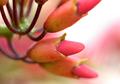
| 06/23/2003 09:03:51 AM | natureby sanandanComment: *Critique Club*
I really like the DOF here, but unfortunately it is so shallow that the soft focus consumes the crisp focus part making it look blurry as well. I think that maybe just a little more of the shot could have been in focus. That would have given us something really sharp to look at.
The lighting is good, no dark spots or annoying bright spots. The colors are really brought out nicely.
I like very much the blurr in the background. You blurred it enough to make it non distracting to the subject. I like how the subject stands out of the background very nicely.
The angle and framing/cropping are just fine. I like how it comes out of the upper left and down into the lower right. This makes for a pleasing composition. I like how the stems are a bit darker than the flowers themselves.
I could see this on the cover of a magazine.
~Heather~ |
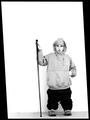
| 06/22/2003 10:41:55 PM | Me and my Monopodby JPRComment: You got DQ there for a bit, but I see it's back. What nice luck! You are definately off centered, but the subject here really doesn't do much for me. I was able to read your description and think this would make a good shot for something like what you were going to do, but individually, it's not too interesting. Lighting is good, and focus and clarity are good. Don't care for the border. Oh, your DQ request wasn't for the border, it was for technique used to make you look short. Guess they thought editing could have been used. And it COULD have, but glad that wasn't the case. :)
~Heather~ |
| 06/22/2003 10:36:34 PM | Solitary Treeby PedroComment: Your border isn't equal all around. it's thinner at the top than on the other 3 sides. I like this shot, but seems to be some blotchyness in the sky. Colors are ok, nice off centered subject. Good juse of negative space. | | Photographer found comment helpful. |
| 06/22/2003 10:35:21 PM | Rock and Roll Hall of Fameby STEINRComment: On this shot, my eyes are draws right to the center of the photo, which to me seems to be the main focal point. Particularily where the triangle part on the right meets the rectangle part on the left. This is barely off centered. It's a good photo, and technically well done. Focus and clarity are good. Lighting conditions are good, and it looks good on the sky. Just not 'off center' enough for me. Not to worry though, doesn't effect the score as much as some people do. | | Photographer found comment helpful. |
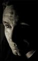
| 06/22/2003 06:29:46 PM | late nightby moondoggieComment: Looks like a computer screen reflecting in your eyes. lol This is a very nice photo. I like the lighting and the low key is nice. Wonderful focus and clarity. i love the detail in your eyes. Nice to meet you. ~Heather~ | | Photographer found comment helpful. |
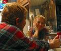
| 06/22/2003 06:27:48 PM | Me, before 10:00a.m.by boyte1Comment: The mirror looks quite dirty to me. I find the specks on the mirror to be distracting. Also, the background in the mirror is quite busy and distracting as well. Focus and clarity on you is good, and I like the angle and idea. Seems strange to have the mirror in your kitchen, but not impossible. ~Heather~ |
|
Showing 911 - 920 of ~2785 |
Home -
Challenges -
Community -
League -
Photos -
Cameras -
Lenses -
Learn -
Help -
Terms of Use -
Privacy -
Top ^
DPChallenge, and website content and design, Copyright © 2001-2026 Challenging Technologies, LLC.
All digital photo copyrights belong to the photographers and may not be used without permission.
Current Server Time: 07/23/2026 10:54:16 AM EDT.
|