| Image |
Comment |
| 02/19/2004 01:09:59 AM |
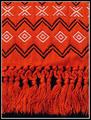
Heirloom Igorot Men's Loinclothby flip89Comment: I like how the white spots kind of stand out of the photo. The bottom section of the photo with the strings looks a little soft focus, but it might just be the way the threads look. something things are hard to make look right. The black background works here. Definately texture. I'm not really sure about the 3D part of the challenge. I don't really understand that much, but this isn't really 3D, but still an alright photo. ~Heather~ |
 Photographer found comment helpful. Photographer found comment helpful. |
| 02/19/2004 01:07:20 AM |
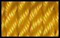
Golden Ropeby agwrightComment: Nice texture. I like how the light reflects off the rope in some places. That makes it interesting to me. Had it all be uniform and all the same color, I don't think this would hold as much interest for me. looks like waves. I like the color and your focus and clarity are really nice as well. great shot for the challenge. ~Heather~ |
| Photographer found comment helpful. |
| 02/19/2004 01:05:47 AM |
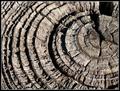
Rough & Readyby boomerComment: Great textures. I like how the lighting/shadows increase the effect of the textures. Focus and clarity are really good, and I like where you have placed this within the frame. The dark space in the upper right is a slight distraction because it is way darker than the rest of the shot, it draws attention to itself. otherwise really nice. ~Heather~ |
| Photographer found comment helpful. |
| 02/19/2004 01:03:53 AM |
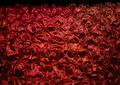
Wrappedby nosherComment: well...it's texture, but to be perfectly honest, I am not very fond of it. I'm not really finding a spot that is in focus. that bothers me. maybe if the lighting were different, and there were not so many shadows or dark spots. I don't know. something just doesn't work here. The color is nice. I like the reds. I also wish the top were cropped off. the black stripe is adding nothing, and creating a distractin from the 'wrapping'. ~Heather~ |
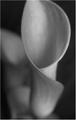
| 02/19/2004 01:01:34 AM |
Calla Lilyby nfesselComment: really grainy. I like the soft focus, it works well here, but I'm not really clicking with this shot. there is something that is not holding my interest. maybe if it were just the front flower, but I'm thinking that the rear flower is taking away something from the shot. black and white works well with the soft focus. ~Heather~ |
| Photographer found comment helpful. |
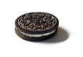
| 02/19/2004 12:59:47 AM |
Got Milk?by blackcanada2001Comment: Definately some texture here. I don't like the shadow though. You could try to place a light source on each side of the cookie and see if that lessens that shadow a bit. Focus and clarity look ok. I wonder too if you could try some kind of an interesting angle, or different placement within the frame. Kind of dead center. Not off enough to really scream dramatic angle. ~Heather~ |
| Photographer found comment helpful. |
| 02/19/2004 12:57:50 AM |
Silhouetteby digitalpinsComment: There are the textures in the ropes. They make lots of nice patterns. I wish this were cropped up a bit. maybe to not show te benches. that way our eyes are automatically drawn up to the bridge and the ropes. The benches really aren't adding anything for me here. I love the lighting. really created itself here, and you have placed it nicely. ~Heather~ |
| Photographer found comment helpful. |
| 02/19/2004 12:56:20 AM |
The Ultraviolet Road Into Infinityby ArcyComment: Light and a 3dimensional surface. This is the first photo yet that has really screamed that to me. A lot of photos are showing texture, and I give them that, but this one shows it by the challenge description. Very nice shot. Love the depth and the colors. quite hard to look at, but I think that's what makes me love it even more. really great for the challenge, and nicely done. One of my favorites so far. ~Heather~ |
| Photographer found comment helpful. |
| 02/19/2004 12:53:16 AM |
Unexploredby rickhd13Comment: I think this is a little too abstract for my own personal taste. Looks like fuzzy carpet, or a rock. Not really sure. There is texture, but can't really tell if it's hard, or soft, or what. looks bumpy. can't really tell if it's in focus or not, since i'm not really sure what I'm looking at. I know some people will just love it, but for me, it's just not my thing. ~Heather~ |
| Photographer found comment helpful. |
| 02/19/2004 12:51:13 AM |
Koosh Textureby PoobaComment: I like the color, and your focus and clarity are really good. definately some texture going on in the shot. I am not sure though if I like the shadows that are going throughout the koosh. kind of makes it look dark, and if there were more lighting that maybe the color could be brought out more. ~Heather~ |
| Photographer found comment helpful. |
Home -
Challenges -
Community -
League -
Photos -
Cameras -
Lenses -
Learn -
Help -
Terms of Use -
Privacy -
Top ^
DPChallenge, and website content and design, Copyright © 2001-2026 Challenging Technologies, LLC.
All digital photo copyrights belong to the photographers and may not be used without permission.
Current Server Time: 07/22/2026 07:24:39 AM EDT.