| Image |
Comment |
| 06/24/2004 12:04:20 AM |
Free At Lastby EddyGComment: I'm loving this shot. My only wish were that it were a bit lighter in the front. Focus and clarity are supurb! Nice crisp lines. The centered placement is good for your subject in this case. I don't mind it at all. The selective color is perfect, and it has overall appeal to me. My only complaint is the darkness in the front. Wish I could see more there. Otherwise, wonderful! ~Heather~ |
 Photographer found comment helpful. Photographer found comment helpful. |
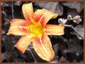
| 06/24/2004 12:01:56 AM |
Morning Rainby OneSweetSinComment: Very bright. The color really makes your subject stand out of the background. Nothing distracting there. Focus and clarity are good, and the little water droplets really add some interest to the shot for sure. I like how the flower is 'facing' the left, and your border looks alright to me. It's not strong enough to distract from the subject, it's subtle. I like it! ~Heather~ |
| Photographer found comment helpful. |
| 06/23/2004 11:59:54 PM |
Blue Eyes Cryingby NeuferlandComment: The area to the left of his eyes, is distracting. Everything else around him is light colored, then the black shapes to the left really stand out. Moreso than his eyes I'm afraid. Looks like the lighting is a bit harsh on his shirt to the right of the photo, and a bit dark on his forhead. focus and clarity are good, and I like the detail. ~Heather~ |
| Photographer found comment helpful. |
| 06/23/2004 11:57:52 PM |
Graffitiby TooCoolComment: While this does fit the challenge perfectly, I'm not really feeling any wow here. Focus and clarity are good, and lighting is alright, and the angle and framing are ok too. Just not drawn in and kept there. Technically, it is a good photo, but not my cup of tea. ~Heather~ |
| Photographer found comment helpful. |
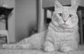
| 06/23/2004 11:55:34 PM |
The Pink, Wet Snifferby mirdonamyComment: I like where you placed the cat within the frame of the photo. The little splash of color is really nice. I'm thinking though, how it would look with JUST the eyes in color. They are piercing eyes really, and they are a slight greenish color on my comp, unless it's just my eyes playing tricks on me, since my computer is green. lol. Anyway, I'm staring at the eyes, and the nose is then a bit of a distraction. Focus and clarity are great, and the lighting and tonal range looks good to me as well. Very nicely done. ~Heather~ |
| Photographer found comment helpful. |
| 05/20/2004 08:58:36 PM |
Loosen up!by FotowereldComment: The lighting looks strange here. Like maybe your white balance was goofy. the background just seems very odd. otherwise, I think it's an alright photo. nothing really 'jump out of my seat' exciting, but technically well done I believe. other than the strange color. ~Heather~ |
| Photographer found comment helpful. |
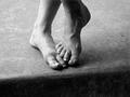
| 05/20/2004 08:54:00 PM |
Sandi's Feetby scribeComment: The dark area at the bottom is a distraction for me. The very strong diagonal doesn't add to the subject here. I do like the subject, and it's quite centered. focus and clarity are really good, and the lighting is good as well. I like how the left side is light and the right side is dark. Overall quite nice. ~Heather~ |
| Photographer found comment helpful. |
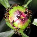
| 05/20/2004 08:48:54 PM |
Peony Helpersby dphillipsComment: Lighting is way too harsh here. There is a light glare on the peoney, and bad shadows on the right side. looks like you used direct flash. it didn't work in this situation.This shot has a lot of detail, and I think that it could be a really nice shot if you could find a better way of lighting it. ~Heather~ |
| Photographer found comment helpful. |
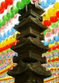
| 05/20/2004 08:45:41 PM |
Pagoda & Laternsby JoviComment: Definatley different. like al the color. I wonder how this would look with the lanterns out of focus. If you could make just the pagoda in focus and the lanterns out of focus, wonder how it would look. maybe something to try anyway. focus is good, and I think that the lighting is good as well. I like the shadows on the pagoda. only spot that is a bit of a distraction is the white sky showing through the lanterns in the upper left. ~Heather~ |
| Photographer found comment helpful. |
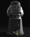
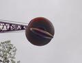
| 05/20/2004 08:43:48 PM |
Headache Ballby DrakeComment: It's definately centered, but it's not very interesting. The background seems speckeled, like noise or something. looks like this was taken with a point and shoot camera, which I can sympathize with. The focus seems a bit soft, but could be a lighting issue. The sky seems very dull as well. Wish there could have been some blue there, or some clouds. ~Heather~ |
Home -
Challenges -
Community -
League -
Photos -
Cameras -
Lenses -
Learn -
Help -
Terms of Use -
Privacy -
Top ^
DPChallenge, and website content and design, Copyright © 2001-2026 Challenging Technologies, LLC.
All digital photo copyrights belong to the photographers and may not be used without permission.
Current Server Time: 07/21/2026 02:41:37 AM EDT.