| Image |
Comment |
| 10/12/2004 11:53:27 PM |
Alien Treeby tasha4pawsComment: Looks like darn near the whole tree...but it isn't, so I guess it still fits the challenge. I was wanting to see more macro type shots of a small part of something. I'm thinking that the color has been altered on this, and it looks very unnatural and unappealing to me. The color doesn't add to the photo at all for me. I close up of one of the branches might have been a better choice than almost the entire thing, but that is just my opinion. Focus seems a bit soft. The background has no distracting elements, so that's good. ~Heather~ |
| 10/12/2004 11:50:17 PM |
A part of my friendsby taroeiraComment: I'm not so sure I like the blue tint the photo has. it doesn't really add to the photo in any way. Focus seems soft in a few places, and the lighting is bright on the lower 2 people. I do think this is a creative interpretation of the challenge and fits the challenge well. ~Heather~ |
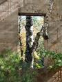
| 10/12/2004 11:43:15 PM |
inside outsideby speaseComment: I do supose this is really only part of what you were seeing, but I'm thinking that ANY photo could really pass as a 'part' of what you were seeing. I was thinking this would be more like a macro type challenge. That being said. I still like the photo. I think that it's got a real dreamy feel. Focus and clarity are good and lighting is what makes the photo for me. Overall nice. ~Heather~ |
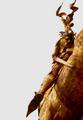
| 10/12/2004 11:38:07 PM |
The Golden Maid of Orleansby edc1Comment: Looks like someone riding an animal. Interesting angle, and the background isn't at all distracting. I wonder is this a statue? Lighting seems good, and I like the color. Definately something interesting to look at, even if I'm not really quite sure what it is. Focus and clarity are good, and I think the placement of the subject within the frame is what makes the photo what it is. Overall nice shot. ~Heather~ |
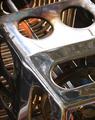
| 10/12/2004 11:35:37 PM |
Burningby kirstiComment: While this does portray part of something, it doesn't really hold my attention very well. Technically, I think the lighting is ok, especially for being such a shiny object, however, there center is a bit bright, and the left side a bit dark. Focus seems a bit soft. My eyes just aren't finding a place to rest. ~Heather~ |
| 10/12/2004 11:27:20 PM |
Selfportraitby DvanComment: Your focus and clarity are really good. We get to see great detail in your face, including lines and stubble. The background, although it's simple, is a bit of a distraction. The is so much texture in the background, I find myself staring at the background as well. I like this in black and white. Lighting appears ok. I might have liked to see a bit more lighting in the eye, but otherwise good. ~Heather~ |
 Photographer found comment helpful. Photographer found comment helpful. |
| 10/12/2004 11:24:45 PM |
neglectedby willemComment: I like the textures. The focus and clarity really help to bring out the textures in the peeling wood. Very simple shot, but lots to look at. I also think that the lack of color really helps to bring out the texture as well. Nice lighting and the angle and framing are good as well. Can't find anything technically that I would improve and visually your photo is interesting and holds my attention. definatley reflects the challenge. I also love the placement of the round circle part within the photo. 10 from me. ~Heather~ |
| Photographer found comment helpful. |
| 10/01/2004 02:46:05 PM |
Breaking Throughby muur88Comment: While I'm sure it was a magnificent sight to see, I don't think the camera was able to capture it how you must have saw it. The colors seem dull. Dead looking grass, blown out sunrays, and dark green water. I think had there been more of a reflection in the water from the sun, maybe it would have been different. But then again, who am I to question the masters. ? It's not like I have produced anything better. ~Heather~ |
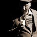
| 10/01/2004 02:42:12 PM |
An eye on the cider press.by jjbeguinComment: While I like the lighting, there are a couple shadows that I wish weren't there, and I supose you can't have both. lol. The shadow from his collar is so very sharp that it draws my attention greatly. And I wish I could see his eyes. He's a lovely old man. Much personality in his face and lines. It makes me smile. ~Heather~ |
| Photographer found comment helpful. |
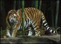
| 10/01/2004 02:39:46 PM |
Prowlin'by karmatComment: Who am I to tell a "master" anything, but the colors here seem pretty dull. I took it into the AOL edit photo and hit auto enhance and it made a WORLD of difference. Made the whites whiter and the orange stand out so much more. I guess it just seems dark as is. Focus seems ok and the environment looks good with the tiger. Nothing distracting. ~Heather~ |
| Photographer found comment helpful. |
Home -
Challenges -
Community -
League -
Photos -
Cameras -
Lenses -
Learn -
Help -
Terms of Use -
Privacy -
Top ^
DPChallenge, and website content and design, Copyright © 2001-2026 Challenging Technologies, LLC.
All digital photo copyrights belong to the photographers and may not be used without permission.
Current Server Time: 07/19/2026 03:45:45 AM EDT.