| Image |
Comment |
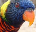
| 11/02/2004 11:39:04 PM |
Brillanceby xtabintunComment: You couldn't find anything better to enter that an almost exact replica of a photo you've already entered? I think all the comments you got on the last one apply here as well. Except that it does't meet the challenge. lol Can't go wrong in a free study, unfortunately I don't see it doing much better in this challenge than it did the last. I think your lighting was very bad for this shot, and that hurt it a lot. The only improvement I see in this one over the last is that it's not cropped so tightly to the beak. |
 Photographer found comment helpful. Photographer found comment helpful. |
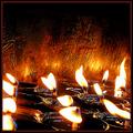
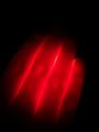
| 11/01/2004 12:48:15 PM |
The Lights Of Johkang 2by Justin EvansComment: Definately different. I love the background. The slight reflections of the flames on the wall look nice. Fire is hard to perfect, but I think you did a nice job. I also like the random blue throughout the photo. nice. ~Heather~ |
| Photographer found comment helpful. |
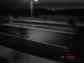
| 11/01/2004 12:45:40 PM |
lonelyby Pictar500Comment: What is this? Looks like a road at night maybe? focus seems really soft and the lighting is so low I can't really make anything out. The date stamp is very distracting. Doesn't add to the photo in any way. Generally people turn those off for taking quality photos. Would you sell this photo with that stamp on there? Probably not. |
| Photographer found comment helpful. |
| 11/01/2004 12:03:41 AM |
Swingin' by KonadorComment: Absolutely LOVE it!! Crisp, clean, screams music. Nothing more to say! Definately a 10. |
| Photographer found comment helpful. |
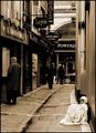
| 10/27/2004 12:37:13 AM |
rich in spiritby MR_PComment: Aww. This is very sad. Cute kid. I wish the lighting on the kid were a bit better, but still very emotional shot. Excellent choice for the challenge. ~Heather~ |
| Photographer found comment helpful. |
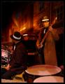
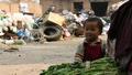
| 10/27/2004 12:17:36 AM |
Photographic Poverty?by SteveJComment: Humorous outlook on the subject. The photo itsself seems grainy and I think that's what you were going for, but I don't prefer it. usually, I would cringe at the sight of a cropped off head, but strangely enough, I feel that it works in this photo. Kind of like a shame thing. overall nice take onthe challenge. ~Heather~ |
| Photographer found comment helpful. |
| 10/27/2004 12:15:31 AM |
Single Handedly, Waging His War On Poverty.by fulgentComment: Definately says poverty. Makes me want to go collect bottles so I can get me a Nike jacket. Focus is a bit soft, and lighting conditions seem to have been poor this day? I wonder if you played with the levels if that might give this a bit more punch. Good representation of the challenge though. |
| Photographer found comment helpful. |
| 10/27/2004 12:12:15 AM |
Any spare change...? by BrookiedComment: Beautiful. Stunning image. Crisp, clear, and gets the point across very nicely. The lighting is perfect, angle is perfect. 10 from me. Very nice. |
| Photographer found comment helpful. |
| 10/12/2004 11:58:56 PM |
Digitsby GraciousComment: Definatley neat to look at. I think we've all done this at some point in time of our life. I like the way you have placed it in the frame of the photo, and I like how we only see a portion of the hand. Come to think about it, very important for the challenge. lol. Seems a bit grainy, or maybe it's just the texture of the hands in the dark, unsure, but taking a shot in low light like this is tricky, and I think you have done a nice job with it. ~Heather~ |
| 10/12/2004 11:56:46 PM |
Espada de Toledoby VangelisComment: Give this a slight rotation to the right, this photo is driving my OCD crazy. lol. It's got a slight left tilt, and it's not enough to make it a dramatic tilt, however not straight enough to be accurate. I think the subject is too centered. Maybe a diagonal angle could have added some interest for me. maybe make it coming out of the lower left corner? I love the background, nothing distracting there. Lighting onthe upper portion of the subject is a bit dark. Overall interesting to look at. ~Heather~ |
| Photographer found comment helpful. |
Home -
Challenges -
Community -
League -
Photos -
Cameras -
Lenses -
Learn -
Help -
Terms of Use -
Privacy -
Top ^
DPChallenge, and website content and design, Copyright © 2001-2026 Challenging Technologies, LLC.
All digital photo copyrights belong to the photographers and may not be used without permission.
Current Server Time: 07/19/2026 02:26:08 AM EDT.