| Image |
Comment |
| 11/10/2004 01:48:22 PM |
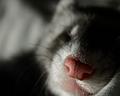
Cute as a Buttonby moviemanComment: oh what a precious little fuzzy. mine wont stay still long enough to get her picture. Definately an extreme close up, great DOF and focus and clarty are right where they should be. Background is nice, only complaint is the light area that looks like it's coming out of her head. I like the texture and lighting really makes this photo. Very wonderful shot. Good luck in the challenge. ~Heather~ |
 Photographer found comment helpful. Photographer found comment helpful. |
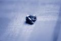
| 11/10/2004 01:46:43 PM |
Hockey Pre-Gameby TommyMoe21Comment: Ohh...I like it! Not sure why, but lots of texture and detail here! The background is great, nothing distracting about that. Focus and clarity are awesome. The angle and framing/cropping are great. Wow. Lighting is also perfect. My second 10 so far. (out of 50) Very nice shot! Good luck in the challenge. ~Heather~ |
| Photographer found comment helpful. |
| 11/10/2004 01:44:27 PM |
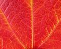
Veins of colourby debbybrisComment: This is almost identical to another shot I have already commented on. Really, the same goes for this shot as the other one. I think the the focus and clarity are really good, and the lighting is nice. Beautiful color. I wonder though if it might add some visual appeal had the 'V' of the veins been coming out of a corner or something. Maybe just a bit too centered? ~Heather~ |
| Photographer found comment helpful. |
| 11/10/2004 01:38:20 PM |
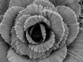
Hoarby sulisComment: Guessing by the title, you were going for the frost? However, you can't really tell that the photo even has frost if that's what you were going for. Honestly, I'm thinking that this will look too much like a flower to most people and you will be scored very lowly. It looks like a leafy lettuce type vegetation to me, but I could be wrong too. I don't like the use of black and white here. I think it adds nothing to the photo. Focus seems ok, but it's still hard to tell what we're looking at. ~Heather~ |
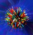
| 11/10/2004 01:31:06 PM |
"Fireworks" Macroby wetlandComment: Definately colorful. I appreciate your attempt to be original and make this 'burst'. Different. Lighting appears to be good, gets a little dark in the lower right hand corner. Focus is good. I wonder though if you could have placed the subject somewhere other than directly in the center of the photo. Put a little angle on it, could boost the visual appeal some. ~Heather~ |
| Photographer found comment helpful. |
| 11/10/2004 01:28:43 PM |
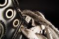
Rustic Scentby GUYinaTIEComment: I'm not getting any feeling of 'scent' from this shot. Unless of course it still smells of new leather. I guess that could be a scent. I like the close up. From the thumbnail, you really couldn't tell what it is, but when you see the larger version and the body hairs, you can then tell it's a piece of jewlery. The texture is nice, and I like the patterns. Lighting is good as well. DOF is appropriate and focus and clarity are right where they should be. Interesting shot. At least it's not an eye. lol ~Heather~ |
| Photographer found comment helpful. |
| 11/10/2004 01:21:16 PM |
One Inchby debitiptonComment: Interesting texture on the ruler, but unfortunately, I don't find the subject that exciting. Technically it's pretty well done, points for that. I like how the lighting is bright on left, but I'm not too fond of the shadow near the bottom side under the ruler. one thing I CAN say...at least it's not another eye. lol ~Heather~ |
| Photographer found comment helpful. |
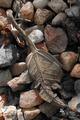
| 11/10/2004 01:19:21 PM |
screwed?by Gareth S.Comment: These sure are cute. I love the color. makes it that more interesting. I like the softness of the photo. Not really sure why, but it does work. Lighting is great. and I think that putting them right in the center of the photo works here. I don't usually like that, but it really does work here, proving there's always exceptions. Nice background, nothing distracting about that. Simple and lovely. I like it! ~Heather~ |
| 11/10/2004 01:17:18 PM |
dead leafby GinaRothfelsComment: I think what I would like to see for THIS challenge "Extreme" close up is an extreme close up of this leaf. Get right in on the 'veins'. That would be some amazing details. Showing the entire subject doesn't really feel like extreme close up to me. I do like the subject, focus seems ok and lighting is alright, maybe a little dark in places but for the most part pretty good. ~Heather~ |
| Photographer found comment helpful. |
| 11/10/2004 01:15:08 PM |
Tax Dayby alonzo76okComment: The color seems dull. I wonder if you played with the saturation a bit if that would make this punch some. DOF is good. Focus is right where my eyes want to put it. Not an overly exciting photo, however, decently done. Lighting is good, no bright spots or distracting shadows. ~Heather~ |
| Photographer found comment helpful. |
Home -
Challenges -
Community -
League -
Photos -
Cameras -
Lenses -
Learn -
Help -
Terms of Use -
Privacy -
Top ^
DPChallenge, and website content and design, Copyright © 2001-2026 Challenging Technologies, LLC.
All digital photo copyrights belong to the photographers and may not be used without permission.
Current Server Time: 07/18/2026 09:52:11 AM EDT.