|
|
|
Showing 391 - 400 of ~2785 |
| Image |
Comment |
| 04/14/2005 11:14:29 AM | Quack all Night (and party every Grape)by TelehubbieComment: *Critique Club*
The first thing I notice about this shot, is that if I didn't know that I was suposed to be looking for it, I would not notice that there was water in the shot at all. I see the reflection of the blue kiss background on the 'floor', which leads me to believe that is where your water is, but it is not very obvious.
I like the lighting very much. I like how the 'duck' is lit nicely, and the background is just kind of hanging out in the background, but yet you can still see it and it's detail. If that makes any sense. I like how the background also ties in with the duck. Not just another plain blue background.
Focus and clarity are great. The focus on the duck is right on. We get very nice detail in the duck.
The one thing that I see that could be played with for improvement maybe is the strong horizontal line. The photo is divided almost directly in 1/2 at the bottom of the blue background. We might have a slightly different angle that moves that division down just a bit so that we see more upper light blue and less of the 'stage'.
Other than that, I think this is a nice take on the challenge and very creative use of 5 grapes, a duck, and a blue background.
~Heather~ |  Photographer found comment helpful. Photographer found comment helpful. |
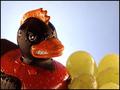
| 04/14/2005 11:01:32 AM | Whaddya mean 'Yellow'?!?!?by coldaComment: *Critique Club*
I like the closeness of this shot. It shows nice detail, especially in the water drops. The DOF is good. I like how the tops of the far grapes are softer focus and everything else is in great sharp focus. Lighting is perfect. Nice even lighting throughout. Color is great as well.
The only thing that I see that could be something to try differently would be the seperation of the photo. The 'seperation' line is directly in the center of the photo. Left 1/2 of the shot (from tip of ducks beak leftward) is heavy and dark in color, and the right side (from tip of ducks beak rightward) is bright in color. Puts a lot of weight on the left side of the photo.
Other than that, for a shot of a duck with 5 grapes in water on a blue background, this is a very nice shot. I really see no need for major improvement anywhere. Very nice job. ~Heather~ | | Photographer found comment helpful. |
| 04/14/2005 10:42:58 AM | Sweet Transvesduckby utroComment: *Critique Club*
A duck and grapes in a dish sitting on something blue. Seems quite a few people had that idea. Yours becomes a little more interesting since the duck is a 'duck of a different color' so to speak.
The photo seems a bit dark except on the right side of the duck. It seems that it should have been brighter with 3 lightsources. Or I should say, I would prefer it if it were a bit brighter.
Is the small ring in the bottom of the dish a ring on the dish, or the water. It's really hard to tell. That being said, the water doesn't seem strikingly obvious. Not sure how that could be 'fixed'. And that detail is only important for the purpose of meeting the challenge anyway. I think that it's a decent photo with or without water in it.
There's a bit of a bright spot on his shoulder and compared with the darkness of the rest of the photo, it's a bit of a distraction.
Focus and clarity seem good, and I like the angle at which you took the photo at. It's not just a head on shot of the duck on a plate, you added some angle and that definately adds to what COULD be a boring shot. Overall, interesting shot which could stand to be a bit brighter. ~Heather~ |
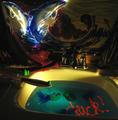
| 04/14/2005 12:19:35 AM | Green Grape quintette skinny dip with Devil Duckie (spot light, lazer, and fiber optic)by beafliesComment: *Critique Club*
As many have stated, this does appear to be a very busy photo. It does have all the elements that it requires for the challenge, although a little difficult to see right away, when you take the time to look at the photo, the elements are all there.
Focus seems right on for such a dark shot. The faucet seems very crisp in focus and nothing appears blurry.
The theme is cute, definately original.
I will comment on a few things. I don't particularily care for the word duck written in the water. It seems out of place to me, and adds to the busy-ness of the photo. I am wondering also if the water could be just a solid blue, and that would cut out the extra blue splotches, and clean up that area of the photo. Another suggestion would be to have used a solid color for the background. I see something that looks like a wave, but it looks like a cloth of some sort. Maybe a solid color for that would have cleared up that area of the photo. I like the dolphins, that's really my favorite part of the image, but I don't feel like they fit in well with the rest of the photo. So, if you seperate the photo into sections, it doesn't seem bad at all. All nice elements, but together they seem to clash a bit.
There is a very white area on the sink near your 'plank' that draws a lot of attention, so when trying to figure out what's going on on the plank, I keep noticing that white/bright area.
The grapes are cute. Overall, it looks like a fun image, a little busy, but has lots of good elements. ~Heather~ | | Photographer found comment helpful. |
| 04/13/2005 12:51:24 PM | By the Seaby cloudsmeComment: *Critique Club*
Very nice crisp image. Focus is great. I like the clarity of the main subject. Bright colors add to the visual appeal of the duckies. Speaking of Duckies, the challenge did call for ONE duck. You got many DQ requests and the SC vote was split decision on weather to DQ or not, so I think you got lucky on this one.
Your strong horizon line is leaning slightly to the right. I don't know if that's a real body of water or a photo of water, but I think that it works well either way with the subjects.
It's hard to take a challenge like this seriously under the circumstances, but you did a very good job (except for the 2 ducks instead of one). I am not sure what the 3 light sources are, but the lighting is very good either way. Very nice set up, fun image and appealing to look at. The border also works well with this shot in my opinion. ~Heather~
| | Photographer found comment helpful. |
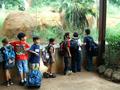
| 12/07/2004 11:30:29 PM | "Okay... children... time to go"by aukipaComment: yup, 7 kids. while I feel that it is a technically well done photo, It is not drawing me in personally. the kids look bored and we can't see what they are looking at either. focus and clarity are ok, and I like the background, it's interesting as well. colors are real vivid and lighting looks good too. ~Heather~ | | Photographer found comment helpful. |
| 12/07/2004 11:28:25 PM | The Unluckiesby echo68phComment: Definately 7 of your subject. I like this shot a lot. Not sure why. Simple and pleasing. I like where you have placed the nails within the frame of the photo. definately better than dead center. I like the background, nothing distracting there. I like focus and clarity and overall a great image. good luck in the challenge ~Heather~ | | Photographer found comment helpful. |
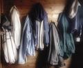
| 12/07/2004 11:07:07 PM | Ready for Winter (Seven Coats All in a Row)by Judith PolakoffComment: I like the soft feel of this photo. like lighting is really nice as well. Focus and clarity are really good, and the placement of the subjects within the photo is nice too. I really like this shot. nothing distracting, but if I had to complain about something, it would be that the hood on the middle coat seems dark compared to the rest of the shot, small detail that doesn't hurt the photo, rather an observation. ~Heather~ | | Photographer found comment helpful. |
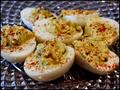
| 12/07/2004 11:00:17 PM | Deviled or Stuffed?by jamminjjComment: This photo is really hard to look at. There is so much clashing texture with that plate in the background that I think it just doesn't work. also I think the DOF doesn't work here. too shallow. there is way too much of the photo out of focus. definately sore on the eyes. you do have 7 of the subject, so right on with the challenge. ~Heather~ | | Photographer found comment helpful. |
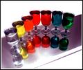
| 12/07/2004 10:52:21 PM | Taste the Rainbowby bobdaveantComment: I have pondered this photo for a long time. I have come to the conclusion that it's missing something for me. the lighting is harsh in many spots, you don't have the colors of the rainbow correct, and the line up seems totally random, with no organization what so ever. I like the color, and I like the idea. you definately have 7 of your subject. ~Heather~ |
|
Showing 391 - 400 of ~2785 |
Home -
Challenges -
Community -
League -
Photos -
Cameras -
Lenses -
Learn -
Help -
Terms of Use -
Privacy -
Top ^
DPChallenge, and website content and design, Copyright © 2001-2026 Challenging Technologies, LLC.
All digital photo copyrights belong to the photographers and may not be used without permission.
Current Server Time: 07/18/2026 08:37:58 AM EDT.
|