|
|
|
Showing 371 - 380 of ~2785 |
| Image |
Comment |
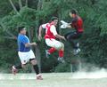
| 04/24/2005 11:30:17 PM | Es mi bola!by mischffComment: *Critique Club*
Now this is some extreme action. Congrats on capturing this very neat scene.
The things I notice about this are things that have already been mentioned, but something that I don't think was mentioned is that the ball seems odd. It might be cause it's a different kind of soccer, but it seems like a different kind of ball. Shiny and no lines.
The background seems a tad dark, but I think that is ok here since the subjects are light and they stand out on the dark background. The only issue I see with the background is the garbage bin, but it's not like you could have just walked over and moved it anyway.
The whites do seem a tad too white in comparison to the rest of the photo.
Focus is also slightly a bit too soft. I wish this were more 'stopped' kind of like frozen in time, but you don't get this shot every day, I'm sure. I think I'd like to see the faces with more detail.
I like the framing, and I also like the dust coming from the ground. Really creates the feeling that something serious is happening there.
Love the scene in general. great capture of the 2 guys battling it out in mid air.
Very nice. ~Heather~ |  Photographer found comment helpful. Photographer found comment helpful. |
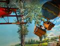
| 04/24/2005 11:17:48 PM | Extreme Rides...by DrakeComment: *Critique Club*
3 comments and they all ask questions. lol. I wont ask cause I know where this is.
While I like the background, I don't think it's a good background for a photo. It seems busy and interrupts the subjects.
The action is good. I think it definately shows action. I'm not so sure about 'extreme', but it works non the less.
Lighting seems just a tad dark to me. Of course cause it's not the best lighting in the world, but I'd like to see more light on the subject.
The plane is a distraction, since it is 'still' while the balloons are the action, and each takes up an equal amount of photo space. I think I'd like to see more balloon and less plane. Not quite sure how you would accomplish that, but it's a thought anyway.
This is definately not your best work. And actually, am sitting here staring at the Febuary 17th Neighbors section of the Battle Creek Enquirer and see your name all over it.
I really think it's the background that distracts from the overall visual appeal of this shot. While it is a lovely background all by itself, it doesn't seem to work with the 'action'. Definately not something you can fix in this situation, but would definately be better had there been another option.
~Heather~ | | Photographer found comment helpful. |
| 04/24/2005 04:44:00 PM | Forsakenby DiComment: *Critique Club*
The first thing that jumps right out at me is the fact that the entire barn is not in the photo. It gives the appearance that you were driving by, and took the shot as you were speeding by and 'missed'. I am not saying that is what happened, but that it the impression that I get without having the entire barn in the photo here.
Also the colors seem dull. I realize that there isn't much color in the photo at all, but to me, leafless trees just don't seem to accent a photo very well. I think this particular photo would have higher visual impact in say a fall or summer setting.
Being from Michigan, I know how crappy the skies usually are, and how we don't get too many beautiful lighting days, so I definately understand, but doesn't change the fact that I think a little color could do some good.
Focus is a tad soft. I would definately like to see a crisp focus on the front of the barn to show some nice detail in the boards. I particularily like the ones near the top that are kind of peeling away.
This fits the challenge very well, there is no doubt in my mind that this is an abandoned building.
~Heather~ | | Photographer found comment helpful. |
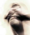
| 04/24/2005 01:48:38 AM | On the verges of sanityby nico_blueComment: *Critique Club*
Well, I'm not really sure what to say about this. I supose some will love it, some will hate it. I unfortunately am in with the group that will not like it. I only have my opinion to offer, since this is quite abstract to me.
The dark thing,, that is going horizontal across the dead center of the shot (I don't know what it is) stands out quite a bit and kind of divides the photo in half. Not knowing what it is, is a bad thing to me, since I think I'm trying so hard to figure out what it is that i'm even looking at, that I don't even see the rest of the photo unless I force myself to look...in other words, it's a distraction to what I feel is suposed to be the 'main focus' of the photo.
The only thing you can really recognize out of the photo, is a mouth, and that's not really clear. No, I could not tell that 1/2 the mouth is smiling and 1/2 is grimacing. It's all kind of a blurry jumble of something really.
I like the 'sepia-ish-ness' I agree that had this been in color, it might have been a complete disaster. I also can appreciate the background. It's a very good thing that there is nothing in the background that is distracting or making more shapes/patterns to clutter up the photo in that way.
I'm not sure about the crop. I'm wondering if having the face/neck in the lower right corner, with a little more negative space to the upper left might have a different appeal?? Something that could be tried anyway.
I hope you take this as just one opinion, and don't take it personally. A lot of people will like it, it's just not my cup of tea. You like it, and that's all that really matters anyway.
~Heather~
| | Photographer found comment helpful. |
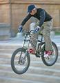
| 04/23/2005 04:37:14 PM | Airtime!by jmleliiComment: *Critique Club*
The first thing I notice about this is that it seems to be a bit light. The background is light, which doesn't really bother me, other than the fact that it makes it look like the lighting wasn't the best for the shot.
The one thing that does bother me about the lightness of the shot is the wheels of the bike. My brain says that they should be black, but they are kind of a muted grey. This, being an advanced editing challenge, could have easily been adjusted in photoshop, if even selectively. His shirt seems to be dark in comparrison with the rest of the photo. And that looks a bit odd, but still ok.
Focus is a bit soft, obviously due to the 'action'. Shutter speed could improve that, and possibly better lighting conditions. Something totally out of your control at the moment, but non the less, something that could have been better if different.
I wish that it were more obvious that he was jumping down stairs. With the blurred background like that, it makes it look like just different colored tiles on the ground or something. I didn't realize they were steps until reading your description. I guess that would mean that it seems like it has no depth.
I think the shot definately says action though. Maybe would seem more 'extreme' if it were more apparent that he were jumping down stairs.
Who wears blue socks with red shoes anyway?
~Heather~ | | Photographer found comment helpful. |
| 04/23/2005 03:48:02 PM | Slidingby stupidcatComment: *Critique Club*
I think Tuckersmom has a good point. The crop would definately be more effective had it been showing her hand and feet. While it seems like such a small detail, it seems to have a major effect on the overall appearance of the photo.
The lighting seems quite harsh, which I'm surprised no one mentioned already. Her legs and hair are blown out and quite bright, while her face is in shadows. I wonder if the only way to 'fix' this would be to retake the shot at a different time of day. I realize that this exact shot only comes once in a lifetime, but I'm sure you could have gotten different shots that were equally as cute as this, and have had better lighting to work with. Just takes time and lots of shooting.
I like the angle you chose for the shot. The diagonals are appealing and well placed within the photo. I like how the diagonals are lower in the photo to the bottom left corner and not dead center in the photo.
Focus seems a bit soft to me. I'm wondering if a faster shutter speed is possible, or even available.
As far as 'extreme' action, I don't think it seems extreme to me, she actually seems to just be kind of floating on air, but with her hair blowing around, it does show action.
Overall a cute photo, definately one to keep. ~Heather~ | | Photographer found comment helpful. |
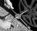
| 04/19/2005 12:15:59 AM | X-Filesby jeromComment: *Critique Club*
I see that you have not found any of the 56 comments you have received as helpful, so I hope I can offer some useful words on this photo.
I've looked the shot over and over, and actually, this is technically a very well done shot.
Focus and clarity are great. I like the detail in the rocks and wheel and even some texture on the lug wrench itself.
The tones are good. Very nice contrats. Someone else said it I think, but I agree that while there really aren't many whites in the photo, they are there, and that you got a nice range of tones.
The angle and framing/cropping is good. I like how you have the lug wrench all in the photo, but the person out of the photo ecept for the hands. The X being in the very center of the photo does not bother me here. I think it works very nicely for this photo.
I'm not drawn into the photo. I think there is something lacking for visual appeal. Maybe it's just not the most exciting of subjects.
Overall, technically very well done, but lack visual appeal. ~Heather~
|
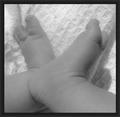
| 04/18/2005 11:37:59 PM | Very Valuedby mlhop05Comment: *Critique Club*
This is a very precious shot. I think it is definately one to treasure.
The lighting does seem bright though, since the photo doesn't have much contrast. There's not a large range of tones. You may have done this on purpose, but I think I would prefer it with a wider range of tones.
Focus does seem soft, but that does not bother me with this image. What does distract a bit is that the blanket seem more in focus than the tiny feet, which puts a little more attention on the blanket rather than on the feet. It's not a huge deal, but something I notice.
I like the angle and framing/cropping. The centered placement of the feet works for this shot. Doesn't always work for all shots, but this one it does.
What does not work is the border. I think that with such a soft, tender photo, the enormous black border kind of overpowers the subject. A small border, I think, would work better.
There also seems to be a bit of grain/noise in the feet. Not noticable in the blanket, but you can see it some in the feet. I don't really know how to fix this other than maybe a noise reduction software.
Overall a nice photo to look at, but could benefit from different lighting/contrast. Still very nice.
~Heather~ | | Photographer found comment helpful. |
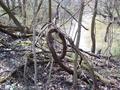
| 04/18/2005 11:25:17 PM | cursive eby booneComment: *Critique Club*
I think that the 'cursive e' is clear in the photo, but there are definately a lot of distracting surrounding elements. The photo is very cluttered with other trees, branches, sticks, leaves...etc.
The entire photo is all a very similar color. Muddy brown. That lacks visual appeal to me.
I am not sure how you could have captured this shot without the other elements or with any variation in colors, so I don't think that this shot could be improved upon. I think that the best decision here would be to have chosen a different subject.
Focus seems a tad soft, I think I would like to have seen some detail in the bark. A crisper focus with a little lighting ON the subject could have brought out some more detail.
Overall I like the cursive e, it is definately original, but the photo of the cursive e just doesn't draw me in.
~Heather~
|
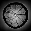
| 04/18/2005 12:45:39 AM | "O"by elsapoComment: *Critique Club*
While this is a very nice photo, I guess I am not drawn into it quite as much as most of the voters.
I find the bright outline around the very edge of the lemon to be odd and actually makes it look like it was cut and pasted. I'm not saying it was...just kind of looks that way with the combination of the gradient background and the glow around the edge of the lemon.
The focus and clarity are wonderful. Stunning detail with the veins. For the challenge, I see the importance of having the entire slice of the lemon in the photo, but I think that outside the challenge, I would like to see this as not so centered. Maybe fill just the upper left corner with 1/4th of the lemon or something. Just an idea.
I like the black and white because I think that it helps bring out the texture/detail in the veins, but can't help but wonder what this would look like with some color.
Overall a very nice pic with awesome detail and fits the challenge, but I'm not totally drawn in.
~Heather~
Edit to add that when I viewed this photo from the thumbnail in your profile, I could not see the bright ring around the very outside of the lemon, and this did have higher visual appeal (in that aspect) from the thumbnail. Message edited by author 2005-04-18 00:49:59. | | Photographer found comment helpful. |
|
Showing 371 - 380 of ~2785 |
Home -
Challenges -
Community -
League -
Photos -
Cameras -
Lenses -
Learn -
Help -
Terms of Use -
Privacy -
Top ^
DPChallenge, and website content and design, Copyright © 2001-2026 Challenging Technologies, LLC.
All digital photo copyrights belong to the photographers and may not be used without permission.
Current Server Time: 07/18/2026 01:46:30 AM EDT.
|