|
|
|
Showing 361 - 370 of ~2785 |
| Image |
Comment |
| 04/27/2005 10:26:16 PM | A Shady Characterby RulerZigzagComment: *Critique Club*
OK, first thing that stands out as a negative here is the corner of the TV. There's a little section of background that is a slight lighter color than the TV and it's in the upper left. With you being in the lower left, I think that it's a bit of a distraction from you.
Focus and clarity look great, especially for being a low light shot.
I love the framing/cropping you chose. I think the negative space works really well in a shot such as this.
Side note...I really REALLY want a Snickers candybar right now.
The lighting in my opinion is great. I like how it hides features and shows others. This photo shows that you can still be a 'tough guy' and still 'pose' for photos.
I personally think this should have scored higher, but I'm a little odd like that anyway. Nice one.
~Heather~
|  Photographer found comment helpful. Photographer found comment helpful. |
| 04/27/2005 12:37:28 AM | Graffiti Gooseby christinamtoddComment: *Critique Club*
This image came up for me last night, and I have pondered it all day on what to say that could have made this photo more visually appealing to me. I am glad I waited to comment, as I can now see your comments and how you feel about your image and placing.
My first advice is to not give up. A free study challenge is a tough one to get a score in, and actually, you got a 4.3, which isn't that bad. If we were told how to vote (guidelines) then there would be no point in voting at all. I think the voting is done a lot on visual appeal, which, if you were going to buy something to hang in your livingroom, wouldn't you chose something you liked? Isn't it possible to like something that's not technically perfect? Is it possible to hate something that IS technically perfect? I think so. It's all about opinion. And for the photos that are going in your album, the only opinion that matters is yours. However, if you are looking to improve your photography to be appealing to the masses, then use this as a good learning tool. Why would you want to appeal to the masses? Some people sell photos, some are pet photographers, some are wedding photographers, some take event photos, some take pics for magazines or newspapers. For those shots, the photo needs to appeal to the masses. That is what this site is for. A learning tool to improve your photography to appeal to the masses.
Ok, now on to your photo.
This critique is how this photo could be improved to make it more visually appealing to ME, and ME only.
The very first thing I notice about the photo is that the goose is a little soft in focus. My eyes want to see some crisp feathers or maybe a little detail in his face. The background is also blurred, which is good in my opinion, however, the combination of the soft focus on the goose and the soft focus of the background gives the overall photo the feeling of being out of focus. Oddly enough though, looking at the photo, the ground in front of the goose is in focus. This could be because the goose is white and the light shining on him is making him look soft. I might have used a deeper DOF for this just to insure that the ground and the goose were in crisp focus.
The upper left corner is quite dark in comparrison to the rest of the photo due to the shadow and that is a bit of a distraction from the bright white goose. The photo is very 'left side' heavy and that also draws away from the grafitti as well.
2 things that I like about the photo are the nice placement of the strong diagonal within the frame of the photo. I like how you did not place it running directly through the center of the photo, but rather to the upper half. That to me is visually appealing and creates nice movement. That movement is halted though with the dark upper left corner.
Second thing I like is how the goose seems so out of place. He could be called Ghetto Goose. Definately something you (or at least I) don't see every day.
The out of focus stick going through the image is also distracting. In my opinion it does not add anything to the image, and would better lead the eyes to the goose had it not been there. That being said, I realize that you may not have been able to move it, but non the less, it would be a stronger image in my opinion without it.
That's about it. Just one more persons opinion. Sorry for the long winded post, please don't get discouraged with the site, and remember...take photos for yourself.
~Heather~
EDIT: I want to add that I looked at your blog site linked in your portfolio and the first photo on there of the Ghetto Goose is a 'wow'. If I had to pick between the 2, I personally would have chosen the other one. There's just something about it that has a lot of appeal to me. You have very nice photos, don't give up here. Message edited by author 2005-04-27 00:59:47. | | Photographer found comment helpful. |
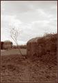
| 04/25/2005 10:01:31 PM | "The Wars Of the Old Discard There Ruins For The New To Find "by JectoComment: *Critique Club*
In this photo, I personally have no clue what I'm looking at. I've never seen anything like this in person and don't recognize it from your photo.
I like the tones and colors. I think it makes it feel older and seem like an old photo from someone's album of old.
Focus is a bit soft, as I think someone else mentioned. It makes it a little harder to figure out what I'm looking at in the photo. You know, even though I don't know the subject, it still feels old and abandoned. I think that is a great accomplishment.
I like the framing/cropping. It feels like the little tree kind of forces the crop to the left, which is a good thing cause I like how the subject is off to the right with the extra space to the other 3 sides. The ground, the sky and the area to the left with the tree.
This is an appealing image to look at. Not too busy, not too plain.
Lighting seems to have been good for the image as well. Very nice sky.
~Heather~ | | Photographer found comment helpful. |
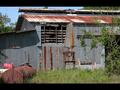
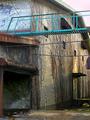
| 04/25/2005 09:21:47 PM | Withered and Weatheredby totaldisComment: *Critique Club*
This is a very interesting building. I think that the scene you captured here is lovely despite being old and broken.
Your focus and clarity are really nice. I like the detail you show us in the panels and roof.
I think I have to agree with most of the commenters and say that I don't prefer the black 'frame' on the top and bottom. Is this the fence you were talking about? I think that instead of the black, I would prefer to see some more of that nice blue sky. I think it would compliment the rusty red nicely, but as is, we can't really see much of it.
I like the barrel in the lower left corner. I think that adds a bit of something to look at without making it too busy.
Lighting is simply wonderful. It looks like it was a very beautiful day to be taking photos. There is only one shadow from the roof to the left that is really noticable and it's not a distraction in my opinion.
Overall I like this image a lot (minus the black top and bottom). ~Heather~ | | Photographer found comment helpful. |
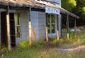
| 04/25/2005 08:52:21 PM | Beautiful Despite Abandonmentby mischffComment: *Critique Club*
And we meet again. (I think it's cause I'm the only one working on this crit club list lol)
Anyway, I think this is a cute building. I'm not really sure that you captured the feeling of abandoned though. When I think abandoned, I think of peeling paint, broken windows, things falling off, older. While you can see that this isn't the most well loved house on the planet, it does look livable.
Setting that aside and on to the photo, I personally like the angle and framing/cropping that you chose. I like how the house is off to the left side and you have placed it out of the photo enough where you have also shown us some of the surroundings.
There is some interesting lighting, but careful, cause it does get too bright in a couple of places. See the 2 poles closest to the left frame of the photo? They are a little hot.
Focus seems a slight bit soft, but not too soft that it is hard to look at. I think that a crisper focus would help us to see the detail in the roof and flowers surrounding the house.
The address sign looks very new compared to the house, maybe that's what gives it kind of a 'non abandoned' look.
There is a white thing in the background that is a bit of a distraction. It doesn't seem to have a purpose in the photo since we can't really tell what it is anyway, and therefor doesn't seem to add anything to the overall visual appeal of the photo, so I don't think that it would take anything away if it were to be removed from the photo. In fact, I think that it might help draw more attention towards the house and forground since I wouldn't have to sit here and try to figure out what it is.
Overall I find this a pleasing, relaxing image to look at. ~Heather~ | | Photographer found comment helpful. |
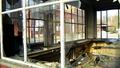
| 04/25/2005 08:23:25 PM | shatteredby messerschmittComment: *Critique Club*
My first impression of this shot was that it was cluttered and busy. Then I read all the very positive comments on the shot and thought that maybe I missed something, and went back to look some more.
The shot still seems very cluttered to me. Of course, it's a mess, it's suposed to be, but in my opinion, it doesn't make for a very attractive photo. Not one I would think to see hanging on a wall or in a gallery.
That being said, and that is only my personal opinion, and technically, I think the shot is wonderful.
Angle and framing/cropping are great. I like how you get to see through the building. I like how it's not just a dead straight on shot of the windows, how it's slightly angled.
Focus is supurb. I mean, very crisp, awesome detail.
Lighting is good on the subject. There is a small sectoin of sky in the background that is a tad bright/white, but other than that, I think lighting on the subject helps to bring out the focus and detail that is so great.
My only real complaint about this is that it's just too busy for my personal taste. Otherwise, very very nice. ~Heather~ | | Photographer found comment helpful. |
| 04/25/2005 07:02:31 PM | Ready to Demolishby JordanZComment: *Critique Club*
I really like this shot and I think the only thing that I see that coule use improvement in my opinon is the whites. Or lack there of actually. There are blacks and greys, but no whites.
I like the black and white you chose. I keep picturing this in color and seeing a white/plain sky. So I think it was a good choice to go with black and white. Also, I think it makes the detail/textures stand out a bit more than maybe they would have if there were colors distracting from the building.
I like the angle. Very creative way to get most of the building in the photo without zooming out so far that the building is very tiny.
Something I find odd are the light dots to the left of the words "Lowertown Depot". The reason it seems odd to me, is cause it looks like braile. lol. Makes me think "why would they make a huge sign on the side of a building into braile." I know it's not, but still makes me wonder what it is.
Focus and clarity seem very good. I can see good detail in the building and surroundings.
A very good shot, where my only suggestion would be more whites. Otherwise wonderful.
~Heather~ | | Photographer found comment helpful. |
| 04/25/2005 01:55:35 AM | movadoatnite.jpgby zagmanComment: For some reason, I want to tilt my head to the right when looking at this. I'm not sure if it's the lighting or what, but it seems to be leaning slightly to the right. I could just be tired though. I see you put this in advertisement gallery. Here's some 'useless info' I've accumulated. Since the 1920's watch ads have displayed the time 10:10. Why? There are a couple reasons. First, it is visually appealing. It's equiangular, so it 'rests easy on the eyes'. The other reason is that usually the manufacturer name is usually under the center of the face, therefor at 10:10, the hands do not cover up the name. Anyway, the other popular time for ads is 8:20, which is again visually appealing, but not good for watches with the manfgr name under the center. In other words, I think people have come to expect 10:10 as the time on watch ads, so something you could try.
Anyway, your shot seems to have unnatural color. Like it was forced this color, or the lighting is changing the color or something. If this is the actual color of the watch, then shame on the people who made it. lol Maybe toning it down a bit would have been more appealing to me personally.
Other than that, focus seems really good and the background works, nothing distracting about blackness usually. I'm not so sure about the centered comp. But thinking further, I think that an angle or offsetting it would not have worked for me, so this actually does seem to be the best choice in my opinion.
Sorry you missed the challenge, hope this helps. ~Heather~
| | Photographer found comment helpful. |
| 04/25/2005 01:32:10 AM | walls covered with ivyby kenboComment: *Critique Club*
We meet again here in Critique Club, almost 2 years later. Wow, how time has flown since the primary colors challenge.
Speaking of colors, I think that maybe the bright color of the bridge is distracting from the abandoned building. Which actually is ok for the photo, but I think for the challenge, I would have liked to have the main focus the building rather than the bridge, which I feel seems like the main subject now.
Focus seems ok, although blurred in some spots, nothing distracting there.
Lighting on the building is alright, but the upper right corner too me, is just too bright. See how it kind of bleeds into the roof? The bright sky takes away the detail of the roof edge. I'm sure there was not much detail there to begin with, but I guess what I'm saying is that the edge line is partially missing. There, maybe that makes more sense. lol
I like how the vines are growing up the walls, that makes this look like it's been there awhile with no love. It was a good building for the challenge.
~Heather~ Message edited by author 2005-04-25 01:34:18. | | Photographer found comment helpful. |
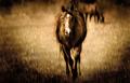
| 04/25/2005 12:01:58 AM | Breaking the Illusionby clarmoreComment: *Critique Club*
From this shot, the horse barely looks like he's even moving. I'm sure he was, or you wouldn't have submitted it to an extreme action challenge, but to be honest, he just doesn't look like he's moving. Maybe walking, but definately not extreme.
To answer your question of do 'you' think it's too photoshopy? Yes. While I love the color, I don't like the darkened corners.
I thought there were some leaves in the 'sky' above the horse, but looking closer, it looks as if there is another horse behind the main subject. This little guy is more than just a distraction, I think he invades your subject greatly and takes so much away from what is such a beautiful subject.
Having the background blurred is a plus, but it does seem a bit unnatural. See the area around the left (the horses' right) rear end? He's got kind of an orangish glow around him. This also distracts.
I have to wonder why the dark corners. Were there other elements that you were trying to hide? Something distracting perhaps? I see no positive purpose to that in this photo.
All that being said, I love the actual shot of the horse, and can only imagine what the scene looked like in real life. I'm thinking the original might have been better (minus the guy in the background, of course)
~Heather~ | | Photographer found comment helpful. |
|
Showing 361 - 370 of ~2785 |
Home -
Challenges -
Community -
League -
Photos -
Cameras -
Lenses -
Learn -
Help -
Terms of Use -
Privacy -
Top ^
DPChallenge, and website content and design, Copyright © 2001-2026 Challenging Technologies, LLC.
All digital photo copyrights belong to the photographers and may not be used without permission.
Current Server Time: 07/17/2026 10:47:13 PM EDT.
|