|
|
|
Showing 351 - 360 of ~2785 |
| Image |
Comment |
| 05/01/2005 01:55:09 PM | Downtown Piperby artvetComment: *Critique Club*
2 things stand out to me right away in this shot. First the background seems odd. I like the colors and I like how it is blurred, but it seems to be 'bleeding' into the 1/2 wall behind the man. See how the top of the little wall kind of just fades into the background? It seems unnatural to me. Still, the colors are nice, and it is blurred nicely as to avoid distracting elements.
Second quite noticable thing is the grain on the man. I would like to have seen a more clear photo with detail on his face and hair. I feel that with the grain, I'm missing detail that could be in his face. Also, his hair is so unique that I think I'd like to see that quite clearly too.
While the focus seems ok, the grain is kind of hiding it. The lighting on his face is a bit dark, would like to see just a bit more lighting on his face.
I love the feel of this photo. He's a rugged looking man, but the photo is so gentile. I think that you captured a very good moment. An interesting character for sure.
~Heather~ |  Photographer found comment helpful. Photographer found comment helpful. |
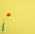
| 05/01/2005 01:40:08 AM | Red Tulip on Yellow Backgroundby Prof_FateComment: I will say that this is a fine capture of minimalism. I like how the flower goes into the frame from the left side of the photo and just leads it out there into the negative space. we are not run out of the photo by any distracting crap and the background is solid making it also not distracting. Lighting is great. No hot spots, no shadows. Focus and clarity are also wonderful. We get some nice detail in the flower and leaves. Lovely color by the way. Excellent shot. I vote it high. | | Photographer found comment helpful. |
| 04/30/2005 03:39:56 PM | Happy Two Year Oldby roonieComment: *Critique Club*
The kids skin appears unnaturally yellow. Lighting is very harsh on her face, creating bright hot spots and shadows. Her eyes are nothing more than black holes in her head. A fill flash could have helped this, or moving her to where the sun was in front of her rather than to the side could have helped.
Focus is a bit soft, would have liked to see crisp focus on eyes (if we could see the eyes)
Her hair is blending in with the background in the upper right. The very small patch of blue in the upper left is a bit distracting. Although, being from Michigan myself, the blue sky doesn't show itself very often, so catch it when you can. lol (how'd you like that snow last week?)
What I do like about this shot is the framing/cropping you chose. I like how she is to the left of the photo looking right with some space on her right. That creates visual appeal and a very nice comp in my opinion.
The colors in her shirt and background are good. Nice bright colors there. Just something about the color on her skin. Probably the lighting and or white balance.
Overall a cute photo, hurt by the lighting conditions.
~Heather~ |
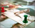
| 04/28/2005 01:06:54 PM | Tacked Memoriesby TiberiusComment: *Critique Club*
I used the magnifying glass trick in a lot of my earlier photos. I think it's in the tutorial I wrote for DPC too. Glad to see it works for other people as well.
What I really like about this shot is how the photos really are nothing more than a background to the tack. The Focus on the tack is wonderful and the DOF really helps that to stand out and be something more than 'just a photo of a tack'.
Lighting is great, no bright spots or distracting shadows. I like the angle you chose for this. It's not directly head on, but not a straight side photo either. Nice in-between.
Interesting to look at, technically well done. The only nit-pick I would have is that you DID stab the guy in the head. Maybe a different photo there might be a little less weird, but still an alright shot.
~Heather~ | | Photographer found comment helpful. |
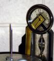
| 04/28/2005 01:22:12 AM | Tick Tacks Stuck in Timeby marvinComment: *Critique Club*
This is definately a different take on the challenge. Very original.
What jumps out at me right away is the purplish glow on the tack. Looks like from lighting or something? Unnatural looking and distracting.
The lighting does seem harsh. Most of the tack is dark, there are bright spots on the clock and the shadows on the wall are very dark.
The wall in the background reminds me of a wall in a school hallway. The lines in the background are a bit distracting as well.
I think it was a good choice to blurr the background, but I think that another background all together might have been better suited for this shot.
Focus seems alright. Nice point on the tack and the numbers on the clock are coming out crisp as well.
The tack and the clock together seem like an odd couple. Although the hands on the clock kind of resemble tack, it still seems like a weird combination of subjects. Especially with the tack being almost as large as the clock.
I think the shot is missing something to draw me in and hold me there. That's just my own personal opinion of course.
~Heather~
Edit to add that I think the perspective is interesting. I wonder though if you could have gotten both the tack and the clock straight. The clock seems to be leaning toward the right a bit, while the tack is perfectly verticle. Message edited by author 2005-04-28 01:24:16. | | Photographer found comment helpful. |
| 04/28/2005 12:25:21 AM | egg-tack-stic (n.)by nico_blueComment: *Critique Club*
Will start off by saying that this is wonderful. Well deserving of the high placing.
I was thinking that when I first saw this, that I would like to have seen the egg further into the lower right corner. But then picturing it, I think that may put the egg too much out of the shot and that you wouldn't be able to really tell it was an egg then. So maybe that's why you placed the egg where it is to begin with.
Then, I was thinking what if we could see more of the egg, but still have it in the lower left of the photo. Maybe move the crop down a bit?? Anyway, something that could be played with. I'm sure you already did, but there is just something slightly off about the crop.
Lighting is what really makes this shot I think. That, and the fact that there are tacks sticking into an egg. lol I love the shadows. The only lighting 'flaw' I see is that on the tack to the far left, it makes a little shadow with a bright circle in the center of it. It seems 'non uniform' to the rest of the photo. Not a big deal, but kind of breaks the pattern a bit.
The background is perfect, nice solid, no distractions.
I can't offer any more than that. Congrats and again, nice shot. ~Heather~ | | Photographer found comment helpful. |
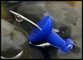
| 04/28/2005 12:02:06 AM | Drop on a tackby lastefComment: *Critique Club*
I like that the pin is curved. I spent a bit of time trying to figure out if it was really curved, or if it was just an illusion. I came to the conclusion that it is really curved.
Focus is really good in my opinion. I love the detail in the rocks, the drop and the pin.
Lighting is also very good. The only pick I have about the lighting is the white reflection in the water. Other than that, I think you did a great job. Seeing that this is an indoor shot, I think it would be easier to control the lighting so you did not get the white reflections. Maybe something between you and the light source?
I like the way you put the pin right in the center of the photo at a diagonal. Dead center doesn't always work, but I think it does here. It's a nice way to fill the frame with your entire subject. The diagonal is visually appealing and creates nice flow through the photo.
Having the tack 'dissapear' into the water is a nice touch as well.
Overall a very visually appealing photo that is technically very well done. Congrats. ~Heather~ | | Photographer found comment helpful. |
| 04/27/2005 11:42:09 PM | A Tack Iraq - NO!by mamaesmeComment: *Critique Club*
Very nice crisp focus on the map. The detail in the texture is awesome. Very nice texture.
You definately met the challenge in my opinion. There is a tack in the photo. Nothing said it had to be more than one tack. Despite what some people thought.
The Tack does seem to be a little bright and too red to me. There is a distracting light glare on the tack and the red is very overpowering.
The 'no' sign on the tack is original and makes this stand out from other shots similar.
The shadow from the tack kind of distracts and 'hides' the point where the tack goes into the map. Maybe a side light could have helped ease the darkness of that shadow a bit.
Overall a nice image, not one I'd hang on my wall, but fitting for the challenge. ~Heather~ | | Photographer found comment helpful. |
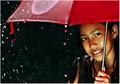
| 04/27/2005 11:26:56 PM | Summer Rainby PhilosComment: *Critique Club*
Well, here we meet again. Pulled your shots one right after the other.
There are 3 things that stand out to me in this photo that I might have liked to have seen done differently.
First, the lighter colored circle on the umbrella stands out like a sore thumb. Quite distracting in my opinion. Once I notice it, it's like that's all I can see when I look at the photo.
Second distraction is the red tie hanging down on the left. That is a brighter red in comparrison to the umbrella and again, stands out a lot.
The third thing is her hand. It is a different color than her face and is a reddish color (probably reflection from the umbrella?) but it is deffinately not natural looking.
Focus and clarity are right on. Wonderful job.
Adorable model, lovely expression and pleasing to look at.
The background is perfect, nothing distracting there. DOF is great. I like how the girl is in focus but the other elements of the photo are blurred. Lighting on the girl is wonderful.
Very visually appealing, I could look at this for a long time. Longer if the light circle were not on the umbrella. :)
~Heather~
Edit to add that even in the thumbnail, it is the light circle that I notice first, and then the girl. Message edited by author 2005-04-27 23:28:44. | | Photographer found comment helpful. |
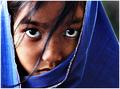
| 04/27/2005 11:15:42 PM | Breeze by PhilosComment: *Critique Club*
Wow...what can I say that 120+ people didn't already say?
The first thing I notice about it is that it seems very speckled. Oversharpened? I love the shot and it is very detailed and visually appealing.
Great focus and lighting. The left (her right) gets a tad bright, but it does not distract from the photo at all. Actually, it could even be a plus.
The hair in the face is a little strong, but not distracting. The eyes are captivating.
Not really much that I can add...simply wonderful. ~Heather~ | | Photographer found comment helpful. |
|
Showing 351 - 360 of ~2785 |
Home -
Challenges -
Community -
League -
Photos -
Cameras -
Lenses -
Learn -
Help -
Terms of Use -
Privacy -
Top ^
DPChallenge, and website content and design, Copyright © 2001-2026 Challenging Technologies, LLC.
All digital photo copyrights belong to the photographers and may not be used without permission.
Current Server Time: 07/17/2026 06:46:55 PM EDT.
|