|
|
|
Showing 331 - 340 of ~2785 |
| Image |
Comment |
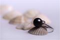
| 05/07/2005 05:14:52 PM | The Black Pearlby vasilkovayaComment: *Critique Club*
This is a very nice image. There really is only one or 2 things I might like to see a bit differently.
First is the light reflection. The photo is lit wonderfully. No distracting shadows, or blaring hot spots. but the light reflection in the black pearl could be a little smaller in my opinion. I think it's important to have the reflection, it shows that it's a shiny object and without it, i think it might be a bit too plain. But maybe just a little smaller as to not take up so much of the pearl?
The other thing is that I personally would like to see a little bit more of the background in focus. Maybe just the start of the first shell in the background, and then fad it from there.
I love the positioning of the ring and the shells. Very nice set up.
Like I said, lighting is also great. I love the soft feel of the photo.
Color is great as is the focus and clarity.
Overall a great image, one to be proud of for sure and one that I could definately see in an ad. Congrats.
~Heather~ |  Photographer found comment helpful. Photographer found comment helpful. |
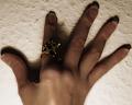
| 05/07/2005 04:06:32 PM | 5 & a little extra shiny somethingby willow_zzenComment: The five fingers are too soft focus in my opinion. The shot is harshly lit. The dark shadows are distracting and the bottom of the photo is too bright on the background. The 'shiny thing' is barely visible since it is sitting int he darkest part of the entire photo. The skin looks unnaturally textured. Too smooth. So smooth actually that the light is refelcting off the back of the hand. I'm not sure what caused that appearance, but definately odd.
The texture of the wall adds nothing visually to this photo. I feel that a different background might benefit the photo a bit. Actually, maybe having the hand set away from the background would be even better. Maybe with a DOF to blurr the background. If you moved the hand away from the background, it would eliminate the background texture that I find distracting and also help to lessen the shadows created on the background, which are also distracting to me.
If you added some different lighting, it would also help to make the ring more visible as it might draw it out of the shadows.
I realize this was a short challenge with little time to compose and shoot, and this has the appearance of a quick shot. Maybe something as simple as brightness/contrast could have even helped this shot dramatically.
~Heather~ | | Photographer found comment helpful. |
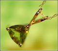
| 05/07/2005 03:46:50 PM | August - Peridotby dartompkinsComment: *Critique Club*
The first thing that stands out to me is the small spot of "stem" that is out of focus. Was this selectively blurred? The focus seems odd in some places. Focus on the stone is also soft. I'm thinking though that because the background shows through the stone, that it appears soft because of that.
The orange reflections in the gold are distracting to me. Gold isn't suposed to be orange, it's suposed to be gold, and seeing it as orange makes me thing that it's not right, which then I wouldn't buy it.
There is also a light reflection in the upper part of the 'stem'. Looks like flash or strong overhead light. That distracts a bit as well.
I like the angle and framing/cropping. The way that the necklace sits in the photo is appealing and adds interest to the photo.
I like the background color, but maybe not with the color of the stone being so similar. Not sure about that. Would have to see it different colors to see which I would prefer, but I haven't decided weather I like the combo or not. Maybe it was the best choice with the green stone. *shrug*
Overall nice shot which in my opinion would benefit from different focus options and lighting.
~Heather~
Edit to add that when I viewed this as a thumbnail, the colors seemed to work out just fine. The odd focus issues were not as visible either. This did make for a more visually appealing image, so I made my mind up that the background color is good, but it just needs different focus and lighting (to reduce the orange glare). Message edited by author 2005-05-07 16:15:50. | | Photographer found comment helpful. |
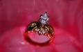
| 05/07/2005 03:14:33 PM | Today, Tomorrow, Forever....by TruegshtComment: *Critique Club*
Wow. That is a lot of pink/red. I do find it a bit distracting, especiall since there is a curved seperation between the 2 different colors of background. It looks almost like a light source, but non the less, it is curved right through the ring and while we look at the ring, our eyes want to follow that curve. for me anyway.
The focus seems ok, but the DOF is too shallow in my opinion. I'd like to see the entire ring in focus, would help me to want to buy the ring. As is, I can only see the diamond, and while that is really pretty, I don't know if I'd buy it if it were on an ugly gold band. I can't see the band to know if I'd like it or not.
The angle you chose for the ring is nice. I like the tilt and the lower placement is nice as well.
I think the part that really is bothering me about the photo is that the gold band has absorbed the background color and is redish. What I want to see is somehow getting the whole ring in focus without the red reflecting in the band. Otherwise, the setup is neat and I think it would be an effective ad.
~Heather~ | | Photographer found comment helpful. |
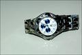
| 05/07/2005 03:00:45 PM | on sale 1,000by gtp1164Comment: *Critique Club*
You got a lot of useful comments on this shot. Don't be afraid to check the 'useful' button to let the commenters know their time spent was appreciated.
To be perfectly honest about this shot, it looks like you threw the watch on the table, took one shot, resized it and submitted. If you were the makers of this watch, would you buy this photo to advertise it?
The focus is soft, I cannot even read who makes the watch. The reflection might have been neat had it been a reflection of the entire watch, but it just looks like reflection from the light source.
Flash doesn't seem to me to be the best choice for lighting in an advertisment.
The background does not help to accentuate your subject either. There is a blue grey tint to it that takes away from the watch in my opinion.
The angle and framing also do not seem to increase interest in the watch. Maybe setting the watch upright so we could read the hands in normal position, or centering it a bit more, I think would add some visual appeal.
The one comment you received that I do not agree with in your case is the comment about setting the hands at 10 and 2. This only works if the watch manufacturer name is UNDER the center. If your watch were set at 10:10, the hands would be covering up the logo, and it would be pointless.
That being said, the other popular time for watches with the logo above the center (like yours) is 8:20. But again, I think that only works when the watch is upright.
~Heather~ |
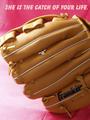
| 05/07/2005 02:23:58 PM | Catch of your lifeby lissylouComment: *Critique Club*
My first impression was "Franklin" brand jewelry?? Which, we all know that Franklin is the brand name of the glove. This would not hold up in a true jewelry ad, since it seems more of an ad for the glove. However, I tried a crop on this just above the word franklin and not only does it eliminate the ball glove ad, it also draws our attention up toward the ring, which, as is, is very small and currently not the main focal point in my opinion.
The lighting appears to be nice. It starts to get just a little bit bright on the glove to the far left, but it's not serious and does not affect the overall photo.
Focus and clarity are really good. I like the detail we get in the glove.
The background is a bit of a distraction. While I personally like the color and the gradient look, there is a crease up near the words, and a seam in the bottom part of the background. That seam would also be eliminated with a crop just above the logo on the glove.
Overall, this is a nice shot to look at, and technically well done, but needs to have a bit more attention on the ring.
~Heather~ | | Photographer found comment helpful. |
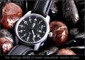
| 05/07/2005 02:59:17 AM | History In The Makingby RedOakComment: *Critique Club*
Not really sure what I can add that hasn't already been said in the 48 comments here and the comments you received in the thread, but I'll tell you what I think anyway.
Very nice crisp focus. Love the details and textures in both the watch and the rocks.
Lighting is great. Only 'flaw' I see is that there are a couple blue reflections in the rocks, one that especially stands out in the lower right hand corner. Once you see it, it draws my attention easily.
This works really good for an ad, although I'm not sure why it's sitting in watery rocks. Kind of like that male sexual enhancement product you see in comercials that is sitting in the middle of a river. What the heck? Anyway, not sure why this works, but it does. Unlike the product in the river.
Love the color. The red rocks really work as a background for this. Not too much color, but just enough to add interest.
The lower watch band stands out a bit cause of the DOF, but it does not have an impact on the photo as a whole.
A very well done shot that deserves the high placing. Congrats.
~Heather~ | | Photographer found comment helpful. |
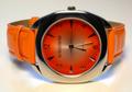
| 05/07/2005 02:38:02 AM | TIME to buy new jewelryby mischffComment: *Critique Club*
With 400+ entries, it's almost a miracle that you happen to get a crit club comment 3 times in a row...it's inconceivable that I would happen to get all 3. Wow.
This is the best of the 3 I've done in my opinion.
I really like the color, very nice oranges.
Lighting is very nice on the subject. If I had to change one thing it would be the surounding color. In the 'white' background, there are traces of orange and blue. I think that it might put more focus on the watch without added color in the surroundings.
I personally like the way you have it tilted. The 'no boundaries' label seems to indicate that something needs to be different here, and you did just that.
Excellent job concealing reflections on the watch face.
The small bit of bright orange wristband which is sort of in the background near the upper part of the watch face is a tad distracting, however, it doesn't have a major impact on the photo, but the photo would lose nothing if it were removed. If that makes sense.
Very nice shot. Look forward to seeing what comes up next. :)
~Heather~ |
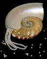
| 05/06/2005 01:01:41 PM | Treasures of the Sulu Seaby flip89Comment: *Critique Club*
Definately a good idea, but I'm not so sure it turned out the best it could. In my opinion, a few things could have been different and it might have made the visual impact of the photo a bit higher.
Before I started anything with photography, my first time on DPC, I would see some photos and say to myself '1/2 the pics out of focus'. Then, as I learned the benefits of DOF, it made sense and I began to see photos differently. What I'm trying to say is that I'm not sure if the 'non-photographer' would understand your DOF in this 'ad'. A non photographer might look at this and say '1/2 the pics of out focus'.
I'm not really sure that you benefit anything from having a shallow DOF here. All it does is blurr the back of the shell and the pearls in the front of the photo. I'd like to see it all in focus.
Another thing I notice is that there are little 'pearls' in each chamber of the shell. They don't look like pearls, but they are similar color and size. I find that a bit distracting from the necklace itself.
Lighting appears to be just good, except for a small spot on the upper portion of the shell that is a tad too bright. See how it almost looks whiter than the necklace?
I like the placement of the shell and necklace within the frame of the photo. Having the necklace kind of pour out of the shell is a neat idea. As for being an ad though, there really isn't much space to put your words. That's just a minor thing, but something to think of if you were going for the ad theme.
Overall, a neat idea that just needs some 'cleaning up'.
~Heather~ | | Photographer found comment helpful. |
| 05/05/2005 12:33:58 PM | The Earringby saiphfireComment: *Critique Club*
You got a lot of really good comments on this.
First things I notice are lighting and skin color.
I think that while nicely done, the earring is still a little too dark. It's more of a grey, and I want to see it more of a shiny white. The person (you) seems either too dark or too bright. I will try to elaborate on that. I have seen some ads where the person is a silhouette and the jewelry is normal. This photo reminds me of those ads, except the person is too visible. If that was not the effect you were going for, then I think we need to see more of the person. Right now, we can't see enough of the person to get details, but we can see enough for it to be distracting to the earring. Hope that makes sense.
Next is the skin colors. Body has a green tone, while the face is red. Looks like effects due to the low light, but definately gives the skin an odd appearance. I played with this a bit and if you convert it to black and white and up the brightness and contrast, it eliminates some detail from the person and takes away the odd skin appearance and puts a little more focus on the jewelry.
The pose looks uncomfortable. Forced. Almost like you had planned on making the photo with the person mostly out of the photo, and then decided to keep it in for whatever reason. The black and white I mentioned with the upped contrast eliminates enough detail in the person that it helps ease the awkward pose yet still leaves enough detail that you can tell it's a woman wearing an earring.
This is just my own personal preference, things in MY mind that would have made this more appealing to ME.
~Heather~ | | Photographer found comment helpful. |
|
Showing 331 - 340 of ~2785 |
Home -
Challenges -
Community -
League -
Photos -
Cameras -
Lenses -
Learn -
Help -
Terms of Use -
Privacy -
Top ^
DPChallenge, and website content and design, Copyright © 2001-2026 Challenging Technologies, LLC.
All digital photo copyrights belong to the photographers and may not be used without permission.
Current Server Time: 07/17/2026 10:47:13 PM EDT.
|