|
|
|
Showing 311 - 320 of ~2785 |
| Image |
Comment |
| 05/11/2005 12:57:21 PM | Pittsburgh, PA @ nightby cj_gvineComment: Photographer's Own Comments...
Nikon D70
2005/04/06 07:10:19.9
RAW (12-bit) Lossless
Lens: 18-70mm F/3.5-4.5 G
Focal Length: 70mm
Metering Mode: Multi-Pattern
1/2 sec - F/4.5
Exposure Comp.: 0 EV
Sensitivity: ISO 320
That's a shame. :( |
| 05/10/2005 01:51:54 PM | The key to life is to find the key to life of the key, o'key?by bergwaltersComment: *Critique Club*
Very nice capture. I like the simplicity of this image. I think it fits the challenge very well.
The focus seems really good on the rocks, but the key appears a bit soft. I'm wondering if it's due to the lighting reflecting off the key.
The key also seems a bit too bright, which is why I'm led to believe that the brightness is affecting the appearance of the focus on the key.
I like the placement of the key within the frame of the photo. very nice use of negative space.
Color is really good.I like how there are little red speckels throughout the photo in the rocks. that adds a bit of interest in the rocks without taking away from the key.
The simple border works well here. I wonder what it would look like against a black border. Would that make the key appear brighter, or maybe tone it down a bit?
Overall a very nice image, that I find highly visually appealing and could only benefit from different lighting on the key in my opinion.
~Heather~ |
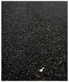
| 05/10/2005 01:44:33 PM | Solitary Treeby artvetComment: *Critique Club*
I'm not sure what I can add that the 59 comments here already have not said.
This is a beautiful image. I am not so sure that it is minimalistic though. The whole frame is filled with interesting things to look at. The sky, the tree, the fence, and even the silhouetted ground. All of it combines together to make a reall nice image, but just not 'simple' enough for minimalism.
I love the silhouettes. They look really nice against that background. One thing that my eyes keep going back to is the light area in the lower left of the photo. I'm not sure exactly why, but that section bugs me a bit. I think it just seems like an odd place to be bright. It's drawing my attention to the bottom of the tree and that just seems like an odd place to want to draw attention too.
Focus and clarity look to be really good. Nothing is terribly blurry or soft.
Overall the image is very nice. Border is kind of huge, but doesn't distract from the image in my opinion cause it's black and white.
~Heather~ |  Photographer found comment helpful. Photographer found comment helpful. |
| 05/10/2005 01:30:51 PM | Grand Slamby tryals15Comment: *Critique Club*
I'm not so sure that cropping or composing a photo so that most of the subject is on the edge of the frame counts a minimalism or not. It does look like a shot where you simply almost missed the subject. Seeing that that is the case by your comments, I will just say that it shows.
The focus on the kid is very soft as well. We get no detail in his face. I want to see that expression better. The dark shadow over his face also does not help us to see his face. Which means that it was very important to get the face in focus.
Now, again, I realize that you said the photo was an accident to begin with, all I'm saying is that it shows, and while it may be an interesting photo for your own personal photo album, outside viewers may not find it particularily fascinating. We don't have the emotional connection to a photo of this kind.
~Heather~
So, since we can't really see his face, what is there left to look at? There is his body, which is also soft focus due to his motion, and there is grass, which is actually in pretty good focus. Of course the grass wasn't moving to create blur.
That being said, neither just the body nor the grass are very interesting to look at. | | Photographer found comment helpful. |
| 05/10/2005 01:05:02 PM | Blue skies and pretty flowers on a spring day!by tolovemoonComment: *Critique Club*
Funny out of the crit club shots I've done for minimalism, the comments either say that the subject is too big, or the subject is too small. Geez, make up my mind. lol
Anyway, I think this is simple enough to qualify for minimalism.
The first thing that really stands out to me is the lighting. It gets a bit dark to the left side of the flower. I'm thinking that some fil flash or some reflected light might have helped get some light on that darker area and it would contrast evenly with the nice background then.
The background is perfect. I love the blue in combination with the color of the flowers.
Focus and clarity are really good in my opinion. We get to see a lot of neat detail in the flowers.
One thing I find distracting is the little piece of branch in the lower left corner. This adds nothing to the photo at all, and without it, it would help to draw our attention to the flowers and also help increase the minimal effect.
Overall I think it's a nice shot of the flowers and it really stands out nice on that background.
~Heather~ |
| 05/10/2005 12:58:21 PM | Just after landingby BoddiComment: *Critique Club*
It's been said before, but I'll say it again. There have been a LOT of water drop shots here on DPC. Which means that for the people who have seen those shots, you really need to create something spectacular and out of the ordinary with these kinds of shots. It fits the challenge of minimalism, but weather we try to or not, we remember those past shots that had super clarity and awesome eye catching color. This shot does not have that.
Your focus is soft. I would like to have seen more in focus here.
The lighting is a bit dark. There is a bright vertical column to the left of the photo that competes with the water drop. I think that the water drop should be the only vertical object in your photo for this to work.
The crop is a bit too close to the left of the drop. See how you cut off the 'wave' to the left?
The little bit of blue is in an odd place. I think that it could add to the photo had it been in a more interesting location, however, with it just kind of hanging out in the backgound a bit, it now becomes distracting, since it is only close to the water drop.
I see this is your first submission on DPC, soon you will get a feel of what the voters like here. Also, you got a lot of helpful comments on this shot, some comments you can take with a grain of salt, some you should take to heart. Don't forget, you can mark comments as helpful if you find them as such. It lets the commenters know you received their comments.
~Heather~ | | Photographer found comment helpful. |
| 05/10/2005 12:48:03 PM | Tomato Cocktailby photogenixComment: *Critique Club*
While this is definately different and original, I don't thik I'm being drawn in here.
The one thing that stands out the most is the huge looking reflected tomato in the glass. That tomato looks to be soft focus probably due to the liquid in the glass? Either way, it makes the majority of the shot soft focus.
THe lighting is neat, I like how it looks in the inside of the glass on the larger looking tomato, but you can see it on the background making a grey circular area in the black background. I think I would prefer this to have one solid color background. I'm sure you could do some curves adjustments to get the background a bit darker while still leaving the tomato cocktail the way it is. Something to play with anyway.
I like the placement of the glass within the frame. The negative space to the left works for me.
Not sure about the stem on top. Makes it look more like a cherry that way, since you don't usually see tomatos with stems, but always see cherries with stems in drinks.
Overall this is a neat photo, but it's not holding my attention. Something missing to make it really pop.
~Heather~ |
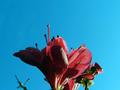
| 05/10/2005 12:38:16 PM | The Tulipby debbybrisComment: *Critique Club*
Very simple and minimal. I like the set up very much and think that the background works well to help make this what it is. Having a different background might not have worked as well.
The lighting on the background seems to be ok everywhere except around the flower and then it does seem like it's a bit too bright, almost engulfing the tulip. Otherwise, lighting is very good and no shadows or hot spots.
Focus seems a tad soft, but I'm wondering if that's just because the white of the background is bleeding into the subject in a matter of speaking.
I saw one comment that said that it might have been good for the tulip to be facing the right, and the more I think about that, the more I think it is true. If this were a photo of a person facing the left, it wouldn't work, I wouldn't think, and I think that maybe the same applies here. Have the negative space in front of the subject. While a flower doesn't really have a 'front and back', this one does appear to be 'facing' left.
I like the color and the photo has overall visual appeal. I think it's a great photo for the challenge.
~Heather~ | | Photographer found comment helpful. |
| 05/10/2005 12:15:43 AM | the sailboatby visaksenComment: *Critique Club*
Wow. Seems like everyone commented on your title. If you would have titled it 'the bench' no one would have even cared about the title. lol
Who cares what you call the pic anyway, you could have titled it 'bird on a barn roof' for all I care and it would still be a good image. On that note though, if you DID mean for the boat to be the main focus, I think you failed. The bench IS the main focus here and the boat adds to it in my opinion.
Focus and clarity are really good. I like how we can see all the little branches in the trees.
Lighting is also good. I like how the trees and the bench are silhouetted. That looks really nice against the blue background.
You did a wonderful job of getting your horizon horizontal. i like the combination of the horizontal water line and the diagonal shore line.
The only thing I think I would like to have seen differently, is that I wish there were some clouds in the sky, but for a challenge like minimalism, it's probably good that there are no clouds...but outside the challenge, I think it would look nice with clouds.
~Heather~ | | Photographer found comment helpful. |
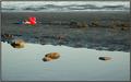
| 05/09/2005 01:50:48 PM | Lonely Bucketby OzzieComment: *Critique Club*
I really like the angle and framing/cropping here. The way the bucket is in the upper left and the water/beach kind of seperates is very neat. I like the diagonal in combinateion with the horizontal as well.
The color of the bucket is bright, which makes it a bit difficult to see and also hard to tell if it's in focus or not. It seems soft, but the shovel is in good focus, so it makes me think that it's the color that just makes it appear out of focus.
Lighting seems very good. Looks like it was a good day to be out taking pics. I like the reflections of the rocks in the water. That adds an extra interest.
I think the photo fits the minimalism category cause while there are very interesting things to look at, it's all very simple.
The border seems uneven to me. There's a white stripe on the top and left, but not on the bottom or right. This could be the way I'm looking at it, I'm not sure, but it does look odd to me.
Overall a very nice shot, maybe decrease saturation on tue bucket a bit to tone down that brightness of the red, but definately a neat find.
~Heather~ | | Photographer found comment helpful. |
|
Showing 311 - 320 of ~2785 |
Home -
Challenges -
Community -
League -
Photos -
Cameras -
Lenses -
Learn -
Help -
Terms of Use -
Privacy -
Top ^
DPChallenge, and website content and design, Copyright © 2001-2026 Challenging Technologies, LLC.
All digital photo copyrights belong to the photographers and may not be used without permission.
Current Server Time: 07/17/2026 07:28:43 AM EDT.
|