|
|
|
Showing 291 - 300 of ~2785 |
| Image |
Comment |
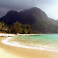
| 06/05/2005 09:11:50 AM | Kauaiby charliebakerComment: *Critique Club*
I'm not really sure how I feel about this photo. The bottom half seems really bright, overly so actually, and the top looks morbidly dark, almost evil.
The more I look at it, the more it seems to me that it just doesn't work together. The beach is beautiful, really nice scene there. The mountain is fascinating, really nice with the fog...the the 2 together isn't cutting it as one image.
I wish I could clarify that more, since it's not really making much sense even to me, but I hope you get what I'm trying to say.
Focus and clarity are good. I like the waves in the water, but I think that the bottom being so bright kind of washes away some of the detail in the waves that I'd like to see. See how the edge of the water is just white? Would like to have seen a bit more of that I think.
Overall, some interesting parts that just don't seem to quite go together.
~Heather~ |  Photographer found comment helpful. Photographer found comment helpful. |
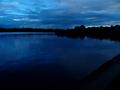
| 06/05/2005 09:01:55 AM | First Lightby pgattComment: *Critique Club*
This may sound odd, since I'm pretty sure the lighting made the color, but I'm thinking that the color here is the main focus, and not the 'lighting' per se. Not really sure that makes any sense, but when I look at this, I say "wow...nice color" rather than "wow, nice lighting".
That being said...the color really is the only thing in the shot. There really isn't much else to look at. There's a silhouetted horizon and a few small clouds, but really not a point of interest other than the amazing color.
The dark area at the bottom doesn't really add anything to the photo since we really can't see what it is. I'm thinking this might have been more effective for me had it bee just a bit brighter out.
As is, I think that the white area over the trees in the horizon is a bit of a distraction since the rest of the image is blue.
I wish I had more to add, but it's really hard to see any detail in this at all. More of an abstract really.
~Heather~ | | Photographer found comment helpful. |
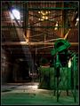
| 06/05/2005 07:25:22 AM | Coming Throughby HRoxasComment: *Critique Club*
My first impression was that this looked really photoshopped. I see a couple people thought the same thing. Your details don't seem like 'too much editing', but it's hard to say exactly what was edited by the details. It just has a feeling of being heavily edited.
The one thing I did notice and you already know about is the purple around the blown out area of light in the celieng. With all the editing you did, you'd think you could have fixed that if you were concerned about it hurting your score. I think it would have more visual effect without the purple and maybe a tad less bright in that area.
I do like the beam, and the green glow on everything is pretty cool as well.
This photo kind of reminds me of the ribbon winner from this challenge. That's a compliment.
Focus and clarity are really good and I think that we get lots of detail in the surroundings. I like the way there are lots of lines in the celieng and then the lines also down the right side, but the bottom left does not have all the bars/beams in it. This brings my eyes through the photo.
Overall a very nice scene, interesting to look at and very little need for improvement. Congrats on the neat shot.
~Heather~ | | Photographer found comment helpful. |
| 06/05/2005 07:14:00 AM | Tunnel visionby RUEDISCHMUTZComment: *Critique Club*
I believe we have seen some other photos of this tunnel before. If not, one VERY similar. This one is really well done. I like the little star at the top. I think that really adds to the photo. Nice catch there.
The end of the tunnel does appear to be maybe a tad too bright, wiping out the detail in the distance, but it doesn't have a major effect on the photo as a whole.
I like the color. The red cast on everything is appealing to me. The added yellow and orange makes this blend well together and all seem to just fall together.
Focus and clarity are really good.
While I really like the angle, I wish there were some way to move that strong vertical line a bit more to the right without changing the overall photo much. It just seems to be a bit TOO centered there.
Very nice view, I think you captured it well. Congrats on the nice score and 15th place finish.
~Heather~ |
| 06/05/2005 06:55:44 AM | Backlit Blown Glass on Woodby KaizenComment: *Critique Club*
I really like the colors in this shot. I like how the glass is outlined by the reddish color. It has a really warm feel to it.
The focus and clarity are really good. Only the left edge of the glass looks to be soft focus and I think that's cause that's where the lighting seems to be the brightest. Otherwise there are nice crisp lines.
The lighting makes this shot, which was perfect for the challenge. I like the slight reflection near the bottom and I like how the inside details are nicely shown by the good lighting.
I like where you have placed the glass within the photo. The negative space works nicely to the left of the glass. Had this been in the center of the photo, I don't think it would have worked as nicely as it does.
I like this image overall. The detail and color really make this one stand out. Tough shot and you did it very well. Congrats.
~Heather~ | | Photographer found comment helpful. |
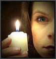
| 06/04/2005 03:14:33 PM | My light will show me the way...by mandyturnerComment: *Critique Club*
I see you don't think of the 'negative' comments as helpful, so I'm not sure I'll be of much help either, since I tend to point out areas where I feel the photo needs improvement in my opinion, but I'll try.
The very first thing I notice about the photo is the grain/noise, as others have pointed out. This may have been YOUR intent or preference, however, I would prefer to see this clearly. What exactly is the main focus? The candle? The face? The eyes? I would think it would be the eyes since even the title suggest that the girl is looking for something. The face is covered with enough grain that it looks out of focus. See the eyelashes? They are almost nonexistant, since they all seem to blurr together and we can't see any seperation of eye lashes at all.
The edges of the candle appear blurry due to the grain interrupting a smooth line.
My eyes move around not focusing on anything, just looking for anything in focus enough for my eyes to rest on. I think having even just one thing to focus on would have been a great improvement.
I like the set up very much. I think that it is a very good comp and the model is attractive and I like the closeness of the candle.
I just wish I could see more detail in the photo.
Lighting definately is an important part in this challenge, and you have mastered lighting with this photo. The lighting would BE the photo.
I think that by the low score, it appears that most people would probably have preffered this without the grain.
What is important though, is what YOU prefer it, and comments are nothing more than a way of telling what would 'appeal to the masses'. If you are putting these in a personal album, then who cares what everyone else says, however, if you are wanting to sell your photos, it is usually a good idea to take into consideration the majority opinion.
~Heather~ | | Photographer found comment helpful. |
| 06/04/2005 02:37:07 PM | Echoby mrmorrisComment: *Critique Club*
Is that a reflection of the poppie, or is that another poppie? I picture a reflection of the poppie to be similar shape as the one in focus, but it isn't, which leads me to believe that it's another poppie. I think that if it were a reflection with similar shape to the in focus one, I would like it a lot better. However, to me, it seems like it doesn't compliment the other one very well. I agree that it does need a 'reflection' however, just maybe one that looks like the in focus one.
I am one who thinks that the green stem in the background seems to be a bit out of place too. I think the photo definately needs SOMETHING to give it additional interest, but I'm not sure if the stem works for me in that way. If the stem wasn't there, then it would just be the flower, and that's not enough to hold my interest. So, maybe it's a good thing, but I'm still undecided on that. Like I said, it needs SOMETHING, but not sure if the stem does the trick.
Focus and clarity are awesome. Very nice detail in the flower and the drops on the flower.
I think that there may be a tad too much negative space. I would like to see the flower a bit more to the right of the photo with the nagative space to the left of the photo, but even a crop off of that would work for me.
Overall a really neat image, which is technically well done.
~Heather~ | | Photographer found comment helpful. |
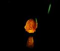
| 06/04/2005 02:07:04 PM | Orange Crystal Lightby joyinlightComment: *Critique Club*
I have never been a huge fan of abstract looking photos. Granted, there have been a couple that have drawn my interest, but for the most part, they just aren't my thing. I like detail. Lots of detail.
The first thing I notice about your shot is the soft focus throughout. Was this handheld in the low light? Since you offer very little comments on this, It's hard to say how you could have improved it, but I will say that if it was handheld, one way to improve it would be to use a tripod or set the camera on something and use the timer if available. This would reduce ANY camera shake and help to give you some more crisp lines in the crystal.
Next, is the color. Due to the low light, I think that the orange color is not as strong as it could be. It appears a bit dark and lacking 'pop'. I tried a simple 'auto enhance' on this and it did help to bring out the colors a lot. I think that if you played with saturation a bit, that might even help to enhance the color even more.
I think that you chose good placement and crop for the object. I think that it works better with the 'center' to the bottom left of the photo. If it had been in the dead center of the photo, it would not have been appealing at all, and we wouldn't be able to see as much of the crystal as we can now.
Overall, I think the image is interesting, but doesn't draw me in and keep me there. That's just my own personal opinion though, many people love abstracts.
~Heather~ | | Photographer found comment helpful. |
| 06/03/2005 01:15:47 PM | Soothingby shutterphunkComment: *Critique Club*
Definately a relaxing kind of photo. The thing that is jumping out at me is the fact that the large candle in the fron is 'blowing' with some kind of wind, but the other large candles are not blowing at all. That looks very odd and out of place to me.
I like the colors. Nice purples and oranges in the flowers. I like that arangement very much. You know, actually, I would like to see this arrangement without anything else. just the flowers and candles floating in water, that would be a great photo too I think. That's a whole different photo though.
I think your focus and clarity are really good. Was a tripod used?
There is a reflection of the light on the forhead, and that's a bit distracting, as there are no other reflections in the photo at all.
I like the angle you chose. I like that the corner of the tub is in the upper left. That makes for some very nice diagonal lines in your photo.
Overall a really nice set up, nicely captured.
~Heather~ |
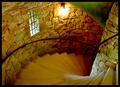
| 06/03/2005 12:51:59 PM | Nautilus Descentby MaverickComment: *Critique Club*
Hmm. While I think this is interesting, it isn't really drawing me in and holding my interest at all. I saw the decent score and thought maybe I was missing something, so I look harder and I am not sure why, but the shot just isn't very appealing to me.
The only thing the lighting really adds to the photo (other than light obviously) is that it makes the stairs darker as they go down, but even that is very slight and not really a major effect.
The color seems odd as well. Lots of orange-ish yellow. While I realize that this may be the actual color, it gives it the appearance that the white balance is off.
Focus is good for the conditions you stated. The stairs seem slightly soft, but the far wall seems nicely in focus.
The blown out light on the wall doesn't add to the photo, and I think creates a distraction even.
I like the scene you captured. I think it's interesting and definately not something I personally see everyday, but still, I'm not drawn into the photo. I hope this isn't harsh, I just can't connect with this shot.
~Heather~ | | Photographer found comment helpful. |
|
Showing 291 - 300 of ~2785 |
Home -
Challenges -
Community -
League -
Photos -
Cameras -
Lenses -
Learn -
Help -
Terms of Use -
Privacy -
Top ^
DPChallenge, and website content and design, Copyright © 2001-2026 Challenging Technologies, LLC.
All digital photo copyrights belong to the photographers and may not be used without permission.
Current Server Time: 07/17/2026 10:47:04 PM EDT.
|