|
|
|
Showing 251 - 260 of ~2785 |
| Image |
Comment |
| 07/09/2005 12:49:11 PM | Flower Spinby ty_roniComment: The subject itself is the flowers, but they are so very tiny that we don't get much detail out of them at all. That and they are in a shadow and do not stand out in the photo. The swirl is a circular shape, but I don't feel like it's suposed to be the main subject, otherwise, what would the purpose of the flowers be at all other than a distraction to the swirl. The colors are interesting, but I don't really like the effect at all. Very abstract with not much to look at. Just not my cup of tea. ~Heather~ |  Photographer found comment helpful. Photographer found comment helpful. |
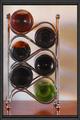
| 07/08/2005 09:05:39 PM | My Shoutby Jade 11Comment: Very nice. I like the way you set this up. I think that it works really well to the left of the photo, not dead center. Lighting is good, focus is ok, seems a little soft on the bottles, but I think that's just the bottles themselves, sometimes glass does that. My only real suggestion would be to find 2 other bottles that had solid bottoms. The top 2 that are on the left side are partially empty and you can see that in the photos. Not really a big deal, but makes it seem less uniform. I like the background and you did a very nice job of levelling your 'horizon' line. Visually appealing image. One of my top picks so far. ~Heather~ | | Photographer found comment helpful. |
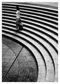
| 07/07/2005 11:41:47 PM | (\) No Fly Zone (\)by vince31874Comment: The first shape I see when this photo opens is a huge square. Even in the thumbnail, All I see is that dark square on the bright background. I think the 'main subject' here is the sign (not the objects on it), which, is actually square. (techncially rectangle, but square is easier to type. lol). That being said...beautiful image. Nice humor and technically very well done. Nice focus, great lighting and the background just adds to the image in all ways. The image is visually appealing and I like your choice of angle and framing/cropping. I like how the sign is off to the right and the kite is off to the left. My only wish for the photo is if the kite had been larger in the image, which would probably only be achieved by flying your own kite a bit closer to the sign. Otherwise, a great image, but maybe not the clearest interpretation of the challenge. ~Heather~
|
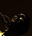
| 07/07/2005 01:15:23 PM | Girl Interruptingby e301Comment: Originally posted by e301:
Well - no it isn't the same place as the minimalism shot, though obviously the similarity is no accident. It most certainly is a sister shot however, and I think there is something to be gained from viewing the two side-by-side. Oh, and it isn't set up: I don't do that, and this is just a question of finding a spot and waiting. And it's my sixth sixth, for parity. |
Make it your 5th 5th. :) Congrats on the bump. | | Photographer found comment helpful. |
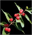
| 07/07/2005 01:21:35 AM | Rougeby HRoxasComment: Nice focus and the DOF is good here. Lighting seems a bit harsh though. Th berries have bright light reflections on them and the shadows also seem like a bit of a distraction. Background is nice, nothing distracting there. I like the diagonal placement of the stem. I think a different crop of the right might have been a wiser choice. Maybe not to cut off the right side of the stem/leaves. Waterdrops add interest to the photo as well. I like how they are there...but not overdone. ~Heather~ | | Photographer found comment helpful. |
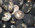
| 07/07/2005 01:18:37 AM | Chinese Aged Eggsby kayt300994Comment: Nice focus in the rocks in the center. The DOF makes it a bit more interesting, however, the subject doesn't really hold my interest. Lacking visual appeal. Technically I think it's well done. Nice lighting, nice focus, frame is nicely filled with the subject, just lacking something. Once thing I do notice is a bright spot right in the middle of the photo on the roundest rock. Not sure if that's part of the rock, or lighting, but it is a bit of a distraction among the other dirties darker rocks. ~Heather~ | | Photographer found comment helpful. |
| 07/07/2005 01:14:46 AM | The Only Circle With an Endby SeaSailComment: Interesting image. I like the lighting. I think it creates some interesting shadows and highlights all the right things as well. I'm not really sure that the 'main subject is clearly a circle', but it is definately implied, and that's good for something. One thing I don't like is how the rope is leaving the photo out the left side. This seems awkward to me. Seems like it should be leaving the photo out the top. That may also help bring a bit of balance to the shot. Right now, it's left side heavy. Looks like you have a dead pixel direcly above the nose. Not like that affects your score any, just an observation in case you didn't know. You can clone it out in advanced challenges, but not in basic, so probably doesn't matter much anyway. ~Heather~ | | Photographer found comment helpful. |
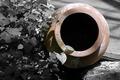
| 07/07/2005 01:10:17 AM | Clay Vase no.3by davmctComment: I really like this. I like how the pot is behind some leaves and not just sitting there on a blank background. the color of the vase is neat and I like the desat you have done here. I think it fits the photo well, and actually works. The cropping is nice. I like how the vase is off center and teh left of the photo is filled with the leaves. background is good, no distractions there in my opinion. I also like the lighting. I think it creates some neat shadows and I like how the center of the vase is dark. Not really much I can suggest here. I really simply like the image. ~Heather~ | | Photographer found comment helpful. |
| 07/07/2005 01:07:50 AM | Explosiveby Ram21Comment: Definatly circle. Unfortunately you'll probably fall victim of the 'too many fireworks' syndrom. The color on this one seems odd. Like you bumped up the saturation to create the color. Not saying you DID, just saying it has that look. I like the placement, and focus for the most part seems ok. Not a lot of visual appeal, but I think it is technically ok. I do like how you did not place the burst directly in the center of the shot. makes for a better comp being off centered a bit. ~Heather~ | | Photographer found comment helpful. |
| 07/06/2005 09:29:57 PM | Ran Out of Ideasby KarchieComment: With over 540 images to vote and comment on, I wish people could refrain from entering photos that they themselves don't even like just so they can have 'something' in the challenge. I'm assuming you already know what's 'wrong' with the photo, but with the large number of entries, I"m trying to give a large number of comments, so I'll tell you what I see.
A good percentage of the image isout of focus. By the largeness of the outter circle, it appears that THAT would be the main subject and therefor would seem that that part should be in focus. I realize that you were shooting for the center to be the 'main subject' but it just doesn't come across that way to me. The lighting is harsh. Reflections in the CD are very distracting and the large white reflection at the top is blown out/white. The center circle doesn't appears to be not in the center of the CD, making this look like a quick kind of shot. The centered composition isn't very visually appealing and the greyish kind of background doesn't really acentuate the subject very well. I hope this doesn't come across as too harsh, but in the same respect, I hope it helps you out in your further photography. ~Heather~ | | Photographer found comment helpful. |
|
Showing 251 - 260 of ~2785 |
Home -
Challenges -
Community -
League -
Photos -
Cameras -
Lenses -
Learn -
Help -
Terms of Use -
Privacy -
Top ^
DPChallenge, and website content and design, Copyright © 2001-2026 Challenging Technologies, LLC.
All digital photo copyrights belong to the photographers and may not be used without permission.
Current Server Time: 07/17/2026 12:32:52 AM EDT.
|