| Image |
Comment |
| 07/27/2005 02:24:55 AM |
Marathon Manby dfrenetteComment: This is neat. I like the lighting, but seems to be a few spots that are a bit too bright. On the shoes and hat. Background is good, nothing distracting there. I wish we could somehow see more of the medal. I like the way you set this up, quite original I think. The yellow reflection in the glasses is a bit of a distraction. ~Heather~ |
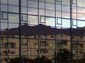
| 07/23/2005 02:24:44 PM |
From another perspectiveby marvinComment: I supose everything has a texture. The glass is smooth, which is a texture, however, when I look at the photo, the 'texture' isn't the first thing that comes to mind. The building is warped, but I'm not so sure that's a texture as much as it is a feature. That being said, I think the photo is interesting. Some good things to look at and hold interest. Focus seems a bit soft mostly in the trees/bushes. Probably hard to get everything in focus, but worth a try. The angle at which you took the photo is good too. Would not have as much interest if the window lines were straight within the shot. Maybe just a tad dark, but not enough that it hurts the photo. Maybe play with the brightness/contrast a bit. ~Heather~ |
 Photographer found comment helpful. Photographer found comment helpful. |
| 07/23/2005 02:16:31 PM |
Colombian Textureby rayz1Comment: Having this in the center of the photo isn't working for me. Texture is ok, but the presentation is lacking. There are no distracting elements in the background, which is good. I wonder if this might work better with just the right 1/2 of the photo. take it and crop it right down the center and I think that would add some visual appeal. Focus and clarity look good, and lighting is also ok. Just needs a different crop in my opinion. ~Heather~ |
| Photographer found comment helpful. |
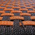
| 07/23/2005 02:13:50 PM |
Basketweaveby Phonic MonkeyComment: I like that it's in color. Adds some interest. Also, at first, I thought that the 'stray string' was a distraction, making the shot seem less uniform, however, I think I like it. Makes it just a bit different in that area to add something to look at and not make it just solid basket. Focus and DOF are both really good. LIghting seems alright as well. The subject isn't something that's making me jump out of my seat with excitement, however, it's a well done photo, technically good. ~Heather~ |
| 07/23/2005 02:07:54 PM |
Texture from Texasby metaphoxComment: The texture is interesting in the bottom right corner. It hink though that this could use a different crop or angle. Most of the photo is made up of the background, which doesn't really add to the photo for me. The DOF is good, but to the point where I can't tell what the dark circle in the center of the photo is. It appears to be metal, since it's got a large light reflection on it, which is also distracting. If that object were meant to be in the photo, then having it in better focus might work. If it's not serving a purpose, then I think it would be better if it were not in the photo at all. Maybe hide it behind the raised part of the subject? A slightly different angle may hide it. Lighting otherwise seems ok, I like how the texture shows up in the shadow as well. ~Heather~ |
| Photographer found comment helpful. |
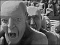
| 07/23/2005 02:02:39 PM |
Sand Slavesby marboComment: Wow. Really neat. Definately some texture in the sand. I like the angle you chose to shoot this as. Maybe a tad close to the mans head for the crop on the left side of the photo, but otherwise ok. The line of people creates a nice diagonal. The background works really well for me. I like how we can see it just enough to tell what's back there, but it's blurred enough to seperate it from your main subject. Black and white seems ok, but I do wonder what these guys looked like in color. Is it grey sand or yellowish sand? Lighting seems good to me as well. I think the shadows add to the shot. Overall really nice. ~Heather~ |
| Photographer found comment helpful. |
| 07/13/2005 01:15:18 PM |
Untitled-130.jpgby xcharrierComment: Love the light in the hair. I think you captured that very well. This one has the same skin coloration as the other shot with similar pose. I love the eyes in this shot. Very nice color. Good pose, but has the unflattering elbow wrinkles. The line inthe background goes directly into her eye. This background doesn't see to work for me I don't think. I like the white of it, and the color works nicely with her skin, but that darned horizontal line. lol Message edited by author 2005-07-13 13:15:45. |
| Photographer found comment helpful. |
| 07/13/2005 01:08:46 PM |
Untitled-8.jpgby xcharrierComment: I like the crop on her back much better here. Gives some 'room to breathe', and I think it helps to show the light coming through her hair. Bit of a tight crop in the leg though. The way her top is wrinkled up around her waist a bit makes her seem 'thicker' in the waist than she really is. Nothing wrong with that at all...but if I had a body like that, I would want it to show to the best of it's ability and not 'hide' behind something that isn't very flattering. Flatten it out and I think it would be just fine. See where I'm talking about? Under her left arm on her right side. It's bunched up there. The earring against that background again stands out and since we can't really see the earring on this side, just kind of looks like something stuck to her face. |
| Photographer found comment helpful. |
| 07/13/2005 01:03:37 PM |
Untitled-5.jpgby xcharrierComment: Love the lighting in her hair. Wish her back wasn't chopped off. Nice pose and look on her face is nice as well, but dark eyes. The earring(?) hanging from the right side of her head near her mouth is bright and a bit of a distraction. Shows up real bright on the darker background. I do like the background here a lot. I think that since the light coming through her hair looks so pretty, that having it cropped so close to her back is a bit of a dissapointment. otherwise, I like this shot a lot. |
| Photographer found comment helpful. |
| 07/13/2005 01:00:17 PM |
Untitled-107.jpgby xcharrierComment: Her eyes seem dark in this shot. I like the pose, I like the look on her face, all seems good except the dark eyes. I saw how beautiful the eyes were in the other pics and wish we could see them here. |
| Photographer found comment helpful. |
Home -
Challenges -
Community -
League -
Photos -
Cameras -
Lenses -
Learn -
Help -
Terms of Use -
Privacy -
Top ^
DPChallenge, and website content and design, Copyright © 2001-2026 Challenging Technologies, LLC.
All digital photo copyrights belong to the photographers and may not be used without permission.
Current Server Time: 07/17/2026 02:53:55 AM EDT.