|
|
|
Showing 2221 - 2230 of ~2785 |
| Image |
Comment |
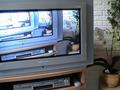
| 09/16/2002 08:05:00 PM | What's on telly?by DamitrielComment: Usually 2 parts to this kind of photo. the neg. space, and the pos. space. The pos. space, or subject is the TV, as stated in the title. Therefore making the neg. space (space not used up by the pos. space) it's surroundings. The photo it's self is pretty neat. I like the effect of using the recorder on the TV like that. The lighting is ok, however does seem to get a little blown out near the upper left corner. What were you refering to as your neg space? By definition, it should be the wall and the plant, however I don't find them that interesting. The focus is good, the angle and framing are good. Overall, a nice photo. Good luck in the challenge. ~Hbunch7187~ |
| 09/18/2002 03:36:00 PM | Open Skyby MaYzComment: Very pretty. I like the soft colors and soft focus. The tiny addition of the yellow in the middle is great. Very nice patterns, and angle and framing are also very nice. Great job, good luck in the challenge. 7~hbunch7187~ |
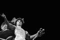
| 09/16/2002 04:54:00 PM | Hercules - Myth of Strength and Courageby chakkobboComment: I know some people are probably commenting about the "black negative space". It was talked about in the forums as being uninteresting, or something. However, i really like it here. I think it was applied very nicely. He seems to be welcoming in the darkness. I love the angle and framing. Originality a plus, creativity however is lacking. Very nice that it is not dead center. Lighting worked perfectly for the effect. Overall great job. Good luck in the challenge. 7 ~Hbunch7187~ |
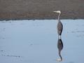
| 09/16/2002 07:35:00 PM | Reflectionsby waltomlComment: I like how he's not centered, rather off center. The reflection is so clear. I definately see the use of neg. space. The focus and clarity are really nice. The angle and framing are excelent. The only thing that stands out right away is the meeting place of the water to the dirt. It appears crooked, like it has a left tilt to it. I do understand that there are other factors that make something appear crooked when actually it isn't. I think that one of those factors applies here becuase the bird is standing straight. What I think has happened, is that the water line is in fact curved, or rounded, and that's what happened. Overall, this is a really great use of neg. space. Good luck in the challenge. ~hbunch7187~ |
| 09/16/2002 05:58:00 PM | flowerby notashamdComment: Not much I can say abou this photo. I like it. I think the neg. space stands out and is very clear here. the subject is pretty, and also stands out perfectly. The angle and framing are good. lighting is perfect. the focus and clarity are also very nice. overall good photo. good luck in the challenge. ~Hbunch7187~ |
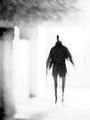
| 09/16/2002 05:38:00 PM | alienby snowComment: interesting. so the neg. space is everything but the "alien"? I think that is fair to say. without the background (neg. space) the person wouldn't appear to look like that, so I think you used the neg. space well to achieve the effect of your photo. Great job and good luck in the challenge. ~hbunch7187~ |
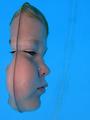
| 09/16/2002 08:22:00 PM | Out of the Blue by JeanComment: This is an excelent photo and nice use of neg space, however that vertical line is very distracting! It breaks right through the middle of the neg space. It is very odd, and I have to wonder what it is, and what caused it. The lighting is great, and the angle and framing are great. Focus and clarity are excelent under the circumstances. Overall really nice photo. Good luck in the challenge. ~hbunch7187~ |  Photographer found comment helpful. Photographer found comment helpful. |
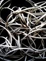
| 09/22/2002 11:46:00 PM | Wiredby BukiosComment: Looks like my christmas lights when I get them out to hang them on the tree. Interesting use of neg. space. lighting is good, and focus and clarity are also very nice.. overall great job! good luck in the challenge. ~hbunch7187~ |
| 09/22/2002 11:25:00 PM | Coca Cola can - circa 1990by prodigal havocComment: wow, this is a really narrow DOF. I guess the neg space doesn't really need to be in focus, so that's fine, however I think that I might have liked to have seen more of the can in focus. overall really neat, and good use of neg. space. good luck in the challenge. ~hbunch7187~ |
| 09/22/2002 11:22:00 PM | gone barefootinby queen 91Comment: lighting and angle are great. I love the cropping and placement of the shoes withing the photo. great use of neg. space. great clarity. good luck in the challenge. ~hbunch7187~ |
|
Showing 2221 - 2230 of ~2785 |
Home -
Challenges -
Community -
League -
Photos -
Cameras -
Lenses -
Learn -
Help -
Terms of Use -
Privacy -
Top ^
DPChallenge, and website content and design, Copyright © 2001-2026 Challenging Technologies, LLC.
All digital photo copyrights belong to the photographers and may not be used without permission.
Current Server Time: 07/22/2026 05:38:09 PM EDT.
|