|
|
|
Showing 161 - 170 of ~2785 |
| Image |
Comment |
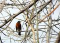
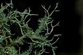
| 09/20/2005 02:17:05 PM | Choicesby fiveriversComment: *Critique Club*
Wow. That bird could not have chosen a better branch to sit on for you to take this photo.
Wonderful framing. If you didn't find any of the comments you received helpful, then I'm not sure if I will be of much help either, since the comments you received were right on in my opinion.
I do think that the take on the challenge is great. I like the way the branches frame the bird and the DOF really helps this.
There is great depth in this shot and really draws the focus to the bird, without taking the focus away from the branches.
I'm not sure weather I like the one vertical branch on the right or not. One opinion is that it gives the bird something to focus on...like he's going to chose that one branch, however, then it also draws our attention away from the bird a bit, but then that's ok too since the challenge is all about the branch, and not the bird. So, I'm thinking that I like it.
Lighting is ok, seems like a bit of a dreary day. too bad the sky wasn't a neater shade of blue to add some color interest, however, you don't get this shot every day, so not likely for a reshoot. Did you try bumping the blues in the shot? might help. something worth trying anyway.
Focus on the bird is ok. We don't get a lot of detail on him, which may be due to the slight shadow, but not a big deal.
Overall a very neat find.
~Heather~ |
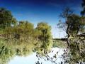
| 09/20/2005 02:09:42 PM | World upside downby nagymelisComment: *Critique Club*
I don't really see a main focal point here. I want to say that it's the branch to the right, however, my eyes aren't really drawn there at all.
The lighting looks good. Looks like it was a great day to take photos. Nice sky, nice color in the sky. the other colors don't seem to compliment the sky much though. Muted greens. I wonder if you boosted some saturation on the greens just a bit if this would help slightly to make it look like everything wasn't dying.
The birds flying around are too small in this version to make an interesting subject, and therefor are also a bit of a distraction. Looks almost like dust on the lens or something.
Horizon appears tilted, however, the branch and the poles in the background are straight, so that is a bit confusing.
I like the angle and crop you chose. I think that having the little leaves in the bottom in the forground makes for something interesting to frame the shot with.
While this is a beautiful scene, it lacks focus and color in the bottom half. I would like more details, and somehow draw some attention to the branch which for the challenge should be the main subject.
looks like a great place to go to gather your thoughts. nice and peaceful.
~Heather~ |
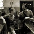
| 09/20/2005 01:59:16 PM | Branch of Abrahamby unicumComment: *Critique Club*
Not being into religion myself, I'm going to trust you on this one. Since you asked for an in depth crit, it would have been nice to have some details on the photo as to your intent, feelings about the photo, post processing, anything, but I supose I'll wing it.
The photo is grainy. In this particular photo, I think that the grain works well, but may have cost you some focus on the subjects. The photo in general seems too soft for my personal taste. I can picture this being crisp and full of detail. Was the shot not quite focussed enough and you tried to hide it with grain? Or did you add the grain and it compromised the focus? Either way, I would prefer focus over grain. Both would be nice though, but if I had to chose one or the other...focus.
I like the mood of the photo. Really nice moment you have captured here. I don't know what they're talking about, but there is definately a pleasant atmosphere.
The one thing that's really bugging me about the photo is the pole sticking out of the top of the boys head! Very strange looking. Very obvious once you notice it, and then it's all I can see. when I look at the photo, my eyes go straight to the pole stuck in the boys head. The lighting fixture behind the pole makes it look even more strange to be there.
Otherwise, this looks like it could be a movie still. I picture a heart felt moment between the boy and the man and some sappy music playing in the background. Lovely moment.
~Heather~
|  Photographer found comment helpful. Photographer found comment helpful. |
| 09/20/2005 01:46:49 PM | Branch Armorby ronaldibayComment: *Critique Club*
I have looked this over and over and do not see a bug as one commenter mentioned. I'm stumped.
Anywho...I really like the DOF, I think that it creates a nice background that is interesting, however, out of the way enough that it's not distracting to your subject either. I do wonder though what this would look like with just a bit wider DOF to show more of the thorny thing. I personally would like to see just a bitmore.
Your horizin line is giving the appearance of being tilted, however, I think it's just a curved area of tland? Having the horizon line is generally taboo, but I think it not only works here, but is nessisary. They way you have your subject toward the bottom of the photo, our attention is drawn there also by the dof. The background is just that, background. Having it blurred as it is, really makes the background useless (in a good way) to the composition, so the horizon line dead center doesn't bug me.
Definately fits the challenge and is pleasing to look at. Lighting is great, angle and framing/cropping are great. Really my only suggestion is a slightly deeper dof.
Nice find.
~Heather~ |
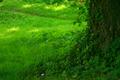
| 09/20/2005 01:38:17 PM | The root of all ...by narcisaComment: *Critique Club*
Is a trunk considered a branch? Not sure to me, so I guess since these challenges are so subjective, I'll accept it as a branch.
The color in this shot is very nice. I like the green of the grass, however, maybe a bit TOO green. Everything kind of blurrs together and it's hard to look at. Not sure if toning down the green would help, or if it just needs sharper focus.
I see that your intent was to have a fantasy like photo and this does have a dreamy feel to it, however, it's just missing something. I do supose that this would make a better abstract than anything, since we don't really get much detail out of the grass or tree trunk.
The trunk itself is quite dark against the bright green grass, making it hard to see much detail there also.
I like how we are at a low angle and that the tree is off to the right and the scene itself looks beautiful. I just wish we could see more of it.
It appears that the main subject in the photo is the color. That alone takes the focal point away from what is truely the main subject. Kind of distracting really.
Overall, nice color, but needs something to draw me into the photo and hold me there. In my opinion, that would be detail.
~Heather~ |
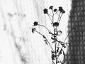
| 09/20/2005 11:59:57 AM | obscure waysby soerenComment: *Critique Club*
Being a flower from your garden, I would consider this more of a stem than a branch. I think that's a bit of a stretch on the challenge.
Focus is soft. I don't know if that was your intent or not, since it does't say in your Photographer's commnets, however, the out of focus look doesn't appeal to me personally. I would like to have seen this in focus. As it is, we don't get any detail from the flower what so ever. If you were going for a silhouetted look, then maybe a different background would have been appropriate.
The blanket in the background creates some distracting elements by having the squares behind the plant. The shadow on the right side is also a bit of a distraction since the left side is so bright.
I think that more contrast would be a good idea, however, again, not knowing your intent, it's hard to say. but the overall photos seems greyish.
It is good that you have your subject off center, I think this would have very little impact at all had the subject been in the center of the photo, so that was a good choice.
I also wonder if color may have been a better choice for this. I think it would have added something a bit more interesting to look at.
The idea behind this image is ok, but I think it just needs cleaned up some. Needs focus, lighting and more detail to look at. I'm just not drawn in and held there.
~Heather~ | | Photographer found comment helpful. |
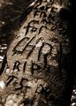
| 09/19/2005 01:38:54 PM | Your Nameby sprite777Comment: *Critique Club*
Due to the site being terribly slow for me right now, the comments and score came up and I saw all the positive comments. The score doesn't really reflect those comments, so I was all excited to be the commenter that got to really pick this apart. Then the image came up, and I really can't see much that I would change about it at all.
I love the DOF, focus is great and right where it needs to be.
The tones and color are great. This photo really creates a mood. A dark saddened mood, and due to the content of the photo, I feel that is appropriate.
The lighting is great, although I think my only nit pick with the photo would be that I wish I could see the part between From and for. It says Love From --- (maybe 'me'?) for chris (missing the s).
Not sure how you could have made it any clearer without compromising the mood of the photo, so really a well done shot.
I like the angle and framing/cropping you chose as well.
Overall a great image, lots of mood, technically well done. Definately fits the challenge.
~Heather~ | | Photographer found comment helpful. |
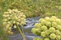
| 09/19/2005 11:31:29 AM | The land of the Angelicaby jonasgComment: *Critique Club*
This photo sufferes greatly from lack of focus. Not having any photographers comments, it's impossible to know what you were trying for here. My biggest piece of advice is if you want someone to spend the time to critique your photo, then you could spend the time to give that person some info.
That being said, the focus hurts my eyes. I can't see anything really. The forground is huge and blurry, which is a distraction if you were trying to take a photo of the background.
The background itself is blurry, so what could be a beautiful scene is really lost in the fuzziness.
Colors seem muted. No real punch in the colors. Maybe a hue/saturation boost and play with the brightness/contrast some.
I can't really tell, but these look like plants or weeds, and that would be considered stems, not branches.
I think had someone in the photo been in focus, this could have been a lot stronger shot, however, as is, it is not as appealing as it could be.
~Heather~ |
| 09/18/2005 09:58:14 PM | Tree Moss Branchesby ShaneBlakeComment: *Critique Club*
The subject is just boring to me. Not something I'd hang on my wall and not really something that captivates my attention for long at all. I guess it just doesn't have the wow factor for me.
The DOF is ok, but I think it creates some soft areas within the focused areas and therefor is distracting.
Color is also a little bland. The branch itself is dark, the background is dark and the branch thingy just doesn't jump out of the photo the way I would like to see it.
I think the way you composed the shot with the subject to the left and the negative space to the right is a good idea. This helps to create balance within the photo and offers the opportunity for good composition.
While this is really a close up of something really tiny, it looks like a far away shot of something larger. With this vision in my head, I want to see the tiny branches close and with more detail. Since the viewer has no sense of scale here, it appears that we are not getting much detail of this object what so ever.
Knowing though that it's just a small thing, you can tell, but not knowing, you can't. If that makes sense.
Overall, I'm just not drawn in.
~Heather~ | | Photographer found comment helpful. |
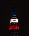
| 09/18/2005 12:11:36 PM | Patriotic Empireby MPRPROComment: *Critique Club*
Nice contrast in the photo. I thinkt he lights are light enough and the darks are dark enough to make this high contrast.
It's a bit odd that we can't see all of the building. One commenter mentioned that they like how you show more than just the color part, but in my own personal opinion, I think I wish I could see at least the outline of the building in the non red white and blue parts.
Focus from what I can tell is great. However, we can't really see much detail in the building at all, everything is so small. Which in reality isn't your fault, however, I keep squinting and getting real close to the screen to try to see more detail (which of course doesn't work).
The colors are neat. I wish the blue was as strong as the red and white, but not enough that it distracts from the photo in any way.
I do which there were some dramatic angle or have the building off center a bit. I think that would create some added interest and have more visual appeal that way.
SOme things work very well centered, and some things just need something extra. This is one of those shots that just need a little something extra to push it to pop.
~Heather~ |
|
Showing 161 - 170 of ~2785 |
Home -
Challenges -
Community -
League -
Photos -
Cameras -
Lenses -
Learn -
Help -
Terms of Use -
Privacy -
Top ^
DPChallenge, and website content and design, Copyright © 2001-2026 Challenging Technologies, LLC.
All digital photo copyrights belong to the photographers and may not be used without permission.
Current Server Time: 07/16/2026 11:27:08 PM EDT.
|