| Image |
Comment |
| 02/22/2003 10:54:19 PM |
Yellow on Iceby KazComment: definately yellow. i love the yellow on blue. the reflection is nice, and the angle and framing/cropping are good as well. i think what I like most is the yellow on blue. focus and clarity are also very nice. great find. good luck in the challenge. |
 Photographer found comment helpful. Photographer found comment helpful. |
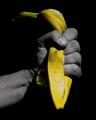
| 02/22/2003 10:52:18 PM |
Rage Against the Bananaby AnachroniteComment: excelent use of the color on black and white. I really like the angle and framig/cropping that you have chosen for this. the color is great. I think that the focus and clarity are great as well. nice dramatic lighting. i really like this shot. good luck in the challenge. |
| Photographer found comment helpful. |
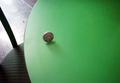
| 02/22/2003 10:50:43 PM |
Yellowby GussiComment: i like the drop, but the coin does nothing for me. the negative space is nice, and the angle and framing/cropping are also good. I think that the coin doesn't really fit in well. i do think that there is a advantage in that this is different that all the other drop shots we've seen in the past. nice focus and clarity. overall an interesting photo. good luck in the challenge. |
| Photographer found comment helpful. |
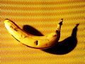
| 02/22/2003 10:48:13 PM |
120 Seconds of Fameby stephanComment: very nice focus. the angle and framing/cropping are great. I like the background against the banana. I like how the banana has blemishes. the shadow is also nice with the lines in the background. definately yellow. focus and clarity are really great.lighting is good as well. a little bit of a glare, but nothing serious. great shot. good luck in the challenge. |
| Photographer found comment helpful. |
| 02/22/2003 10:44:31 PM |
roller coinby j-oconnorComment: not exactly what I think of when I think "yellow", but there may be some kind of meaning here for you. sorry if I seem like an idiot, but this doesn't look like it's in focus, and I don't really see any yellow at all. I think that the angle is ok. the negative space is an advantage to the shot. good luck in the challenge. |
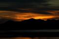
| 02/22/2003 10:41:33 PM |
"Amber Captured"by YomiComment: beautiful sunset. I like the silhouetted mountain. the angle and framing/cropping are great. color is very nice. i think it's divided just nicely with the horizon and the mountains. the dark clouds on the top create a nice balance. a nice shot. good luck in the challenge. |
| Photographer found comment helpful. |
| 02/22/2003 10:38:52 PM |
Flight of Icarusby AleciaComment: quite pretty. the angle and framing/cropping are good. i like how the dragonfly is near the bottom right corner. the colors are good. I do wish that it were a little bit brighter. I realize that this appears to be a lamp? and probably lit from the other side. still with that the bottom were a bit brighter. some extra light might bring out the color even more. a nice find. good luck in the challenge. |
| Photographer found comment helpful. |
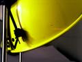
| 02/22/2003 10:36:45 PM |
Yeller Lightsby jblharshawComment: definately yellow. I am not sure if I think that this is the best angle and framing, however. it's kind of hard to tell what exactly we're looking at. at first, I thought it might be a hard hat near some kind of light, but then realized that it's probably a light, hence the title. the focus and clarity are great. lighting is also good on the subject. good luck in the challenge. |
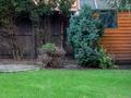
| 02/12/2003 11:57:29 AM |
Intruder Alertby auroraComment: I'm going to assume that this is a cut out of a head which is placed behind the bush. in this case, it fits the challenge nicely. Creative, thought out and executed nicely as well. The angle and framing/cropping are good. It's nice to seet the main subject off to one side. There is a blue spot over towards the left of the photo, I'm not really sure what it is, but being so bright in the photo, it's a bit distracting. if its something with your camera, than I understand that you couldn't edit it out, but if you were to have this photo outside the challenge, then it may be a good idea to clone over that bright blue spot. the only other suggestion I may have is that the window is a bit cluttered. I'm not sure if it's something inside the building, or if the window its self is dirty, but being so near to the bush, my attention is also drawn to it, and stays trying to figure out what's wrong with it. it's a nice shot. and i'm jealous of that green grass! :) good luck in the challenge. |
| 02/12/2003 11:52:50 AM |
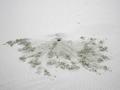
Are You There?by dasein06Comment: I'm not really seeing where the person is in this photo. It looks like an animal hole to me, where the animal is pushing sand out of his hole, but no person. Sorry if I'm not looking hard enough.
About the photo, The angle and framing/cropping are good. I like how you have the entire subject in the photo, and it fills the frame nicely. I thought maybe of not having the hole centered, but when I pictured not centered, it looked kind of silly, so in this case, I think that centering is a good choice. The lighting is good, not bright spots or distracting shadows. focus is nice as well. the sand is very defined. All it needs is a person. Good luck in the challenge. |
Home -
Challenges -
Community -
League -
Photos -
Cameras -
Lenses -
Learn -
Help -
Terms of Use -
Privacy -
Top ^
DPChallenge, and website content and design, Copyright © 2001-2026 Challenging Technologies, LLC.
All digital photo copyrights belong to the photographers and may not be used without permission.
Current Server Time: 07/25/2026 11:30:53 PM EDT.