|
|
|
Showing 1151 - 1160 of ~2785 |
| Image |
Comment |
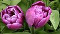
| 05/27/2003 06:49:28 PM | Purpleby cykhansenComment: *Critique Club*
I'm sitting here trying to think of somethings to say. I'm staring at the picture, I've read the comments, and I'm still at a loss of words really.
I read that the focus is really great, and look at the shot, and it is great in some places, most places for that matter, but when I look at the water drops, I wish that they were ALL as clear as the ones on the leaf. I'm thinking though that this maybe due to the texture and pattern on the flowers showing through the drops, making them look busy, when there isn't anything really showing through the ones on the big leaf to the right making them nice and clear and sharp?
I do think that it feels a little unballanced. I wonder if you had focused on just the right flower and the leaf, if this could have helped some. I'm just throwing that out as something to try. Probably something i'd have to SEE in order to say if it really works or not.
The colors are really nice. Purple and Green definately fit into the challenge.
The lighting seems to have been working with you this day. I think that the light shining in the drops is really nice.
This shot doesn't really appeal to me, however, it doesn't NOT appeal to me either. I'm rather indifferent about it. Well done, just nothing that makes me jump out of my seat with excitement.
~Heather~ |  Photographer found comment helpful. Photographer found comment helpful. |
| 05/27/2003 06:34:24 PM | Green Livingby GinaRothfelsComment: *Critique Club*
Secondary colors are created by mixing EQUAL amounts of 2 primary colors. By this definition, the only color that is close to meeting the challenge is the green tree in the background. The rest appears to be more of a blue/green, which would not be a secondary color.
(darn those picky people)
I am also not diggin the left tilt of the photo. It's not enough to be dramatic, but enough to be noticed, which makes it look like an error rather than something that was done for a reason.
The focus and clarity are also strange. I'm not really sure what's going on with that green tree in the background. It looks really pixeled, when the rest of the shot is, for the most part, ok.
It is hard to tell if the white area is sky, or if it maybe another wall from a building in the back?? I do think it is sky though, and I do also think that it's way too bright. See what it's doing to the roof?
I think it's a pretty scene, worth trying again for outside the challenge. I like the pillars, and the round ball on the top of the building. I think it makes for a nice composition.
Try it on a day that is not quite so blinding though.
~Heather~ | | Photographer found comment helpful. |
| 05/27/2003 06:22:29 PM | Christmas Stockby mcraelComment: *Critique Club*
There sure is a lot of color in this shot. Too much color, I believe. There are Purple, Orange and Green. Which are the secondary colors. However, there is also White, Black, Red, Yellow and blue.
If you are taking a photo of a jar, if you want that jar to be the main object, you do not surround it by other jars which are just as pretty.
I think that is the mistake you made here. While your secondary colors are pretty, the surrounding colors make those specific colors less important.
Your focus and clarity are great. I also think that because of the pattern on the paper, and the effects which are printed ON the paper, that it makes it look like you were able to accomplish 'special effects' in this shot. When really it is the actual print, not what you have done.
For example, the tag looks like it has some really great lighting effects on it, but that is just printed ON the tag, and actually the lighting isn't that great. On the subject, it's Ok, but look inside the tag. In the middle of all these pretty colors, there is a horrible dark shadow that really does nothing for the shot.
The angle and framing/cropping are really good. I do like very much how the subject fills the entire frame, and how you have included the tag and rope in the photo as well.
The colors are really vivid and stand out wonderfully, however, not for the purpose of the challenge.
Still quite pretty, and I think I could see this on a card or party invite.
~Heather~ | | Photographer found comment helpful. |
| 05/27/2003 02:51:47 PM | Deep Purpleby DoorskidderComment: *Criitque Club*
This looks purple to me. A lot more purple than the pinkish color people have entered. So I say that it fits the challenge in my opinion.
However, this does suffer greatly from lack of focus. You've heard it before, but what kind of crit would this be if I didn't mention it. You have used DOF very nicely to blurr the background to get it out of the way and let the subject shine, however, I am wondering if you set your distance, and then moved? The water drops are a nice touch, but as stated, creates some frusteration, as they are easily detected as being out of focus.
The lighting seems ok, but I wonder if some extra lighting would have helped both the focus, and to helps the front of the tuilp to have more detail.
The angle and framing/cropping is good. I wouldn't change that. I like how you have put the flower to the right of the photo. That does have visual appeal, however, it's hard to see through the focus to concentrate on the good aspects of the photo.
There is a vertical line, which I just noticed in your background, which once noticed creates a bit of a distraction to me. It cuts right through your subject. In through the top and out through the bottom. The blurred background helps to hide it, true, but once I see it, it's very obvious.
I believe this would have scored much higher with sharper focus.
~Heather~ |
| 05/27/2003 01:43:25 PM | Weeping Wisteria, Secondary to Noneby pupparazzoComment: *Critique Club*
I can see to the right of this photo, that this plant produces some really pretty flowers. I am wondering why you did not focus more on the actual flowers rather than half blooms.
Also, the brown slimy looking thing protruding from the top of the photo is not only a bit of a distraction, but kind of grossing me out as well. lol I don't find that part appealing much at all.
Did you just use flash on this? I'm wondering because it seems dark in some places, and the water drops are a bit bright. The overall lighting on the petals are ok, but some harsh shadows are created and also the inner part of the plant is dark.
Focus and clarity look ok to me as well. I think that you show some good detail in the petals and the water drops.
I think that the overall shot is a bit busy. There really isn't a focal point. I think that if you were to put the main focus on the pretty opened up flowers, that might help to create something to look at, rather than just our eyes wandering around searching for it.
The color is good, which is important for the purpose of this challenge. It's a good solid purple, which definately fits the challenge.
~Heather~ | | Photographer found comment helpful. |
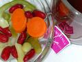
| 05/27/2003 01:20:55 PM | Afternoon Snackby dphillipsComment: *Critique Club*
I think you did a good job finding natural subjects, and putting them in a "natural environment" to take your photo. That shows a good eye.
I do think though, that the only official secondary colors are the Carrots and the beans and celery. The tea tag looks more of a pinkish color to me. A secondary color is created by mixing equal amounts of 2 primary colors. Mixing red/blue would actually make a darker purple.
Your photo still meets the challenge, but with this explaination, I find the tea tag to be a bit of a distraction.
Setting that aside though I think that this is well set up, and well taken.
The focus and clarity are good, and on a shiny subject, you did an excellent job with getting texture and detail.
The background looks like a paper towel to me. I think that the texture/pattern on the background is a bit of a distraction. I wonder if this might look better with just a plain, smoothe background. Maybe even just a piece of white poster board.
The lighting is good. I think that is the main reason for the good detail in the veggies. There are no blown out areas and no overly distracting shadows.
I like how you have the food bowl to the left, and the tea to the right, however, I wonder if you could find a true purple object to replace the pinkish one. Different tea label maybe?
~Heather~ | | Photographer found comment helpful. |
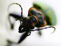
| 05/27/2003 02:17:20 AM | Charge!by dadas115Comment: *Critique Club*
Not much I can offere here in the way of suggestions. I really like this shot. If I HAD to pick something to pick on, I would mention that the blue spot on his front leg looks like an error and is a bit distracting.
However, It really only shows up when I increase the brightness on my moniter, so it's not a big deal at all.
Great DOF. I am one of those that really likes it. I think that what is important, is in focus, and the rest is just background. Speaking of background, the plain white works well. no distracting elements there.
Great colors. I think that if there were more light, creating more detail in his face, that that might distract from the color itself. Creating too much detail to look at, and we may overlook that which is important for the challenge. So I think that you made a wise decision there. With both the lighting and DOF.
I like the angle and framing/cropping as well. Really 'in your face' kind of shot. Sometimes that doesn't work...here however, it works very well.
Congrats on the 13th. This is excellent.
~Heather~ | | Photographer found comment helpful. |
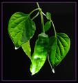
| 05/27/2003 01:58:42 AM | Green Pepperby ThomasComment: *Critique Club*
The first thing I want to add here is that I really really like the little purple border. lol
Also, I'm really glad you didn't turn the pepper purple. I like the green pepper on the black background with the purple border. Excellent choice in my opinion.
My only real complaint at all would be the harsh lighting on the bottom. Which you already know about, and yes. It is still a great photo.
The angle and framing/cropping is good. I like how it just kind of hangs there. Right out of the middle of the top. Very visually appealing in my opinion. (but then again, so is the purple border, so what do I know) lol *wink*
I think that focus and clarity are good. I like the detail that you show us in the leaves and the smootheness of the pepper.
Love the background. There are no distracting elements in the solid black background.
Really great job. ~Heather~ | | Photographer found comment helpful. |
| 05/27/2003 12:46:24 AM | Yields Greenby drydocComment: *Critique Club*
While I can see and read your explaination, I think that the red/yellow watering can is a little too brightly colored for this shot. It kind of 'steals the spotlight'. It's so much brighter than the plant that it really is a distraction for the plant.
The yellow alone might not bee SO harsh, and would still allow for your 'story' to stand true. In your explaination, I don't believe you need the red.
The lighting is not ideal here. The shadows are also a bit of a distraction in my opinion. As suggested, moving a bit away from the wall will help to reduce this shadow. Also, play with different lighting. That will helps shdows also.
The solid white background was a good choice, as there are no distracting elements in the background alone.
Focus and clarity seem ok to me. I especially like the detail in the water.
The angle and framing/cropping are OK, but maybe a little close to the plant on the left. Either crop more of the plant out, or include the entire plant. I tried a crop on the top also, and it actually doesn't look bad if you crop out ALL of the red part, and just let the yellow peek in through the top. Just my opinion though.
It's a neat idea.
~Heather~ | | Photographer found comment helpful. |
| 05/27/2003 12:30:51 AM | Sunset in my stomach except not in my stomach and instead in the skyby Asexaul duckComment: *Critique Club*
The colors are excellent. I can say that about this image. However, it's really difficult to say much more. At this tiny size, it's hard to really get any detail out of it. It looks like it was over sharpened, but this could be a result of the small size also.
I think that the colors are strong, and the trees at the bottom add to the shot.
I can't tell much about focus and clarity.
I do believe that this would be a nice image in large size.
My biggest suggestion would be to submit bigger shots. We used to have to submit 640 x 480. I think that was a good size. We are allowed to submit 640 x 640, but I think that's too big for most moniters to see completely on the screen, and again is just as bad as having the image too small.
I say to keep it above 400. Of course there are exceptions, like panoramas and similar, but I think that around 400 is a good amount to see. That's about twice the size you have here. This is almost thumbnail.
I believe that there are some tutorials in the LEARN section relating to size of images.
Keep shooting! And welcome to DPC.
~Heather~
I want to add that your title makes no sense. lol. Bigger photo, smaller title. *smile* Message edited by author 2003-05-27 00:32:25. | | Photographer found comment helpful. |
|
Showing 1151 - 1160 of ~2785 |
Home -
Challenges -
Community -
League -
Photos -
Cameras -
Lenses -
Learn -
Help -
Terms of Use -
Privacy -
Top ^
DPChallenge, and website content and design, Copyright © 2001-2026 Challenging Technologies, LLC.
All digital photo copyrights belong to the photographers and may not be used without permission.
Current Server Time: 07/25/2026 05:09:27 AM EDT.
|