|
|
|
Showing 1111 - 1120 of ~2785 |
| Image |
Comment |
| 06/02/2003 10:59:13 PM | I Am The Matrixby jenaromComment: *Critique Club*
Wow. Really nice. I like the effect a lot.
Lighting is everything here. I think that the projector provided enough light to effectively see the person, and not too much light, so that it still stays mysterious. I think however, that I would have prefered a more 'green' section to be on the face. Or at least a different pattern, so that there are not 2 really dark vertical stripes right in the middle. I realize that this helps the mystery feeling, but just seems too stripe-y. Maybe if the lettering were scattered instead?
The color seems really good. Green was a popular choice for this challenge. I feel like I'm in the green challenge all over again.
Focus and clarity seem really good on the person. I wonder how this would hold up if you could have gotten some of the lettering in focus as well. Maybe at least the larger lettering that is closest, and then have the smaller, farther away ones out of focus.
The angle and framing/cropping work well here. Simple but effective. Good crop, I don't feel that it's too close, or that there is too much neg. space. I think it's right on the money.
Really nice job.
~Heather~
|  Photographer found comment helpful. Photographer found comment helpful. |
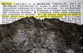
| 06/02/2003 08:00:24 PM | Definition of Matrix - Fossil of fernsby ladpupmoeComment: *Critique Club*
This is a little off the wall, yes, but I would say it definately fits the challenge.
I do think that the lighting is a little low on the fossil. Maybe some kind of either side lighting, or lighting from the top would helps the little ferns to stand out a bit.
The focus seems a little soft as well. Maybe it's just the texture of the rock, but the little ferns don't seem to be very crisp.
The comment that this is a copycat pic is a bit rediculous. What shot ISN'T a copy cat pic? You have put an object in front of words, and that's pretty common, but I see nothing wrong with that.
The angle and framing/cropping I think works for this shot. You were able to get both the definition and the rock in the shot, and show adequate amounts of both.
This doesn't grab my attention and hold it, but it isn't bad either. I think that the rock was probably difficult to get both lighting and focus because of the texture and bumpiness. Still a good interpretation however.
~Heather~ | | Photographer found comment helpful. |
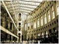
| 06/02/2003 12:37:11 PM | Library Squareby friscaComment: *Critique Club*
I'm finding this shot really busy. Lots of lines that really lead to nowhere.
I'm also wondering about the perspective/angle. The strong vertical line (support to the left of the center of the photo) appears to be leaning to the right. When matched up with the edge of my screen, it is leaning. However, the right side seems to be leaning inward as well. Wide angle lens? Sometimes they create distortion and can look a bit odd, with strong verticals curving inward to the photo.
The lighting is also a bit strange. Really bright at the top, to where it is almost washing out the detail in the ceiling. However, it's really dark in the bottom right so that we really don't get any detail at all out of that area.
Focus looks really good. Things seems sharp and lines are nice and crisp. Clarity though is a bit different. There are so many lines that in some places it all just kind of mushes together. Also, the people are really too far away to get much detail out of at all, and are almost a distraction to the building, which is a distraction itslef. lol
I wonder if focussing in on a smaller section of the building would have worked better for me.
You got a nice score, and some great comments, and I feel bad saying that this doesn't really appeal to me. Like I'm the bad guy or something, but it's just not striking any interest with me.
~Heather~ Message edited by author 2003-06-02 12:37:38. | | Photographer found comment helpful. |
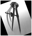
| 06/02/2003 12:12:18 PM | Shadow Danceby autoolComment: *Critique Club*
I think I'm missing something. Someone said to use a simple border. Does it get much simpler? It's white.
The only thing I can think of is that the black triangles are not part of the photo, rather part of the border?? It looks like a white paper which was angled on a black background. maybe it's ME that is seeing it wrong? Oh well.
As for the photo. It's a really great photo. The only thing that I can really see that I'd like to see improvement on would be the focus. It seems like it's generally soft throughout the photo. Both the shadow and the object are soft. Maybe at least have the points sharp? I can also see that there is a screw section in the middle, but those are soft also. Maybe it just seems that way cause of the light.
The lighting I think it good. I love the shadow, and think that it's a really important part of this shot doing well. I like how the white surface fades from bright at the top to a bit darker at the bottom.
The angle is interesting, though I find myself tilting my head to try to look at it. I'm not sure why, but aparently my brain wants to see this horizontal. Visually though I like the angle you put it at. I think it's nice. But still trying to turn my head. lol
I like the darkness of the object on the light of the paper. Great shot.
~Heather~ | | Photographer found comment helpful. |
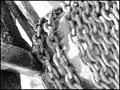
| 06/02/2003 01:06:22 AM | Chainsby ursulaComment: *Critique Club*
I really like this.
Actually, the only thing I can see that I could really make a suggestion on would be the harsh lighting. Seems to wash the photo out in a few places.
This is a really neat setup. I like the angle you took this at. Not dead on, at a bit of an angle. Really neat. Gives something to really look at. The closeness is really good as well. We can see enough to get our imaginations going as to what this is, but can't see quite enough to give it completely away. I'm sure someone who deals with these would guess it right away, but not me. Mind you, this is a good thing.
The focus and clarity are really good. Wonderful detail you show us here. I expecially like the texture of both the chains and the darker object to the left of the photo. Nice combination of different textures. The black and white really does help to bring out those textures, and had this been any other type of challenge, I'd still like to see this in b/w.
So, my only complaint is the hot spots really. I wonder if a different time of day would help for this? Or maybe that might just create some shadows we don't want either. Maybe taking it in bright light, but then casting a shadow over the entire image? Like putting up a sheet or something. Outside and being such a large looking object, it might be difficult though. Not really sure what else to suggest about the lighting, but definately would like to see it without the hot spots.
~Heather~ | | Photographer found comment helpful. |
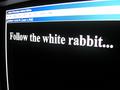
| 06/01/2003 11:57:20 PM | Neo, Follow the white rabbit...by WILDBLUEComment: *Critique Club*
I've never been fond of the computer screen/tv screen shots. I think that they are easy and lack creativity. Also, they are really borderline (and sometimes do) in breaking the 'work of art' rule in the challenge rules. As a moderator, we've gone around and around with these kind of shots. Looks like you made it this round.
About the shot. Being done in Photoshop, you'd think this would be flawless. however, there is a white spot above the W in the word WHITE. I find that strange and distracting.
I wonder if this would have looked better if you had set your screen saver to "scrolling marquee" and typed this in, then set your marquee to SLOW REALLY slow so you can take a pic of it. You can set the background color to black and the font to white. This would have eliminated all the 'junk' at the top of the screen.
The focus on the words is good, nice and crisp, however, the focus on the upper part is really blurry, which makes it an even bigger distraction.
Not my style really.
~Heather~ | | Photographer found comment helpful. |
| 06/01/2003 11:46:51 PM | Transmissionby marinajoeComment: *Critique Club*
I'm going to guess as to what this is and the meaning. You'll have to let me know how I do.
This looks to me like a phone cord, and it looks like something passing through the phone cord. Like maybe when they picked up the phone in the matrix and were transported somewhere. Looks like something being transported through a phone cord. The curly kind of phone cord.
Ok, now that i've gotten my guess out of the way, I'll talk about the photo. I hope I will be able to offer some helpful advice, as it looks like you were not happy with the comments you recieved on this.
First of all, it is a bit hard to identify. The photo is grainy, low lighting and doesn't seem focused well.
These 3 things actually are probably related. A lot of times when taking a shot in low light, parts will turn out with grain. Also, any camera shake at all when photographing in low lighting will result in a less than sharp photo.
I would suggest setting the camera down on something. Don't try it hand held. I would also use the timer if available on your camera. That way, you don't even have to touch the camera as the shutter releases. This way, you will definately cut down on shake, and the result will be much clearer.
However, if you were going for the blurry unrecognisable look, I think you achieved it really well. Took my imagination even awhile to come up with what this could be.
It seems well balanced with the exception of the bright blurr in the upper left. I find this to be a bit of a distraction, as I'm not really sure what part it plays in the story being told by the photo and also it doesn't seem to 'go' with the rest.
not really my sort of photo, but if my guess about what this is suposed to represent is correct, than it definately ties in well with the purpose of the challenge.
~Heather~ | | Photographer found comment helpful. |
| 06/01/2003 11:32:09 PM | matrix: n. something from which something else originatesby mcraelComment: *Critique Club*
This is a very pleasant shot, which is what you were trying to accomplish, and that's good. It's peaceful and pretty.
Somthing is missing though, and I think that pedromarlinez actually gave you a helpful critique relating to the lighting, which I find to be off somehow.
The bottom half seems well lit and clear, but it gets dark. Almost creepy toward the top of the photo. The apple dissapears into the darkness and is consumed by the black. A little extra lighting could have helped this a little. Even if not a lot, I think that it needs just a tad more light. If glare and reflection were a problem, placing a thin cloth or paper between the subject and the light source would help to reduce that.
It looks like it was getting a bit harsh on the full apple, as there is a little bright spot there. Nothing huge, but still noticable.
The setup is really nice. I like how you have both the full apple and the cut apple. The apple blossoms are nice as well. really pretty.
Literal take on the challenge is nice. It's different anyway. Not the same old green lettering or sunglasses. lol
It seems that some didn't even get the reference to something from which something else originates. Apple originate from apple trees, and these flowers are from the trees. I get it.
It's hard for some people to see past there nose it seems.
Focus is alright it seems. Seems crisp in some places, and soft in some place. Kind of a nice mixture though. Dreamy. I really like the reflection. Wouldn't be the same without it.
~Heather~ | | Photographer found comment helpful. |
| 06/01/2003 11:18:33 PM | The One With Coolby pupparazzoComment: *Critique Club*
Well, I've sat here now for awhile looking, and I can't find all these 'deep' meanings. I've seen both movies and I'm still drawing a blank. Oh well. Blaming my own ignorance here.
I will start out by mentioning something no one else seems to have mentioned. The lighting on the dogs face is really harsh. Wipes out all the detail in his fur.
I'm not really sure what the boot means, especially sitting next to a sleeping dog wearing sunglasses, but It doesn't seem to fit, and actually takes away from the dog in sunglasses. As the boot is so dark, and the rest of the shot is so bright, it stands out and appears to be the main attraction, expecially being right in the middle of the shot, when the sunglasses are hugging the edge of the photo.
Focus and clarity appear to be good. There is good detail in the carpet, and also in the part of the dog that is not harshly lit. Love the detail on his nose especially. Really great texture there.
Angle and framing/cropping seem to be a bit off. I'd like to see the sunglasses not so close to the edge of the frame. I feel that they should be a more important part of the pic, and they just don't stand out well way out there.
Funny shot though with the dog wearing glasses.
~Heather~ |
| 06/01/2003 11:04:28 PM | Faster than a speeding...by pncowleyComment: *Critique Club*
I'm not getting the sense of speed here. When I first saw this actually, I thought it looked like a pencil tip. Didn't really give off a really great first impression thinking it was a pencil.
However, now knowing that it is a bullet, that then makes me think that you processed the heck out of this and maybe it would have been best left alone?
It's a bit grainy, and the saturation does look like it's been jacked up a bit. I'm not quite sure I like that effect.
The angle and framing/cropping are good. I think you caught the bullet falling at a nice time. Your patience paid off there.
I wonder though if you could try something like a long exposure shot to make it look like it was actually moving. That could have been really effective. There is a tutorial Here //www.dpchallenge.com/how.php?HOW_ID=21 on how to do this if it is within your camera limitations.
The bckground is good. No distracting elements there. White is a good color background for this shot.
Focus is hard to tell because of the graininess of the subject. It doesn't really look like it's fucussed that well. Is this why you post processed so much?
Fits the theme of the matrix nicely I think. With all those stopped bullets in the movie, it worked. Not with the title you put on it though.
~Heather~ | | Photographer found comment helpful. |
|
Showing 1111 - 1120 of ~2785 |
Home -
Challenges -
Community -
League -
Photos -
Cameras -
Lenses -
Learn -
Help -
Terms of Use -
Privacy -
Top ^
DPChallenge, and website content and design, Copyright © 2001-2026 Challenging Technologies, LLC.
All digital photo copyrights belong to the photographers and may not be used without permission.
Current Server Time: 07/24/2026 06:23:27 AM EDT.
|