|
|
|
Showing 1101 - 1110 of ~2785 |
| Image |
Comment |
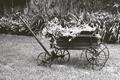
| 06/04/2003 08:30:59 PM | That Old Wheelbarrowby nathaliedooComment: *Critique Club*
It says you added a bit of a brownish tint, but it looks black and white. I wonder if a lighter brown tint (closer to sepia) would have worked more effectively here. While I think you did a nice job with the photo, it's lacking something in my opinion.
I think the plants on top of the little wagon lack detail. Looks like a lighting issue combined with the grainyness. When the details in something aren't really clear to begin with, then you add elements to it, it kind of makes it all mushy looking.
There is a patch of grass right in front of the wagon that looks like it's all matted down and trampled on. I wonder if you could have moved the wagon over to the left just a little bit to get that bad section of grass out of the shot?
Focus and clarity look ok on the wagon and on the background items. i think though that maybe the background is another contributor to why the plants on the cart look not right. They kind of all blend in together. Really busy looking ontop of that wagon. lol
Overall, you did achive the look you were going for. Looks real old and so does the photo. Curious to see how a lighter brown would have looked.
~Heather~ |  Photographer found comment helpful. Photographer found comment helpful. |
| 06/04/2003 08:17:53 PM | Splashby e301Comment: *Critique Club*
Well, I will admit that I'm not seeing this the way you had intended. I found the splash itself to be interesting, but the extra falling objects to be a distraction. I expecially don't like the ones at the very top. Are they coins you were dropping?
Anyway, I like the crown created by the splash. It is almost a thing of perfection. I would have cropped out the top thing of falling objects, and even the second. So that the shot included the crown, and only the little splash marks coming from the crown. Yeah, maybe that does make it a bit 'cliche' but I think things are cliche for a reason. Cause they look good, and are quite effective.
I think having this in black and white is enough to set it apart from 'the rest' though. Usually people are putting all kinds of colors and patterns in it. Black and white actually accents the crowns edges to me. Lets us see JUST the splash and not have to worry about other elements.
It looks like you need a very slight left rotation, as the far edge of the bowl appears to be leaning to the right a bit.
Overall a nice shot, just would like to see that tighter crop.
~Heather~ | | Photographer found comment helpful. |
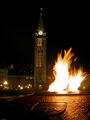
| 06/04/2003 07:58:41 PM | Guess where my home is... :o)by kosmikkreeperComment: *Critique Club*
Ok, here's my stand on this. First off, I lined the center of the tower up on the edge of my screen (flat screen) and it appears to be straight to me. Just fine. It lines up right from the tip of the triangle atop the door, to the flagpole on the top of the tower. However, the outter edges of the photo are leaning inward, which is a common distortion of wide angle lenses. You can't really see it on the right due to the flames, however, that side is leaning to the left. The left side f the photo is more obvious, and leaning to the right, so I wonder if that's why people say it's tilted?
Oh well. Looking at this, I got no sense what so ever of your home, or even what country your home is in. I see now that it's Canada, but I did not get that from looking at your photo. This is the fault of my own ignorance, maybe, but it doesn't scream home.
Setting that aside, the flames are really neat. As mentioned, I too feel that they are the center of attention rather than the building, which I guess represents canada somehow. but, what do I know, maybe the fire represents canada as much as that building?
You could have cropped out the plaque at the bottom. I don't feel that it's clear enough to add anything to the photo. I can't really see what's on it, and it's a bit soft on the focus also. I don't feel that you would be losing anything if you cropped it (due to the non clarity) and it would also help to bring your main focus up to the fire and building. If you could get it a bit clearer, then I don't think it would hurt to leave it in the shot.
~Heather~
| | Photographer found comment helpful. |
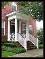
| 06/04/2003 07:41:55 PM | It's the only Brick house on the leftby CreativeFlyPhotoComment: *Critique Club*
A very well maintained house. Good bushes, nice grass, pleasant to look at for sure. It's the kind of shot you'd see in a House For Sale ad. I'm not realy sure about the 'creative' part of the challenge though. Someone stated that it looks like a snapshot, and while I think it's a step further than a snapshot, I don't think it you have gone out of the way for creativity.
Technically though, you hit this right on the mark. My only technical complaint would be that the sky in the background is a bit white out, and bright on the building in the background.
Focus and clarity are really great. Love the detail in the brick and the white stair rails. Nice crisp lines.
The angle and framing/cropping are nice to display the house at. We get to see the main elements. Door, brick, window, and stairs. We can tell that it's more than single story, however, are close enough to get the real detail, rather than the overall size.
The lighting looks ok for the detail and for not getting bad shadows or bright spots on the house. The far windows are showing a little reflection, however, nothing real serious. The only real lighting problem I see is that hot spot in the back on that other building.
The title does work nicely. Reminds me definately of home cause that's kind of like we tell people where our house is.
I have a question. Did you remove the flag for the photo? I know how some people complain about flags in photos. Could have been one of those seasonal flags though. Anyway, I think you did a good thing to remove the flag, even though it is part of your home, because it would have been in the way to see your actual home.
Overall, technically, it's quite good, little to complain about, but it just doesn't stand out to me more than that.
~Heather~ | | Photographer found comment helpful. |
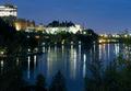
| 06/04/2003 03:53:25 PM | It's Good to Come Home!by ursulaComment: *Critique Club*
What I really find attractive in this shot is the white building in the middle. Your focus and clarity on that are just awesome. The lines are crisp, and we get some really nice detail out of it.
However, the surroundings aren't really that nice. There is a dead branch in the lower left corner that I'm finding particularily annoying. It stands out there just screaming 'I'm ugly'.
The sky is good, and the reflection in the water is also ok. I don't like the way the lights look on the surrounding buildings though. The focus is sharp, but the lights are all fuzzy, which takes away from the sharpness in my opinion.
It's a nice night shot. You did a good job of getting lighting and focus to work for you on the building.
I think that maybe a different crop would have helped, or maybe just get in a bit closer on the building. I'm not finding the forground filler attractive much at all.
All the talk about meeting the challenge, I think this works just fine. Home isn't always your own house. There are some things that you see that just feel right, and you sigh and say "I'm home".
~Heather~ | | Photographer found comment helpful. |
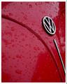
| 06/04/2003 02:09:21 PM | red wet volksby imagesloyolaComment: I could be wrong, but this looks like water, and the challenge called for NO water, however, you could have sprayed coolaid all over your car.
About the shot itself, I think it's ok. Neat effect, and good angle on the car. Lighting looks good for the effect as well. focus and clarity are good in my opinion.
~Heather~
*Revision*
Made to LOOK like water, a lot of people will probably just jump on that and run. Unfortunately I think that will hurt the score. No one expects cooking oil on a VW. lol. Oh well. I try to assume that the challenge has been met, and go from there.
This will be an 8 from me. I noticed some horizontal shadows(?) to the left of the VW sign that I find to be a bit distracting. Otherwise, as I said before. Good shot. |
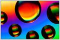
| 06/04/2003 02:10:24 AM | Mongolian Fire Oil on a CDby DavenitComment: Wow. Neat shot. Saw this exact same concept on psig today too. Maybe it's yours too, but if not check it out //www.photosig.com/go/photos/view?id=931844.
Love the color in this shot. I'm a huge fan of color and this take the cake. I especially love the background. Very nice vivid colors, and nothing distracting.
I only wish that the large bubble in the middle didn't have that white line that makes it look 'not round'. That little tiny part is a bit distracting, but hey, what can you do? Great job.
~Heather~ |
| 06/03/2003 12:40:43 PM | Red.. or Blue?by BigSmilesComment: *Critique Club*
Strange looking pills. They almost look like they are textured or something. Actually, they look like those foam ear plugs that you squish up and put in your ears.
The photo seems to have speckles throughout it. I see a couple pixels that appear to be dead, but other than those, the pills look a bit grainy, and there are also speckles in the bluish areas of the glass.
The focus looks good on the pills, there is a nice crisp line seperating the red from the blue pill.
Color is really bright. Looks like you upped the saturation levels a bit. not a bad thing, I think it helps them to stand out even better on the background. i wonder though why the glass looks so strange and spotted like that. maybe something in post processing? You didn't say what you did TO this photo, so it's hard really to say.
I like the angle and framing/cropping you chose very much. I like the tilted angle of the glass. Very dramatic. Had this been a straight on shot, I think it would have been quite boring and not 'different' than any of the other pill shots. The angle sets this one apart.
~Heather~ | | Photographer found comment helpful. |
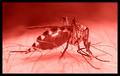
| 06/03/2003 12:50:22 AM | Feasting on RED!by kosmikkreeperComment: *Critique Club*
Nice macro. Definately creepy.
I'm not really sure where the focus is? I see a couple small parts that seem to be in sharp focus. All near the 'feet' of the mosquito. Right near the skin. See in the bottom left corner, that patch of human skin that is really detailed. We can see the texture nicely. I try to follow that sharpness through the photo, and I see a couple arm hairs, and then the antenae of the mosquito. This doesn't seem like a great path for the DOF. I'd like to see parts of the body that were in focus as well. Probably the body and head at least.
The lighting appears to be good. We do get to see great detail in the patterns on his back and lots of different 'mosquito parts'. No harsh spots or bad shadows.
The angle and framing/cropping are really good. I wish his leg wasn't in front of his face, but you couldn't have exactly asked him to move it. I like how the body is kind of 'in your face'. I think the close crop works here, as we all know exactly how tiny this little guy is. We don't need any other reference to size, so cropping right in on him works well in my opinion.
I don't mind the red. I think that it works ok here because when we think of mosquitos, it's in warm weather, we think of blood, and we think of disease. All which could be represented by the color red. Blue just wouldn't have worked here I don't think.
~Heather~ | | Photographer found comment helpful. |
| 06/02/2003 11:22:02 PM | my matrixby redhedComment: *Critique Club*
Lighting is an issue in this shot. The pills are almost over lit, and the bottle isn't lit enough. I don't like the harsh shadow created by the front pill onto the pill behind it. It kind of takes a chunk right out of the pill in the back. Probably lighting this more, and just putting a thin sheet or paper between the light and your subject might provide enough light, but cut down on glares created by too much lighting.
While I realize it's probably the label that's tilted, the tilt of the lettering really makes this look like everything is going to slide right off the right side of the photo. See how the lettering doesn't line up with the upper frame of the photo? Being so close to the edge, it's really obviously tilted and creates a distraction.
I'm glad you have cropped this to cut out your address and RX number. I saw a shot once that left all that info in, and I was freaked out. Couldn't believe someone would have given out all that info. So the crop there is appropriate to me. You could have carefully cut it out and then shows the entire bottle, but I don't think it would have been as effective.
Focus and clarity seem to be just fine. Good detail in the pills, and the lettering on the bottle isn't blurred or anything.
The black background also works nicely as there is nothing distracting in the background. Also helps to make the subject stand out.
I think that just about anything would qualify to be in this challenge, so I think it fits the challenge nicely.
~Heather~ | | Photographer found comment helpful. |
|
Showing 1101 - 1110 of ~2785 |
Home -
Challenges -
Community -
League -
Photos -
Cameras -
Lenses -
Learn -
Help -
Terms of Use -
Privacy -
Top ^
DPChallenge, and website content and design, Copyright © 2001-2026 Challenging Technologies, LLC.
All digital photo copyrights belong to the photographers and may not be used without permission.
Current Server Time: 07/24/2026 04:59:51 AM EDT.
|