|
|
|
Showing 1091 - 1100 of ~2785 |
| Image |
Comment |
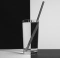
| 06/06/2003 02:16:26 PM | Black & white H2Oby ladpupmoeComment: *Critique Club*
Well, The verticals are vertical, but the strong horizontal line in the back is not horizontal. The is a bit of a tilt/curve in the 'horizon' there.
I don't particularily care for the straw. It's being all distorted by the ridges in the glass. Also, you can see the ridges at the top of the glass.
I think that this would have a higher visual impact on me if the glass was a solid glass, or if the straw was just not there. I realize that the straw was added to make this shot not 'boring' however, I think it has a negative effect on the photo as is.
The focus seems a bit soft, but I'm wondering if that is because of the wavy ridges in the glass as well. Most likely hard to capture becuase of the textures.
The angle and framing/cropping (with the exception of the tilted 'horizon') is good. I think being centered is important for such a symetrical shot. And the horizontal line IS placed in a nice spot within the photo.
I do think that this is a bit grey though. Would like to see the whites white.
Overall a nice shot, with some few minor adjustments, this could be great.
~Heather~
|  Photographer found comment helpful. Photographer found comment helpful. |
| 06/06/2003 01:42:07 PM | Aria, 10 days oldby RobroComment: *Critique Club*
The expression of this little girl is great. I think that the way she is not looking directly at the camera and looking off into space is wonderful. The little catchlights in her eyes are precious as well.
I only wish that the focus were more sharp around her eyes. Right now, the sharpest part seems to be her clothing near the bottom left of the photo. The texture in her clothes right there is great. I wish that same detail could be shown in her eyes.
The angle and framing/cropping is good. As I stated, I love the pose. I wonder if you should have either cropped MORE of the ear, or less of the ear. Right now, it's kind of cut right in half, and a bit awkward. I like the little bit of space in the upper left giving her some room to stare.
The tones are good. Maybe a little grey, maybe contrast adjustments would help to bring out the whites and blacks a slight bit more. Not much, but that might give the FULL tonal range obviously.
A precious shot none the less. Definately one for the books, or even the wall for that matter. Great capture. Congrats on the granddaughter.
~Heather~ | | Photographer found comment helpful. |
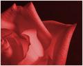
| 06/06/2003 01:32:57 PM | Duotone Roseby scrooslooseComment: *Critique Club*
I'm not really sure if this is considered duotone or not. I'm not educated in that area enough to decide. I does not LOOK to me like a duotone. It looks like a full color image that consists of 2 colors. Seems to be the same thing, but I don't think it is.
Oh well, setting that aside, I think the image itself is great. I don't see any true black, when you lighten up the background, it's actually a really dark redish color. I tried this shot in black and white and really like it also.
your focus and clarity are what make this shot great. You show us some really neat detail in the petals of the rose. it is a perfect rose, no flaws, althought I don't mind seeing flaws either.
The angle and framing/cropping are good. I like how the one triangular petal sticks out into the shot. Very visually appealing this way.
I dont really have any suggestions for improvement on the shot, unless it's not duotone, then there is the obvious one. However, still good.
~Heather~ | | Photographer found comment helpful. |
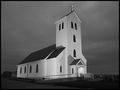
| 06/06/2003 01:50:39 AM | Midnight Churchby tyrkinnComment: *Critique Club*
Wow...the focus and clarity here are supurb. The lines are so crisp and clean that this almost looks like a model. The building is so flat, and most of all so CLEAN. Look at how white that building is!
I'm not a religous person, but I reallyl ove the way the cross on top stands out so perfectly. Like it's glowing or something.
They really have this church lit well. And I think you took advantage of that nicely.
The angle and framing/cropping are good in my opinion. I like how you have placed a little space in front of the church for 'breathing room' I think it's very effective. I am wondering though, is there a bit of wide angle lens distortion? I say this because if I line up the vertivals with the edge of my screen, the ones on the left of the screen appear to be leaning to the right and the vertivals on the right seem to be leaning a bit to the left. Everything is leaning inward. There really isn't a true vertical in the shot that I could find. Mind you, this is only a obsessive compulsive distraction, and doesn't seem to effect the photo in a bad way, rather just an irratation to me, who actually sits and lines these things up. lol
I like the tonal range (is that the 'proper' term?) I see nice white whites, and nice black blacks. The sky is beautiful, and nice for this image.
What makes a photo 'icelandic'? I see this was taken in Iceland, but what was the giveaway? Is there a certain style or something that is considered Icelandic?
A really nice photo. Great job.
~Heather~
| | Photographer found comment helpful. |
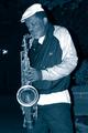
| 06/06/2003 12:27:06 AM | Blues in Blueby jmark53Comment: *Critique Club*
Other than a few hot spots,(hat, teeshirt and coat sleeve) I think this is a wonderful image.
His skin tones and lighting on the skin are wonderful.
Your focus and clarity on the man is also good. Between the lighting on the skin, and the nice clear focus, you show us some really great detail in his face.
There are a few small things I can mention that could be improved upon, but I don't think it's absolutely needed for the photo to still be great.
First, the object on the left, which looks like a street light is slightly distracting, however, not serious.
Also, and I'm starting to like this less and less, is the harsh shadow created by the man to his right. Probably a result of flash, and being too close to the background. The more I look at this, the more of a problem it seems to me. With a night shot though, I'm not really sure how you could reduce that, other than adding some other lighting around the man, and that might be a bit awkward.
I like the blueness of the photo, I think it fits nicely. Maybe you could go back some night, and drop off a few coins, and slip this into his coin holder as well. I bet it would make him smile.
~Heather~ |
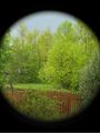
| 06/06/2003 12:00:52 AM | My Window on the Worldby cpanaiotiComment: *Critique Club*
This is definately different.
I like the color. It's really quite vivid and beautiful.
The inside of this looks like a painting. I'm why you did the circle thing. Is it optional? Or is it a required thing when shooting with a teleconverter? I know nothing about these, so pardon my ignorance.
I think I'd have prefered it without the circle if possible. However, if crispness and color would have been sacrificed, I'd prefer it the way it is.
The left side looks a little weird. There is a thing over there that looks like a wooden structure. Maybe a garden swing? It looks really fuzzy and lacks any detail at all. While the right side is not suffering this fuzziness. That seems a bit of a distraction for me.
I love the view. It's really nice with the fence and trees. I like the color of the fence with the colors of the trees.
The focus and clarity of the center of the photo looks really nice. Clear lines on the fence, and in the tree in the middle. Good job with this.
You've taught me something by posting this. I still don't know what a teleconverter is, but I know that it creates this circle border thingy.
~Heather~ | | Photographer found comment helpful. |
| 06/05/2003 02:40:02 PM | 50 Years Togetherby sagestudioComment: *Critique Club*
Awesome. Simply beautiful. This creates a lot of emotion, and that's just perfect.
The angle and framing/cropping are super. You capture the hands at an angle that we can see the rings, and the age of the people is shown nicely by great detail.
Focus and clarity are great, showing us both the detail in hands, and rings. I especially love the wrinkles.
If I HAD to make a suggestion for improvement, it would be that the left hand side is a bit distracting with the spots in the background. The background on the right seems fine to me.
The Lighting is nice. I thought that maybe a bit more lighting on the mans hand would help, but I'm not really sure. I like it. I think it's moody.
I wish there were more I could offer in the way of suggestions, but I find this to be a very touching, emotional, well done piece of work.
Great job!
~Heather~ | | Photographer found comment helpful. |
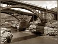
| 06/05/2003 02:32:21 PM | Salt River Gorgeby rcrawfordComment: *Critique Club*
I with I could offer some suggestions for ways of improvement here, but I think this shot is just simply wonderful.
Your focus and clarity are supurb. I especially would like to note that we can see the X shapes in the railing of the bridge in front here. Wonderful detail!!
The angle and framing/cropping are really nice as well. I like how the water kind of flows into the bottom right (or from the bottom right) Either way, it's very visually appealing in my opinion.
I like the shadows, I think that it includes enough 'variation' to make this interesting. The tones work nicely. Goes from whites to blacks, and seeing a lot in between. Works nicely on this old bridge.
The lighting conditions look to have been on your side this day. The sky is not overly bland, and includes a few clouds to enhance the overall look.
I don't think I'd like to see a thing done differently. Great job.
~Heather~ | | Photographer found comment helpful. |
| 06/05/2003 01:16:27 AM | One Of These Days...I'll Be Big Enough Too!by OneSweetSinComment: *Critique Club*
And we meet again.
While I try to look at the expression on his face. I'm catching that bright area in the background out of the corner of my eye, and it's messing thing up for me. Makes me want to blink and try to focus again. Usually when I say something is a distraction, I mean it's a little annoying and just doesn't work, but here, it really is effecting the photo in a bad way. It's right near his eyes, and is drawing my eyes away from his really badly.
I think that the tonal range is good. Nice whites in his shirt and nice darks in his hair and shorts.
He really does have a nice expression. Focus and clarity are nice as well. Good detail in his face and hair. I love the way the light highlights his dark hair. Very nice.
Surroundings are good except for that unfortunate bright spot to the upper right. I am assuming that if you were to get down lower, you'd have a bunch of crap in the background that you don't want.
The crop might be just a TAD tight to the left and top. Maybe just a little room there. Could you match the space to the right?
Overall, still makes me smile, and definately fits the challenge in my opinion.
~Heather~ |
| 06/04/2003 11:24:02 PM | House Invaderby mbardeenComment: *Critique Club*
Let me know where this is, so I never move there. I don't mind spiders, but the ones here are all fuzzy. Cuddly looking. This guy looks harmful.
As to if it meets the challenge, "to each their own". Everyone takes things differently, and if you think of spiders when you think of home, then it fits the challenge. Who am I to say otherwise.
As for the shot itself. Really neat. Nice focus on the front legs. I think that the front 'feet' are nice and crisp and really sharp looking both sharp focus and sharp meaning pointy. It's a good combo. I dislike seeing pointy things with sharp focus. Doesn't usually work.
The lighting looks ok. Even puts a bit of shine on the web.
I wonder though if it would have been possible to get any detail out of the body. We can see he's got a body and legs, but that's all he is. Can't really see a head, or any detail OF the head or body. I think the black kind of makes it all blend in together. Might not even be possible to GET any detail, but would definately be interesting.
I like the angle and framing/cropping. Nice and close, but not crowded. You COULD have cropped a bit off the bottom and still had a good crop, but as it, I don't think it's harmful at all to the photo.
You did a nice job of blurring the background, and I find nothing distracting in the background. The lighter area at the bottom actually gives it enough variation as to not be boring in my opinion.
Nice find!
~Heather~ | | Photographer found comment helpful. |
|
Showing 1091 - 1100 of ~2785 |
Home -
Challenges -
Community -
League -
Photos -
Cameras -
Lenses -
Learn -
Help -
Terms of Use -
Privacy -
Top ^
DPChallenge, and website content and design, Copyright © 2001-2026 Challenging Technologies, LLC.
All digital photo copyrights belong to the photographers and may not be used without permission.
Current Server Time: 07/24/2026 03:39:45 AM EDT.
|